



Project Overview
An integrated social media campaign was designed for Dr. Ahmed Fadel Dental Center aims to provide dental awareness content in a different way, combining medical information with an entertaining visual style.
The goal was to build a campaign that could:
- Simplify Dental Awareness
- Capture Attention Quickly
- Build Trust with the Audience
- Create a Memorable Brand Presence
- Encourage Booking & Communication
The campaign targeted children, youth, and parents, while maintaining a simple style that suits the general public and avoids medical complexity.
The Challenge
The primary challenge was to present dental themes, which are often associated with fear or pain, in a way that:
Attractive and unconventional.
Easy to understand within seconds.
Fun without compromising medical credibility.
Suitable for different age groups.
Able to stand out among similar medical content.
Visually consistent despite the varied campaign themes.
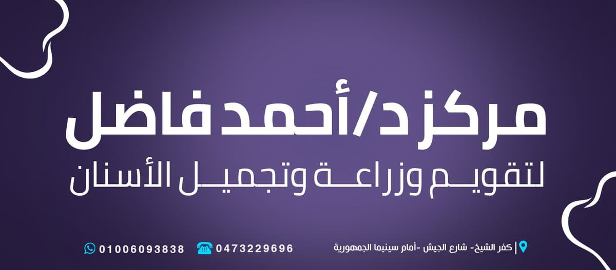
It was also necessary to maintain the clarity of addresses and contact information when viewing the design through the phone screen.
Campaign Strategy
Campaign Personality
- Friendly
- Educational
- Humorous
- Modern
- Trustworthy
- Approachable
- Family Oriented
The campaign was built on the idea of transforming medical information into a short visual story that the audience can easily understand and remember.
- Communication Approach
The content was based on:
Titles in the Egyptian dialect.
Short, direct sentences.
Everyday situations familiar to the audience.
Obvious feelings such as pain, fear, relief or confidence.
Provide one key tip in each design.
An indirect invitation to take care of your teeth and visit a doctor.
Creative Concept
The Tooth as the Main Character
The main idea of the campaign is based on transforming the tooth from an inanimate medical item into a living character that possesses:
Feelings.
Facial expressions.
Body language.
Everyday situations and stories.
Problems that the audience can empathize with.
The tooth appeared within the campaign in various cases, such as:
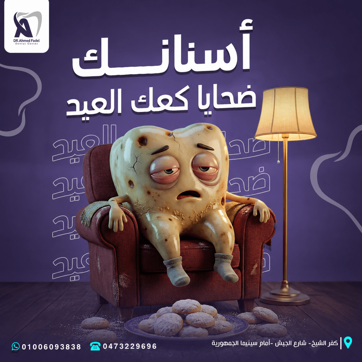
Tired tooth due to eating sweets.
A tooth suffering from nerve pain.
Age affected by smoking.
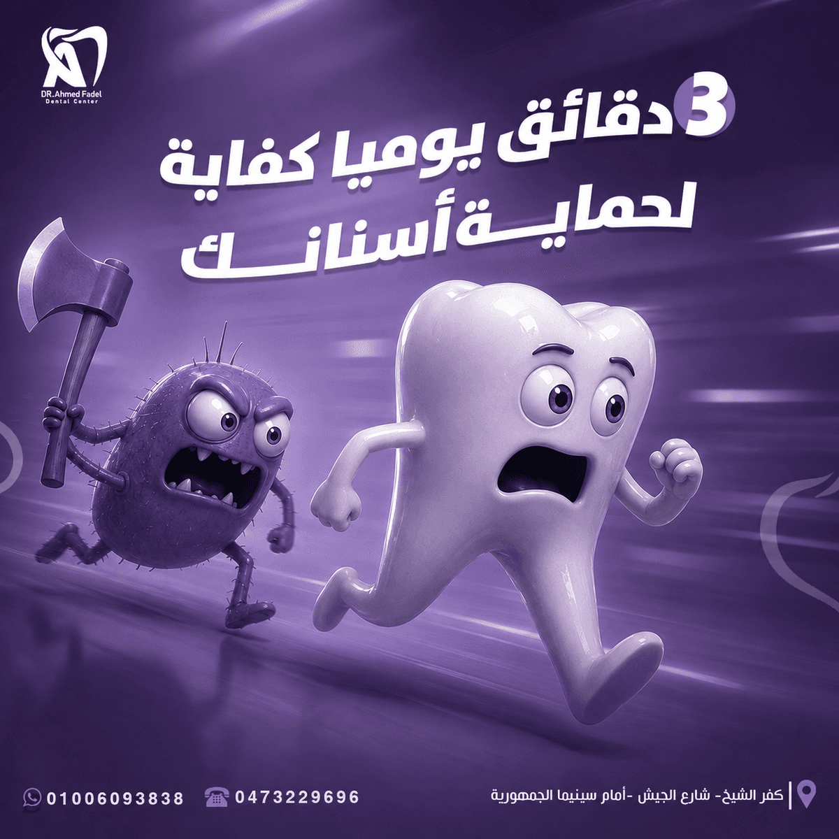
A tooth escaping from bacteria.
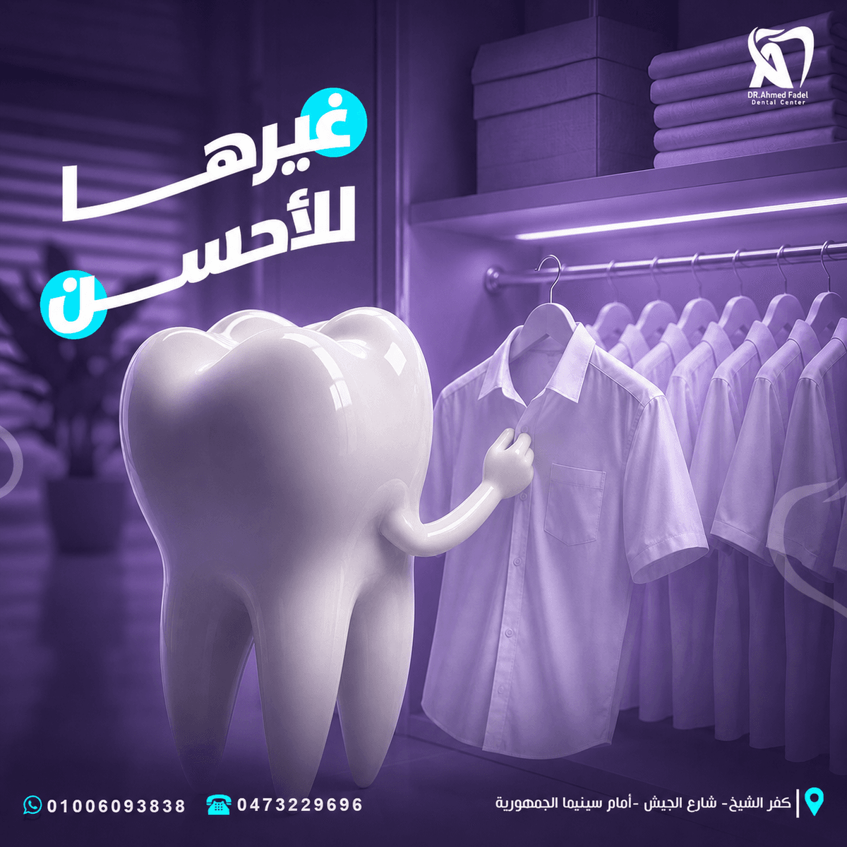
Age looking for a better appearance.
A doctor in the form of a tooth provides the solution to the patient.
This method helped transform medical problems into easy-to-understand visual scenes without the need for long explanations.
Campaign Message
- Teeth talk
The messages are built on the idea that every dental problem has a clear impact on a person's life and smile.
Instead of using traditional medical images, the problem is expressed through symbolic and playful situations, such as:
Sweets as a cause of toothache.
Bacteria as an evil character haunts the tooth.
Endodontics as a rescue operation.
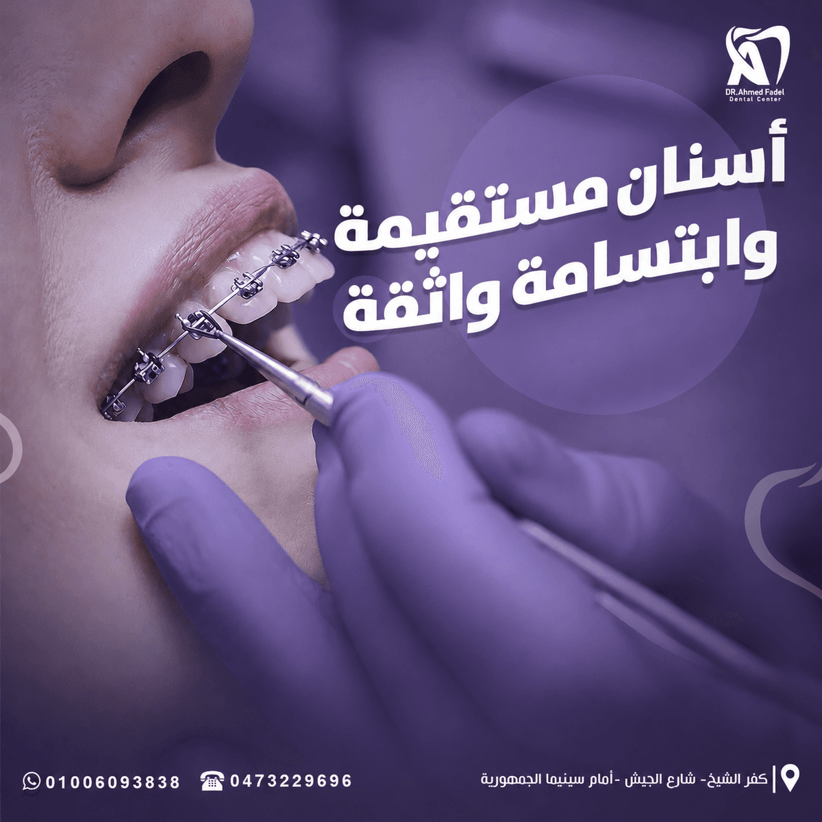
The braces as hero figures protect the child's smile.
Smoking as a habit depletes the health of the tooth.
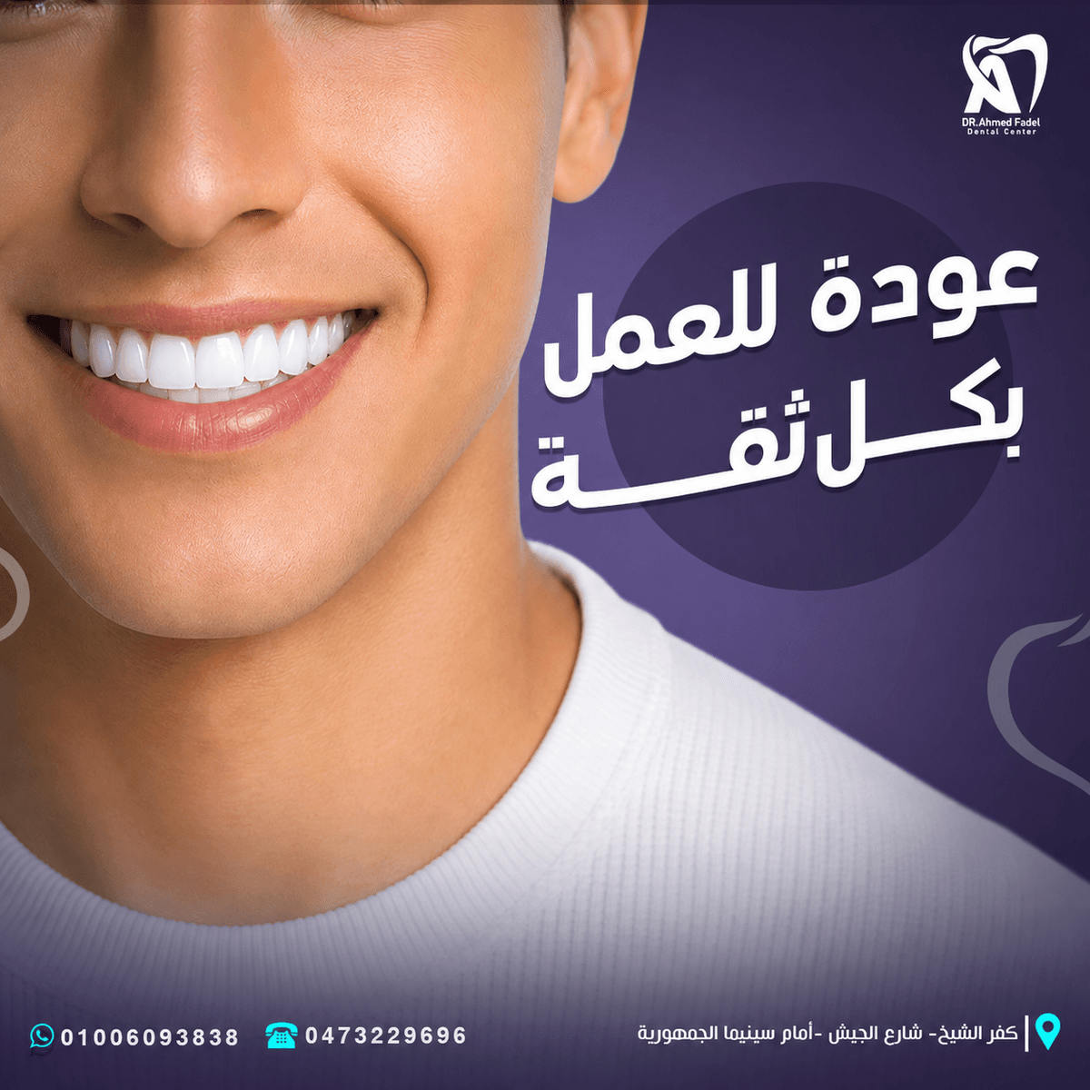
Changing the shape of teeth as a change in appearance and confidence.
Campaign Content Pillars
Hollywood Smile Campaigns
Primary Campaign FocusImplant & Surgery Ads
Primary Campaign FocusPatient Transformations
Primary Campaign FocusClinic Tech Highlights
Primary Campaign FocusContent Pillars
The campaign content was divided into a group of themes to ensure diversity and continuity.
- Dental Awareness
Educating the public about problems and habits that affect dental health.
- Prevent Tips
Providing simple tips that can be implemented daily to prevent tooth decay and pain.
- Treatment Promotion
Introducing the center’s services such as:
Nerve treatment.
orthodontics.
Cosmetic dentistry.
Caries treatment.
Follow up on children's teeth.
- Lifestyle Content
Linking dental health to daily habits such as:
Eating sugars.
Smoking.
Teeth cleaning.
Negligence in visiting a doctor.
- Children's Dental Care
Providing messages directed to children and parents through a fun style and characters close to the child’s world.
Color Psychology Strategy
Campaign Strategy
The campaign's visual system is built around a unified world based on:
- 3D Character Design
- Cinematic Lighting
- Storytelling Scenes
- Strong Arabic Headlines
- Expressive Facial Reactions
- Dark Purple Environments
- High-Contrast Composition
Each design presents an independent scene, but remains part of the same visual world of the campaign.
Bilingual Typography Sandbox
Campaign Strategy
Primary Color
- Deep Royal Purple
Dark violet was used as the main color because it expresses:
Trust.
Professionalism.
Calm down.
Quality.
Modern medical character.
The color also helped create a uniform background that allowed the white characters and titles to stand out clearly.
- Accent Color
- Bright cyan
Sky blue was used in elements that needed to attract attention, such as:
Important words.
Communication icons.
Phone numbers.
Location tags.
Some visual details within the scene.
The color gives the campaign a modern energy and breaks the dominance of purple tones.
Supporting Colors
White, gray and light violet tones were used to add:
Visual clarity.
Strong contrast.
A sense of cleanliness.
Depth within the viewer.
Flexibility in designing characters and backgrounds.
Typography Strategy
A bold, modern Arabic font was used to achieve maximum clarity on social media platforms.
- HeadlineStyle
The main titles feature:
- Bold Arabic Typography
- Large scale
- Strong Visual Hierarchy
- White High-Contrast Color
- 3D Depth & Drop Shadows
This method helps the message to be read quickly even before focusing on the details of the scene.
- Supporting Typography
Simpler weights have been used in:
Contact information.
the address.
Secondary texts.
Phone numbers.
This is to maintain clarity of information without competing with the main headline.
Interactive Tooth Emotion specimen board
Mascot Visual Expression:
Grinning with a clean spark reflection
3D Material & Art notes:
Using bright whites and clean glass reflections for aesthetic beauty.
Copywriting System
The campaign relied on short titles in the Egyptian dialect to be close to the audience and easy to remember.
Examples of writing style:
- Your teeth are victims of holiday cakes
- Less sugars... a sweeter smile
- Calendars champion your child's smile
- Treat the root canal and say goodbye to your toothache
- Smoking kills your laughter
- 3 minutes a day is enough to protect your teeth
- Change it for the better
- Copy Characteristics
- Conversational
- Short & Direct
- Emotionally Driven
- Easy to remember
- Action Oriented
- Suitable for Social Media
Each title is written to act as a visual hook and attract the user before reading the rest of the details.
Post Composition Blueprint Grid
Hover over the wireframe components to explore layout structure rules.
Character Design
The characters are designed in a 3D style that combines realism and cartoon.
- Character Features
Clear and exaggerated facial expressions.
Big eyes for increased emotional impact.
Different materials reflect the condition of the tooth.
Body language related to the message.
Use accessories to support the story.
Easy-to-understand features for all ages.
- Character Conditions
The appearance and texture of the characters were changed depending on the topic:
The healthy tooth appears with a shiny white material.
The tired tooth appears dull and has visible cracks.
The tooth affected by smoking appears dark and stressed.
Characters associated with caries appeared evil or aggressive.
The doctor appeared as a calm and reliable figure.
This diversity gave each publication an independent character while maintaining unity of style.
3D Art Direction
The artistic direction relied on designing integrated scenes and not just separate characters.
Items such as:
Home chair.
Dental clinic.
Treatment room.
Symbolic medical tools.
Sweets and chocolates.
Clothes and wardrobes.
Home lighting.
Characters of bacteria.
Devices inspired by dental instruments.
- Lighting Direction
Violet cinema lighting has been used with:
- Soft highlights
- Rim Lighting
- Focused Light Sources
- Background Blur
- Strong Character Separation
Lighting helped highlight the characters and create a unified atmosphere between all the designs.
Design & Production Phases
1. Brand Positioning & Market Audit
Comprehensive analysis of competitor messaging and target demographics.
Composition System
A consistent layout is built that helps the campaign get recognized quickly.
Main Layout Structure
- Top Area
Center logo.
Main title.
- Middle Area
The main character or scene.
Auxiliary elements of the story.
- Background
Purple shades.
External lines inspired by the shape of teeth.
Simple details that do not compete with the content.
- FooterArea
WhatsApp number.
phone number.
Center address.
Website icon.
A nearly constant location for contact information has been maintained for easy accessibility across all publications.
Visual Direction
Each design is built as a story that can be understood without reading an additional explanation.
- Problem
Present the problem through a clear situation or expression.
- Emotion
Showing pain, fear, exhaustion or anxiety for the character.
- Visual Metaphor
Use a visual symbol that explains the cause or solution.
- Message
Add a simple title linking the scene to the medical service.
- Action
Directing the public to take care of their teeth and communicate with the center.
This system makes publications combine advertising, awareness and entertainment at the same time.
Target Audience
The audience experience within each publication is designed according to the following stages:
- Stop
The character and unconventional scene attract attention while browsing the content.
- Understand
The short title gets the idea across in seconds.
- Relate
Everyday situation makes the user feel that the problem is close to him.
- Remember
The characters and cartoon style help the message be remembered.
- Trust
The unified identity and clarity of the center’s information enhance the sense of professionalism.
- Act
Contact and location information encourages the user to contact or book an appointment.
Brand Consistency
Despite the different themes, the unity of the campaign was maintained through:
Fixed color palette.
Unified character style.
The same lighting method.
Large titles in white.
Use sky blue as a highlight color.
Linear tooth shapes in the background.
Footer is a constant for communication data.
Clear and repeatable placement of the logo.
This helped create a visual system that was recognizable even before the name of the center was read.
Campaign Applications
The system is designed to be scalable across:
- Instagram Posts
- Facebook Posts
- Sponsored Ads
- Stories
- Reels Covers
- Educational Carousels
- Service Promotions
- Seasonal Campaigns
- Clinic Screens
- Printed Posters
The characters themselves can also be developed and used in short videos or Motion Graphics content.
Design Process
Discovery & Research
Understanding the center’s services, target audience, and method of communication.
Content Planning
Identify medical topics and convert them into short messages.
Concept Development
Find appropriate visual metaphors and situations for each topic.
- Character Development
Determine the character's form, expressions, and texture to suit the problem.
- 3D Scene Direction
Scene construction, lighting, and story auxiliary elements.
- Visual Composition
The integration of characters, titles, and elements within Layout is balanced.
- Retouching
Unifying colors and lighting and improving details and textures.
- Brand Adaptation
Adding the logo, contact information, and fixed visual elements.
- Final review
Review readability, contrast, message clarity, and consistency of all campaign posts.
Design Outcome
The end result was a social media campaign:
Possess a clear visual character.
Presents medical content in a fun way.
Transforms teeth into characters that are easy to remember.
Strike a balance between awareness and advertising.
Suitable for children and adults.
Maintains medical credibility.
Scalable to new topics and services.
Provides a consistent presence for the center on digital platforms.
The goal was not to design a set of separate publications, but rather to create a Visual Campaign System that the center could rely on to continuously communicate with its audience.
Final Statement
The goal was not only to promote dental services, but to transform dental awareness into engaging visual stories that people can understand, relate to, and remember.
By combining expressive 3D characters, conversational Arabic copy, cinematic art direction, and a consistent visual system, the campaign created a friendly and recognizable digital presence for Dr. Ahmed Fadel Dental Center.