



Project Overview
BUILD UP Development & Construction is a company specialized in development, construction, finishing and renovation works, and provides integrated solutions for residential, commercial and medical spaces, from concept and design to implementation and delivery.
The goal was to design a Social Media Campaign that expressed:
- Construction Expertise
- Complete Turnkey Solutions
- Modern Design Thinking
- Quality & Reliability
- Smart Living Solutions
- From Concept to Execution
The campaign was developed to present the company's services in a modern and powerful way, while transforming construction and finishing topics into attractive and easy-to-understand visual ideas within social media platforms.
The Challenge
The main challenge was to provide multiple and similar services in the field of contracting and finishing in a way that:
Clear and quick to understand.
Different from the traditional content of contracting companies.
It reflects the quality of implementation and technical expertise.
She explains that the company offers integrated solutions and not a separate service.
It attracts residential clients, business owners and clinics.
It maintains the unity of identity despite the diversity of services.
Encourages the public to reach out and request a quote.
It was also important to communicate that BUILD UP does not only implement the design, but also manages the entire project from planning to final delivery.
Campaign Strategy
Campaign Personality
- Professional
- Confident
- Modern
- Reliable
- Innovative
- Detail-Oriented
- Solution-Driven
The campaign was built on presenting the company as an implementing partner who can transform any idea or space into an integrated project, with a focus on quality, space utilization and commitment to implementation.
Communication Tone
Clear and direct.
Strong and confident.
Close to the language of the public.
Focuses on the end result.
Connects the service to the customer's daily needs.
Far from complex engineering details.
Combines practicality with visual ambition.
The Big Idea
The main idea of the campaign is based on the concept:
- From Imagination to Reality
Each message begins with a desire or challenge facing the client, then introduces BUILD UP as the entity capable of transforming the idea into a real, integrated space.
This concept appeared through messages such as:
Take advantage of every meter in your apartment.
Smart home with one click.
Imagine and we will implement it.
Your imagination comes true at the lowest cost.
Return your home like new.
Your apartment From A to Z.
Your clinic is on key.
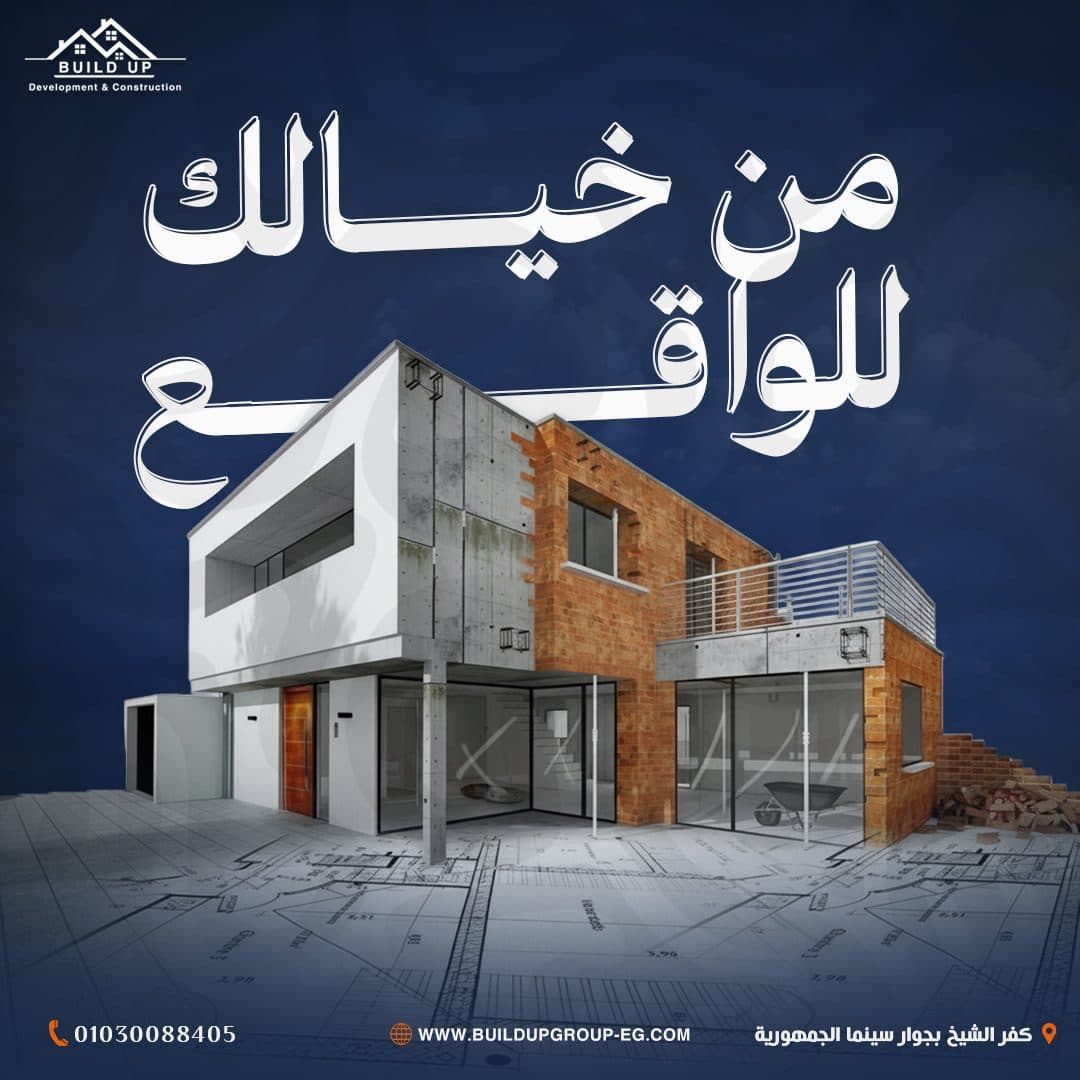
From your imagination to reality.
You encounter your address.
In this way, the campaign no longer only offers construction services, but also presents a clear promise to the client:
Your idea begins with imagination and ends with a place ready for use.
Content Direction
The campaign covered a variety of the company's services, including:
- Interior Finishing
- Full Apartment Finishing
- Turnkey Solutions
- Renovation & Remodeling
- Smart Home Systems
- Space Optimization
- Construction & Development
- Exterior Facade Design
- Clinic Finishing
- Residential Projects
- Commercial Spaces
- Design & Execution
Each service was handled by a separate Visual Concept, maintaining the unified visual system of the campaign.
The plan also combined:
Service Promotion
- Brand Awareness
- Problem–Solution Content
- Visual Concept Posts
- Turnkey Service Communication
- Inspirational Content
- Lead Generation Posts
- Conversion-Oriented Content
Campaign Content Pillars
Turn-key Villa Finishing Ads
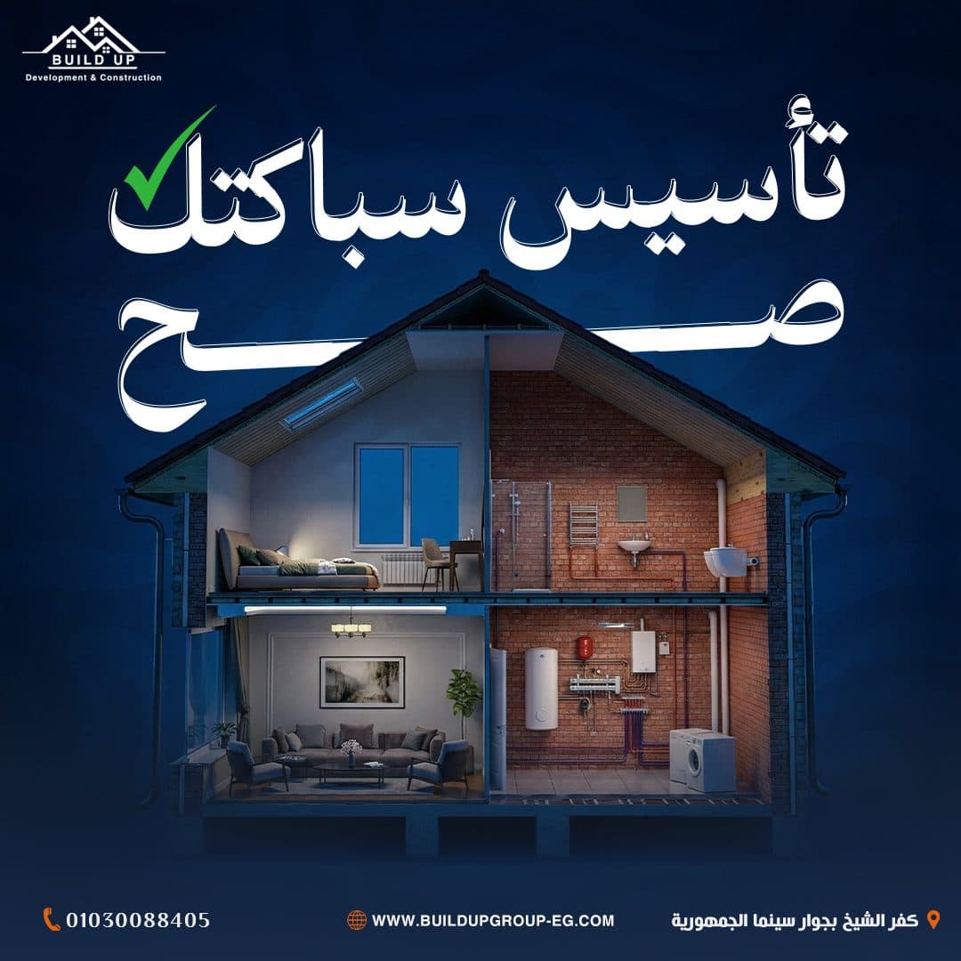
Primary Campaign FocusPlumbing & Electrical Engineering
Primary Campaign FocusImagination to Reality Posts
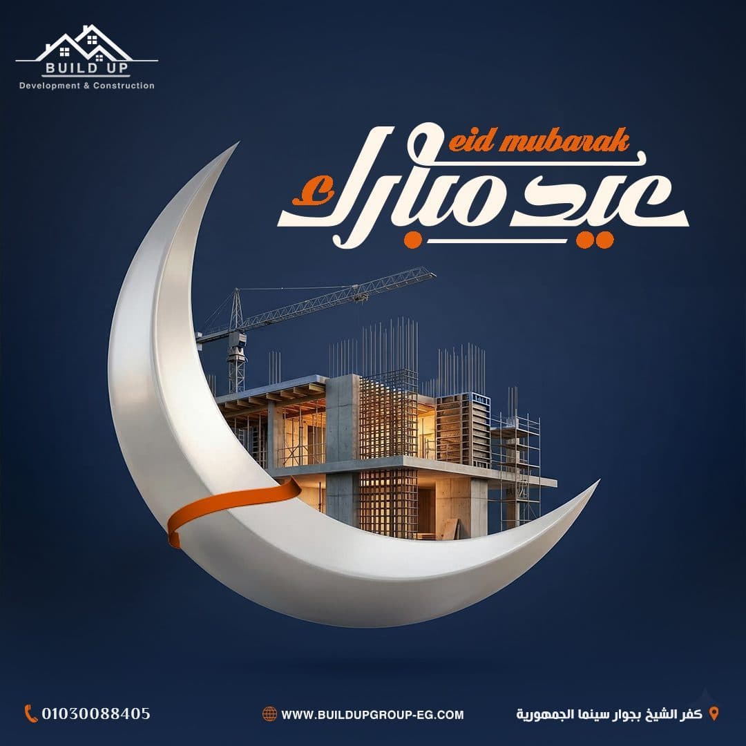
Primary Campaign FocusEid & Seasonal Campaigns
Primary Campaign FocusVisual Direction
The campaign's visual system was built based on:
- Bold Arabic Headlines
- Cinematic Photo Manipulation
- Architectural Visuals
- Strong Visual Metaphors
- 3D Construction Elements
- High visual contrast
- Dramatic Lighting
- Clear Information Hierarchy
- Consistent Branding Elements
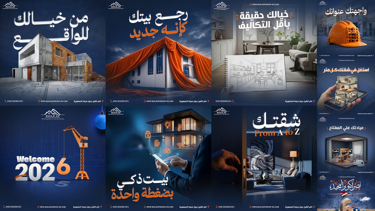
The designs relied on strong architectural scenes that help the public imagine the final result of the service before it is implemented.
Realistic elements were also combined with 3D scenes and surreal concepts, to transform the services into distinctive images that are easy to remember.
This was shown by:
An entire building emerging from a phone screen.
Smart home surrounded by control icons.
A space half of which is unfinished and the other half is finished.
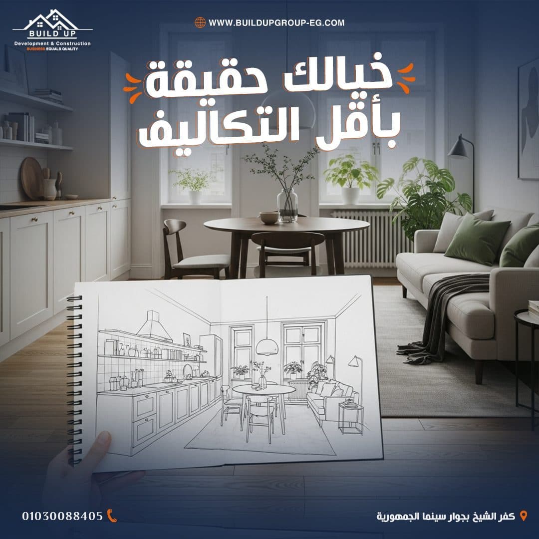
A sketch turns into a real interior design.
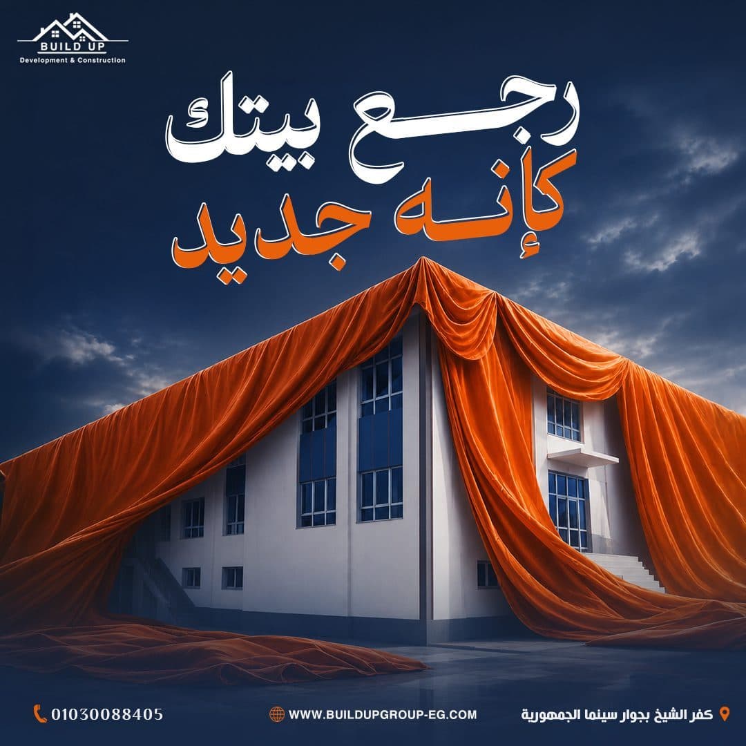
A building revealed by an orange curtain.
Engineer helmet with built-in architectural project.
An entire clinic appears next to a huge key.
Color Psychology Strategy
Campaign Strategy
A color palette inspired by BUILD UP's core identity.
Primary Color
- Deep Navy Blue
Dark blue was used to express:
Trust.
power.
Experience.
Professionalism.
stability.
Geometric character.
Color appeared in the backgrounds, overlays, shadow areas and elements that work to unify the different images within the campaign.
It also helped give the designs a luxurious and institutional character that suits the field of construction and development.
Secondary Color
- Construction Orange
Orange is used to express:
Energy.
Implementation.
Movement.
Innovation.
Construction activity.
Attract attention.
Color appeared in:
Keywords.
Icons.
Communication means.
Visual elements.
Illuminations.
Materials used within Visual Concepts.
Orange also helped direct the viewer's eye towards the main message and added strong contrast with the blue backgrounds.
Supporting Colors
- Clean White
White was used in the titles, logo and basic information to achieve:
The highest degree of clarity.
Ease of reading.
Clean and modern look.
A visual balance between blue and orange.
Bilingual Typography Sandbox
Typography Strategy
A strong and bold typography style was chosen, because most of the content is based on short messages that should be noticed and read within seconds.
- Arabic Headlines
Wide Arabic fonts with a strong presence were used to achieve:
- Strong Visual Impact
- Fast Readability
- Clear Hierarchy
- Confident Brand Voice
- Modern Construction Look
The headlines were white, with orange used to highlight words associated with the result or service.
Also used:
- Dark Outlines
- Drop Shadows
- Layered Text Effects
- Extended Arabic Letterforms
This is to increase the strength of titles and separate them from complex architectural backgrounds.
English Typography
English texts were used to a limited extent within some messages, such as:
- From A to Z
To emphasize the modern nature of the service and add visual diversity within the campaign.
- Supporting Text
Simpler weights have been used in:
Phone number.
Website link.
Company address.
Contact information.
Description of secondary services.
Photography & Art Direction
The campaign relied primarily on Photo Manipulation to produce unconventional architectural scenes that express each service quickly and directly.
The visual style included:
Combine buildings with 3D elements.
Carefully isolate people and projects.
Combine sketches with realistic images.
Uniformity of lighting and color grading.
Add realistic shadows and reflections.
Transforming daytime scenes into a cinematic character.
Using Blue Color Grading to unify the campaign.
Add Orange Highlights associated with the identity.
Integrating technical elements with smart homes.
Creating scenes that combine construction and finishing stages.
Each design was treated as an independent scene carrying a visual story, and not as a background image with only text added to it.
Interactive Architecture Blueprint Wireframe
Living Lounge
Hover to view design details
Smart Kitchen
Hover to view design details
Creative Office
Hover to view design details
Layout Grid System
A consistent system was designed that helps standardize all campaign posts.
- Logo Placement
The BUILD UP logo has been placed at the top left to keep it visible throughout all designs.
- Website Placement
The website link appeared at the top or bottom of posts depending on the design configuration, with an orange globe icon.
- Main Headline
The title occupies a large space within the upper third or middle of the design, being the first visual element that the viewer notices.
Hero Visual
A main scene was used that expresses the service and serves as the primary focus point within the composition.
- Brand Color Highlights
Specific words are highlighted in orange to direct reading towards the key interest or outcome.
Contact Footer
The following items are installed at the bottom:
Phone number.
Website.
Company address.
Communication and website icons.
This system helped achieve:
- Brand Consistency
- Fast Content Recognition
- Clear Visual Hierarchy
- Stronger Brand Recall
- Easy campaign expansion
Post Composition Blueprint Grid
Hover over the wireframe components to explore layout structure rules.
Creative Concept
A different visual idea was developed for each post according to the nature of the service and the marketing message.
- Space Optimization
- Take advantage of every meter in your apartment
A multi-storey house that appears above a phone screen inside the user's hand was used to express the intelligent planning of spaces and the possibility of utilizing every part within the unit.
The landscape reflects the company's ability to see the entire space and redistribute it practically.
- Smart Home Solutions
- Smart home with one click
A modern home has been integrated with a person who controls its systems through the phone, and the addition of illuminated icons that express:
Lighting.
Security.
the heat.
Internet.
Monitoring.
Energy saving.
The design demonstrates that smart home systems have become a simple experience that can be controlled from one place.
- Design & Execution
- Imagine and we will implement it
The space was visually divided between an unfinished phase and a luxurious finished phase, with a person using a virtual reality headset placed in the middle.
The landscape expresses the client's ability to see the future outcome before implementing the project, while the company is responsible for turning the vision into reality.
- Interior Design
- Your imagination comes true at the lowest cost
A drawn sketch of an interior space was used in front of the actually executed design.
This transition shows the relationship between:
- Concept → Planning → Execution
It also reflects the company's ability to transform initial ideas into realistic and practical designs within the available budget.
- Renovation
- Return your home like new
The building is covered in a huge orange fabric that is lifted to reveal the new look, in a visual metaphor similar to the unveiling of a completely renovated project.
The color orange helped connect the landscape to identity and convey a sense of change and renewal.
- Full Apartment Finishing
- Your apartment From A to Z
A door opens into a finished and luxurious interior space, conveying the idea that the company handles all phases of the project from inception to delivery.
The scene expresses the customer's experience when receiving a ready-to-occupy space without having to deal with multiple implementing agencies.
- Clinic Turnkey Solutions
- Your clinic is on key
A 3D model of an integrated clinic was used with a large key in the foreground of the scene.
The key expresses the Turnkey Solution concept, while the details of the clinic demonstrate the company's ability to equip medical spaces functionally and visually.
- From Concept to Construction
- From your imagination to reality
Different stages are integrated within one building, from the structure and raw materials to the final completed form.
The design reflects the project's journey from drawing and planning to construction and finishing.
- Exterior Facades
- You encounter your address
An apartment building is integrated inside a construction engineer's helmet, with the backdrop of a real construction site.
The scene connects:
Engineering planning.
Security.
Implementation.
Final exterior appearance.
He also confirms that the project's facade is not just a cosmetic element, but rather the first expression of the value and identity of the building.
Campaign Applications
The campaign is designed to be scalable and usable across:
- Facebook Posts
- Instagram Posts
- Sponsored Ads
- Instagram Stories
- Service Highlights
- Project Announcements
- Educational Carousels
- Website Banners
- Company Profile
- Outdoor Advertising
- Printed Promotional Materials
- Sales Presentations
The visual system also allows adding new services, projects or offers without losing the identity of the campaign.
Design & Production Phases
1. Brand Positioning & Market Audit
Comprehensive analysis of competitor messaging and target demographics.
Design Process
Discovery & Research
Understand the company's services, nature of projects, customer segments and features that differentiate BUILD UP from competitors.
Research & Market Audit
Analyzing the content of contracting and finishing companies and studying the visual methods used within the market.
Content Planning
Dividing services into key messages that include:
Construction.
Finishing.
Renewal.
Design.
Smart homes.
Turnkey.
Residential and medical spaces.
Concept Development
Develop an independent visual idea for each publication, linking the service to a short and clear marketing message.
- Image Selection
Choosing architectural images, human elements, and materials that help build the desired scene.
- Photo Manipulation
Perform merging, isolation, perspective correction, lighting manipulation, and adding shadows and reflections.
- Color Grading
Unifying all scenes using dark blue shades, while adding orange touches for identity.
- Visual System
Determine the locations of the logo, addresses, website, contact number and address.
- Final Adaptation
Preparing designs with the appropriate sizes and quality for organic content and sponsored ads.
Design Outcome
The end result was a Social Media Campaign:
Uniform and easy to recognize.
Providing modern construction and finishing services.
Transform technical services into easy-to-understand visual ideas.
It reflects the company's experience and strength of implementation.
Highlights the concept of integrated service from start to finish.
It demonstrates the diversity of the company's services without distracting the identity.
It combines engineering with visual creativity.
Suitable for organic content and sponsored ads.
Encourages the audience to imagine the end result of the project.
Maintains the presence of the logo and contact information in all publications.
Flexible to add new services and projects in the future.
Final Statement
The goal was not only to promote BUILD UP’s construction and finishing services, but to create a complete social media system that transforms technical services into clear, inspiring and visually memorable stories.
The campaign combines architectural expertise, creative photo manipulation and consistent brand communication to present BUILD UP as a reliable partner capable of transforming ideas, sketches and unfinished spaces into complete environments ready for living, working and growing.
From imagination to planning.
From construction to finishing.
From vision to reality.