






Project Overview
An integrated social media campaign was designed for Dr. Ahmed Samir, a specialist in physical therapy and therapeutic nutrition, with the aim of building a strong digital presence that reflects medical expertise and makes health content more visible and relevant to the audience.
The campaign focused on services:
- Treatment of obesity and thinness
- Therapeutic nutrition
- Treatment of obesity and thinness in children
- Cupping and physical therapy
- Awareness of medications and weight loss methods
- Online consultations and follow-up
The goal was to create a visual system that could express:
- Medical Trust
- Clear communication
- Professional Expertise
- Friendly & Accessible Presence
The Challenge
The main challenge was to present the medical content in a way that combined seriousness and visual appeal, without the publications appearing traditional or complex.
The campaign was required to be designed:
It attracts attention amid the great competition on social media.
Simplifies medical information for non-specialized audiences.
Maintains credibility and professionalism.
Covering diverse topics and services within a single visual system.
Suitable for different audience segments, from children to adults.
Supports awareness and promotional content at the same time.
It makes the doctor's personality an essential part of the brand.
Campaign Strategy
Campaign Personality
- Professional
- Trustworthy
- Energy
- Friendly
- Clear
- Modern
- Results-Oriented
The campaign style was built to make the doctor appear as an expert and close to the audience, while maintaining a clear, professional medical presence.
Target Audience
The campaign targeted:
People who want to lose weight.
Cases that suffer from thinness and difficulty gaining weight.
Parents concerned about the health and weight of their children.
Those looking for specialized nutritional follow-up.
The public interested in physical therapy and cupping.
People who need simple information about weight loss medications.
Campaign Strategy
The content has been divided into a group of themes to ensure diversity and continuity.
Awareness Content
Publications explaining the dangers of using unknown medications, information about weight loss methods and the difference between different procedures.
Educational Content
Simplified comparisons and information help the public understand treatment options more clearly.
Service Promotion
Introducing the clinic’s services such as:
Obesity treatment.
Slimness treatment.
Treatment of childhood obesity.
Treating thin children.
Cupping and physical therapy.
Personal Branding
Showing Dr. Ahmed Samir inside the design to enhance trust and build a direct relationship with the audience.
Promotional Content
Design clear offers, such as an online follow-up discount, highlighting the offer visually without affecting the medical message.
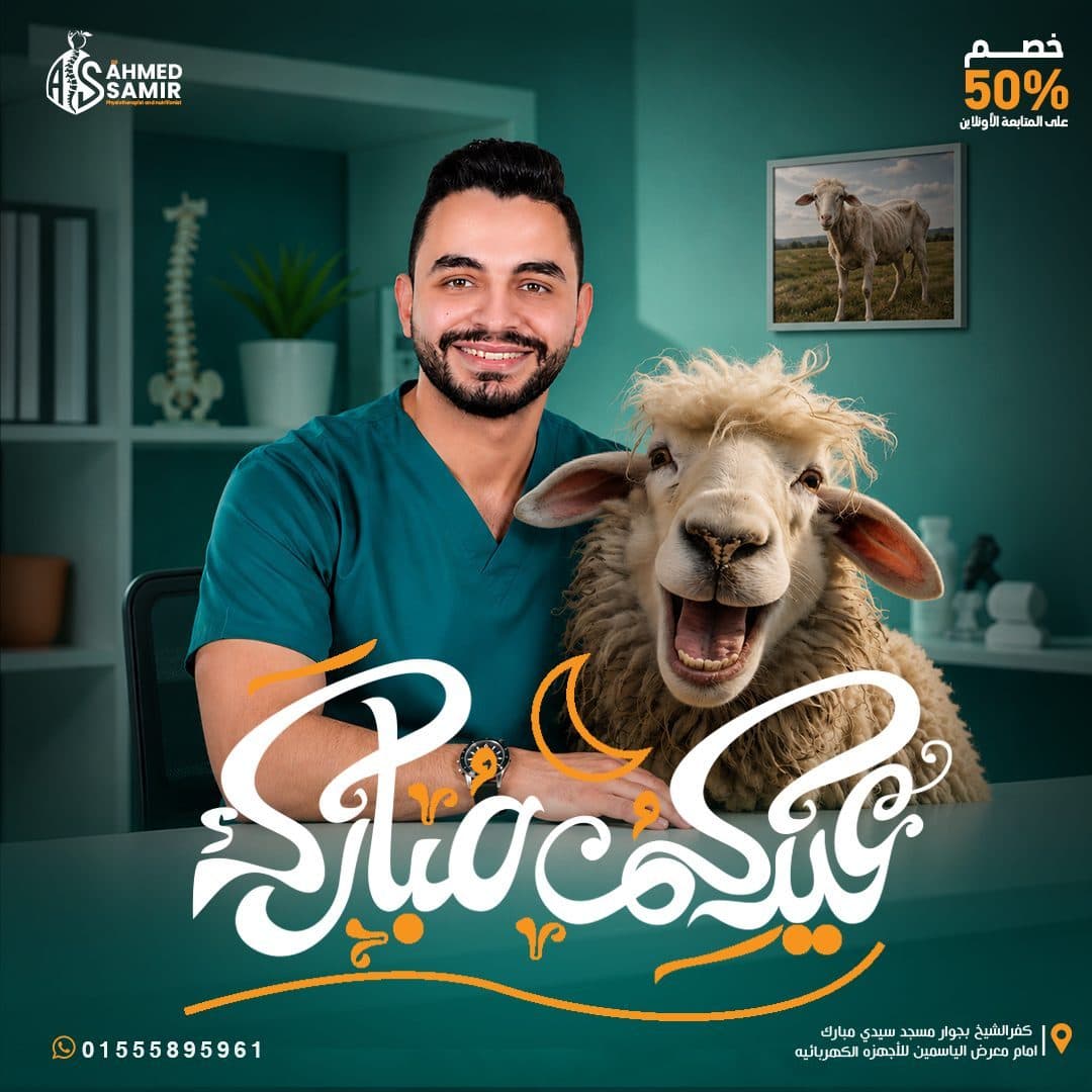
Seasonal Content
Ramadan publications, holidays and events, while preserving the colors and basic elements of identity.
Informational Content
Publications of working hours, contact information and the clinic’s website in an easy-to-read manner.
Creative Concept
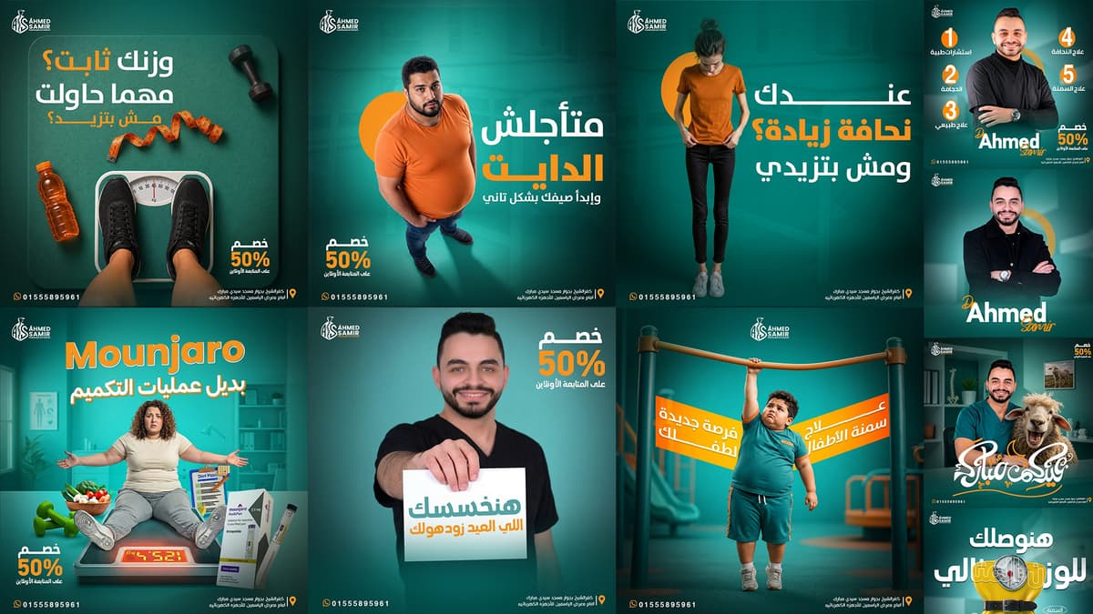
The creative concept was based on transforming health problems into unconventional visual scenes that are easy to understand and remember.
Visual Metaphors such as:
A belted bag to express weight control.
A box bearing the danger mark for awareness of unknown medicines.
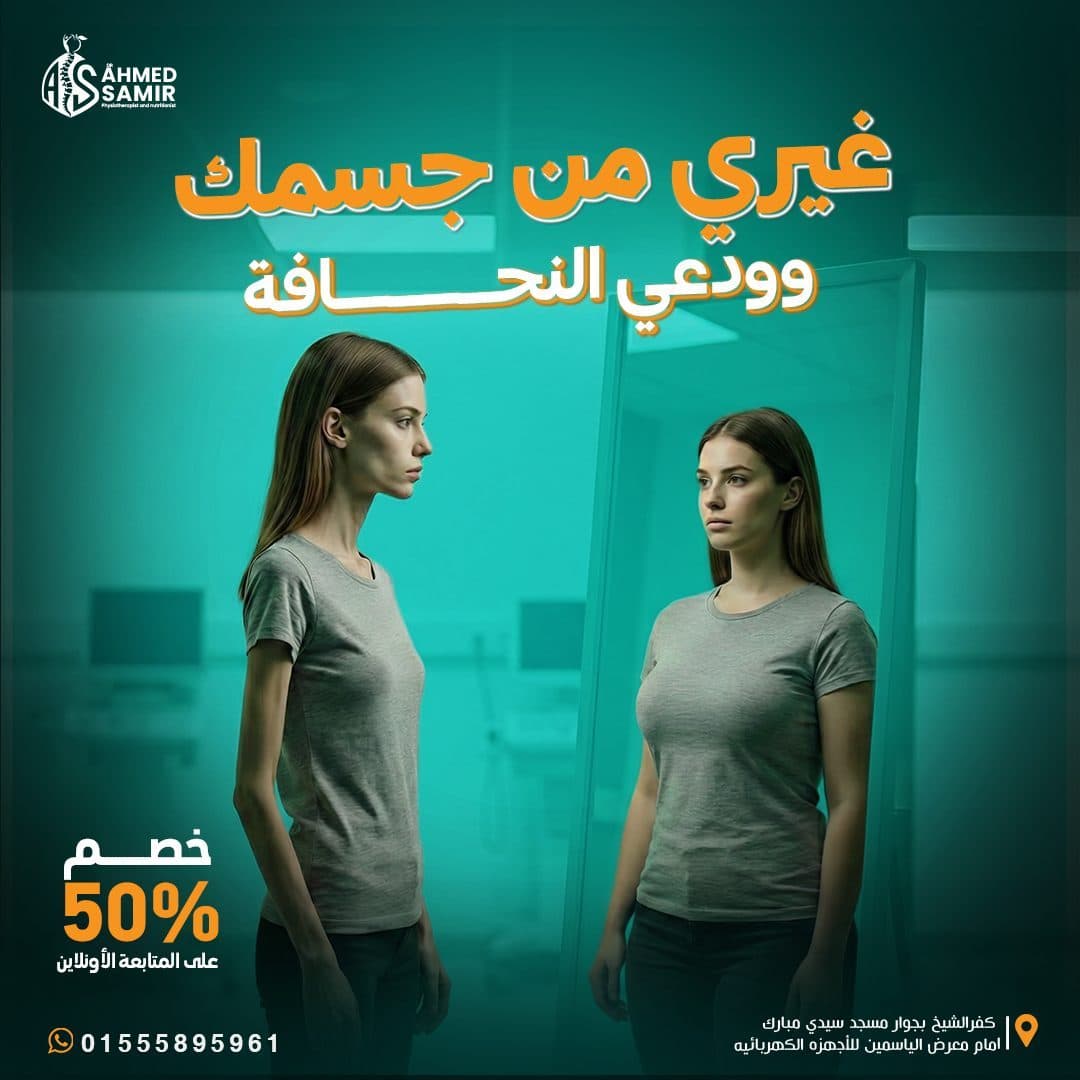
A scale and different characters to illustrate the problems of obesity and thinness.
A child clings to a sports equipment to express the difficulty of movement resulting from obesity.
The sheep sports reflection in the mirror to deliver a motivational message in a fun way.
Medical items and therapeutic tools to explain the differences between procedures.
This method helped transform medical topics into content:
- Simple
- Memorable
- Shareable
- Emotionally Engaging
Campaign Content Pillars
Medical Infographics
Primary Campaign FocusWeight Loss & Gain Series
Primary Campaign FocusChildren Nutrition Posts
Primary Campaign FocusSeasonal Medical Offers
Primary Campaign FocusCampaign Strategy
The color palette is built around two primary colors that reflect the personality of the campaign.
Primary Color
- Deep Medical Teal
Color expresses:
Trust.
health.
Calm down.
Professionalism.
Modern medical environment.
Multiple shades of it were used in backgrounds, lighting and color gradients to create visual depth.
Secondary Color
- Energy Orange
The color orange was used to add:
Energy.
Movement.
Feeling positive.
Highlight titles and offers.
Direct the user's attention to important information.
Supporting Colors
- Clean White
Use white in:
Headlines.
Explanatory texts.
Contact information.
Achieve contrast and readability.
The contrast between Teal, Orange & White helped create a distinct, easily recognizable identity within the Feed.
Color Psychology Strategy
Typography Strategy
A strong and clear typography style was chosen that matches the nature of the medical and advertising content.
Arabic Typography
Broad Arabic fonts were used in:
Headlines.
Marketing messages.
Keywords.
Offers and discount rates.
Using lighter weights for explanatory texts, dates, and secondary titles.
English Typography
Modern English fonts have been used in:
Doctor's name.
Names of medications and procedures.
Titles mixed between Arabic and English.
Medical and technical elements.
Typographic Hierarchy
A clear visual sequence is built based on:
- Bold Headline
- Highlighted Keyword
- Supporting Message
- Offer or Call to Action
- Contact Information
This system helped the audience read the main message within a few seconds.
Bilingual Typography Sandbox
Visual Direction
The campaign's visual system was built based on:
Medical wallpapers in teal.
Cinematic lighting directed towards the main subject.
Strong central formations.
Gradations and shadows to increase depth.
Circles and geometric elements in orange.
Cut and combine images in a realistic style.
Use Glow to separate people and objects from the background.
Large titles with high contrast.
Fixed bar for contact and location information.
Clear distribution of the logo and marketing presentation.
Despite the diversity of topics, all publications maintained the same visual spirit.
Photography & Art Direction
The direction of the images is based on mixing portraits and composite elements to create scenes that quickly communicate the idea.
Doctor Photography
Images of the doctor were used in poses that reflect:
Trust.
Welcome.
Experience.
Proximity to the public.
Professional presence.
Patient Representation
Characters were chosen to represent different situations, such as:
Obesity.
Thinness.
Children's weight problems.
Confusion between therapeutic methods.
Concern about health outcomes.
Image Manipulation
Visual processing was implemented with the aim of unifying images through:
- Color Correction
- Skin Retouching
- Background Replacement
- Light Matching
- Shadows & Reflections
- Depth of Field
- Realistic Compositing
Thus, all scenes appeared as if they belonged to one visual world.
Interactive Metaphor Guide
Layout Grid System
Posts are designed with a flexible system that allows content to be changed while maintaining consistency.
Main Layout Structure
Brand Logo
at the top to ensure continuous visibility of the mark.
Strong Headline
A direct, large headline that represents the primary entry point for the design.
Hero Visual
A main character or element that visually explains the idea.
Supporting Information
Short texts or explanatory points without crowding.
Promotional Badge
Fixed space for offers and discount rates when needed.
Contact Footer
The contact number and location of the clinic within a clear and repeatable space.
The system has been developed to work on square prisms, covers and horizontal sizes.
Post Composition Blueprint Grid
Hover over the wireframe components to explore layout structure rules.
Campaign Applications
The visual system has been applied to a variety of content, including:
- Educational Social Media Posts
- Awareness Posts
- Promotional Offers
- Doctor Profile Designs
- Service Introduction Posts
- Clinic Schedule Posts
- Online Follow-up Campaigns
- Seasonal & Holiday Posts
- Facebook Cover Design
- Children Nutrition Campaigns
- Weight Loss Campaigns
- Weight Gain Campaigns
- Medical Comparison Content
The flexibility of the system helped deliver multiple messages without losing the personality of the sign.
Design Process
Discovery & Research
Understand the doctor’s specialty, the services provided and the nature of the target audience.
Research & Market Audit
Analyzing competing medical content and studying ways to present health information on social media.
Content Planning
Dividing topics into awareness, educational, service, promotional and seasonal content.
Creative Direction
Determine colors, style of images, type of lighting, and how to use visual metaphors.
Concept Development
Develop a different visual idea for each post, linking it to the overall campaign system.
Visual Production
Implementing compositing, image processing, designing elements and writing visual content.
Design System
Unifying logo locations, contact information, colors, displays and typography.
Final Optimization
Review text clarity and contrast and prepare designs for publication on digital platforms.
Design & Production Phases
1. Brand Positioning & Market Audit
Comprehensive analysis of competitor messaging and target demographics.
Design Outcome
The end result was a social media campaign:
It has a strong, easy-to-recognize visual character.
Medical information is presented in a clear and attractive way.
Achieve a balance between awareness and promotional aspects.
Enhances confidence in the doctor and clinic services.
Uses visual ideas to help remember the message.
Maintains consistency despite different types of content.
Easily expandable and produce new posts.
Suitable for use on Facebook, Instagram and advertising platforms.
Final Statement
The goal was not only to design individual social media posts, but to build a complete visual communication system that transforms medical information into clear, engaging and memorable content.
The campaign strengthened Dr. Ahmed Samir’s digital presence by combining professional medical credibility with bold visual storytelling, consistent branding and audience-focused communication across every social media touchpoint.