

Project Overview
Enab is a brand specialized in providing stuffing and oriental food, and targets the audience in the Saudi market through an experience that combines home-style taste, quality, and ease of ordering through delivery applications.
The goal was to design a social media campaign that could express:
- Authentic Eastern Taste
- Premium Food Presentation
- Easy ordering experience
- Strong & Memorable Visual Presence
- Modern Saudi Market Communication
While preserving the oriental character of the brand and presenting it in a modern and attractive way.
The Challenge
The primary challenge was to design a campaign:
Shows the quality and details of food in a delicious way.
It maintains the luxurious and distinctive identity of Annab.
Offers and prices are presented in a clear and quick-to-understand manner.
It suits the nature of the content on social media platforms.
It combines sales and informational content without losing visual consistency.
It encourages the public to order from the website or delivery applications.
What was needed was to create a flexible optical system, not just a collection of separate designs.
Campaign Strategy
Campaign Personality
- Authentic
- Appetizing
- Premium
- Warm
- Generous
- Contemporary
- Gulf Oriented
The campaign was built around the idea of presenting traditional cuisine in a modern visual style, with an emphasis on product abundance and quality presentation.
- Communication Goals
Increase awareness of various products.
Highlighting the offers and available packages.
Clarifying ordering and delivery methods.
Enhancing the brand’s visibility on digital platforms.
Build an immediate desire to try the product.
Creative Concept
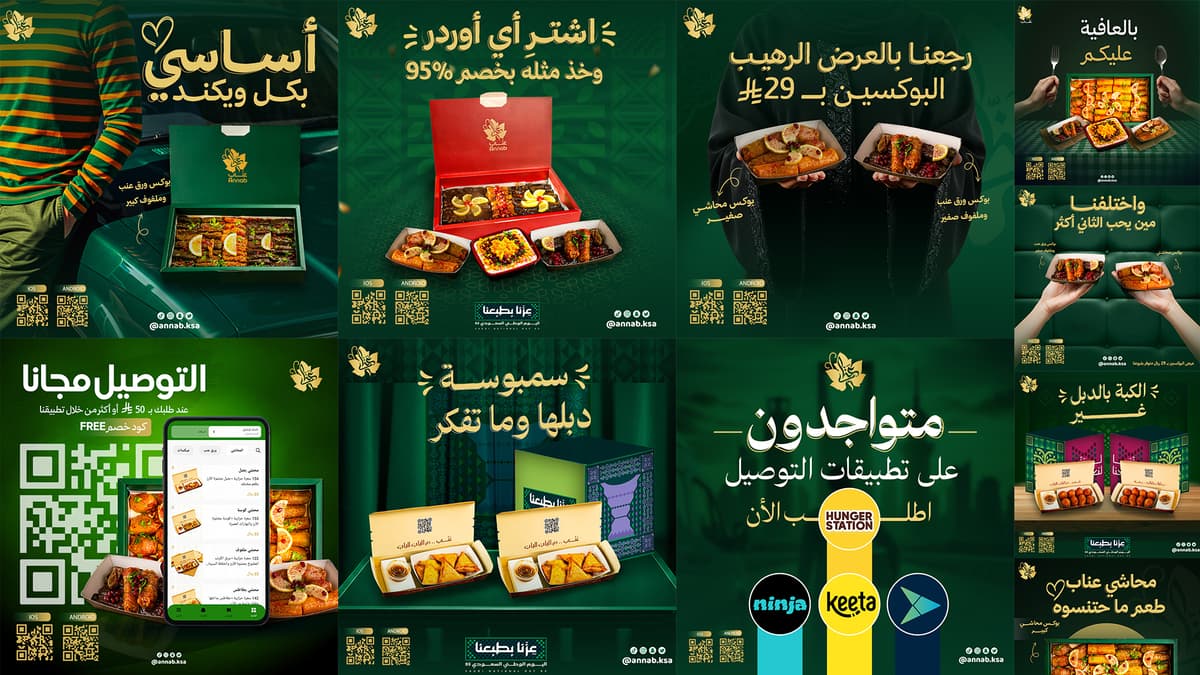
The creative concept was based on turning food into the main element within each design.
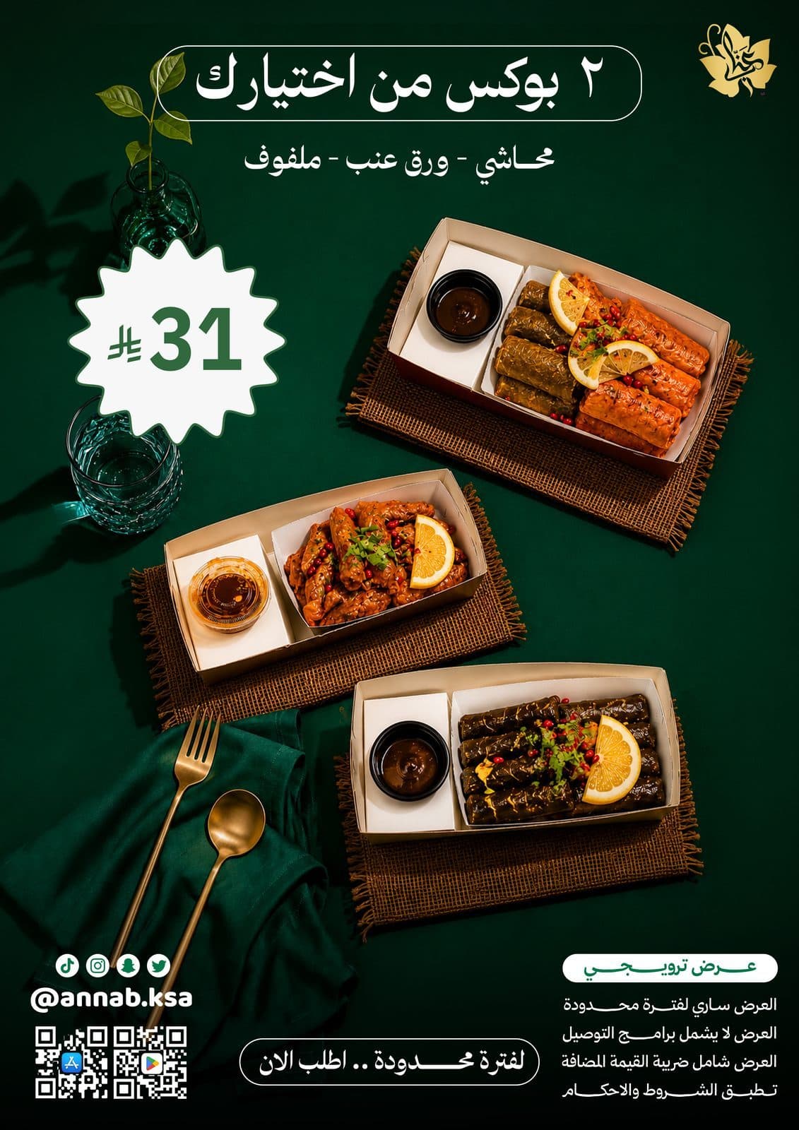
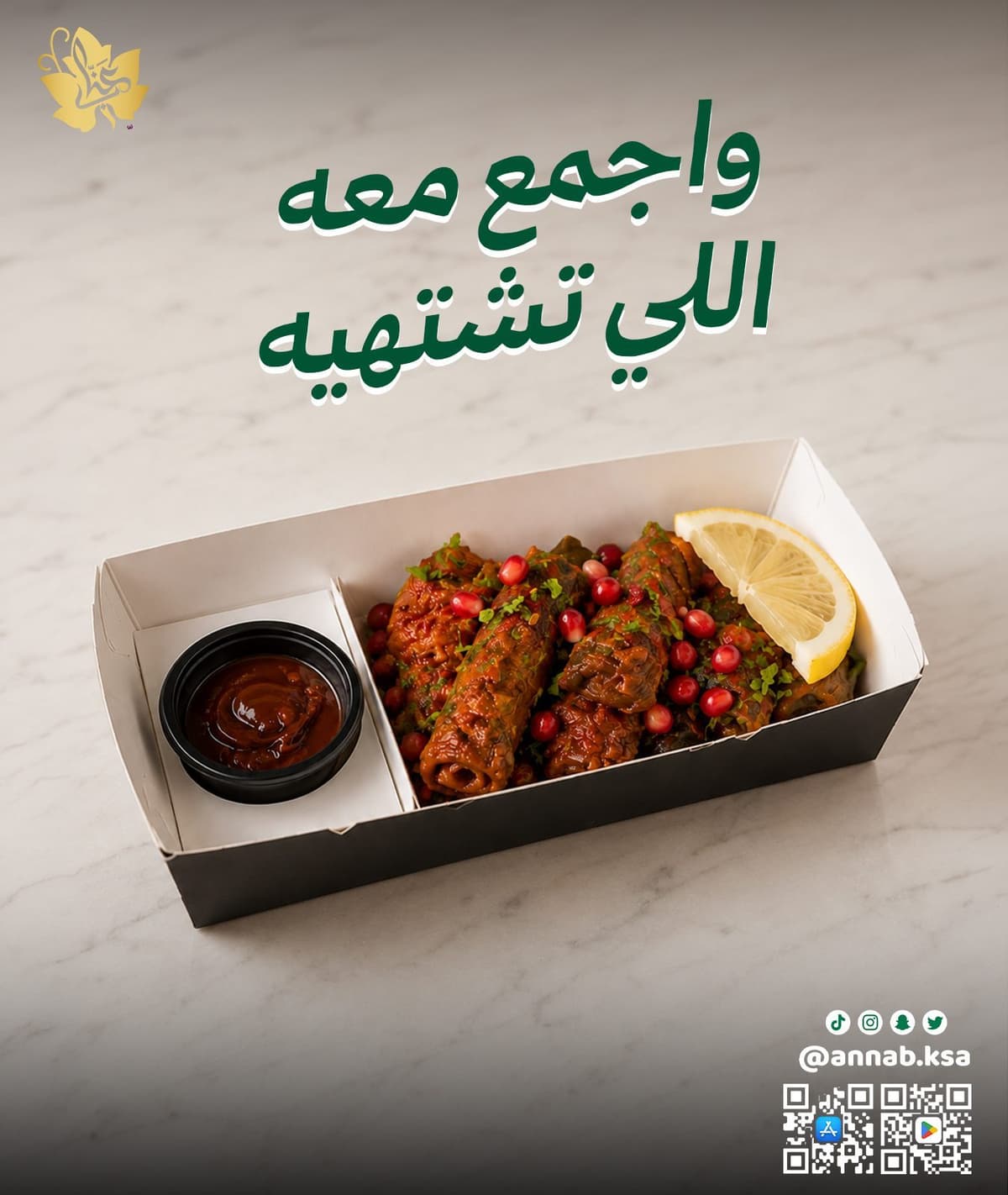
The images were used in large size with lighting showing:
The texture of grape leaves and stuffing.
Sauces and dressings.
Colors of lemon, pomegranate and parsley.
Quantity of product inside packages.
Quality packaging and presentation.
The images were supported by direct Arabic titles close to the audience, such as:
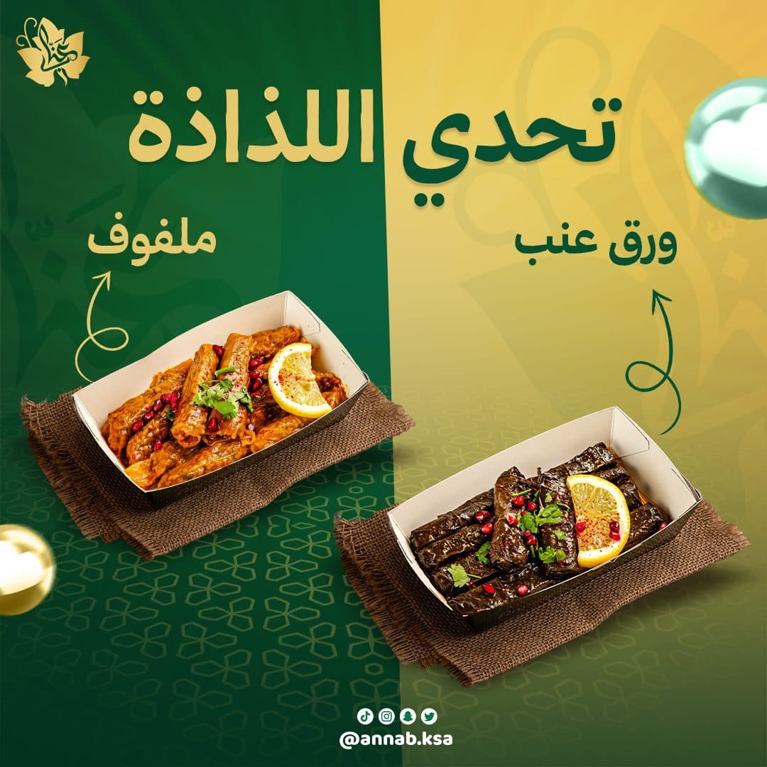
- Delicious challenge
- More stuffed zucchini than jujube
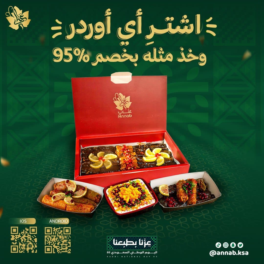
- Any small box
- They are available on delivery apps
The simple writing style helped create quick and natural communication with the audience.
Campaign Strategy
The basic colors present in Annab's identity were relied upon, and used in a way that enhances the sense of luxury and delicacy.
Primary Color
- Deep Emerald Green
Color expresses:
- Originality
- Quality
- Trust
- Connection with nature
- Luxurious oriental character
It was used in backgrounds, titles, packaging and basic elements.
Secondary Color
- Warm Golden Yellow
It was used to add:
- Warmth
- Energy
- Highlight offers
- Attract attention
- Supporting the luxury character of the brand
Supporting Colors
White and neutral tones were used to achieve:
Clarity of texts.
Balance of spaces.
Easy to read prices.
Separate the product from the background.
Highlighting the order elements and QR Codes.
Campaign Content Pillars
Appetizing Dish Showcases
Primary Campaign FocusFamily Gathering Boxes
Primary Campaign FocusSpecial Discount Campaigns
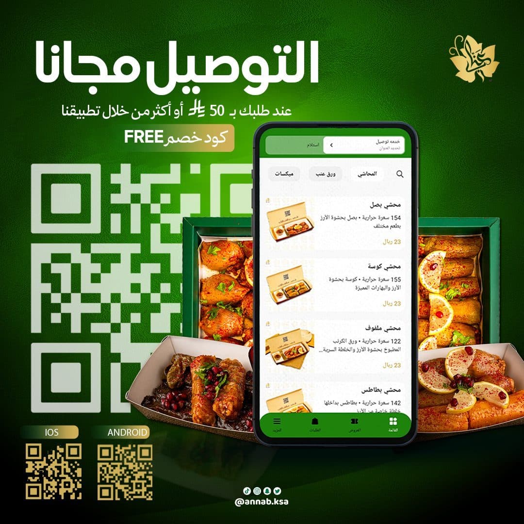
Primary Campaign FocusDelivery App Banners
Primary Campaign FocusTypography Strategy
An Arabic typographic style was chosen that is characterized by strength and clarity, while preserving the oriental character of the sign.
Arabic Typography
Bold Arabic font for main titles, used for:
Attract attention quickly.
Show promotional messages.
Supporting a fun and close-to-audience character.
Achieve strong clarity on phone screens.
- Supporting Typography
Simple lines were used in:
Prices.
Application names.
Contact information.
Offers details.
Subordinate phrases.
A clear hierarchy is built between title, product, supply and ordering method.
Color Psychology Strategy
Visual Direction
The campaign's visual system was built based on:
- Bold Arabic Headlines
- Large Food Photography
- Deep Green Backgrounds
- Golden Highlights
- Split-Screen Layouts
- Organic Hand-Drawn Arrows
- Subtle Brand Patterns
- Clear Offer Badges
- QR Codes & Ordering Elements
These elements helped create a style that was easily recognizable, even as the type of content varied from one post to another.
Bilingual Typography Sandbox
Content Pillars
The campaign content is divided into several main types:
- Product Awareness
Publications that focus on displaying products and their details, such as:
Grape leaves.
Cabbage.
Stuffed zucchini.
Boxes and various assortments.
- Promotional Offers
Designs offer:
Discounts.
New prices.
Economic Boxes.
Offers are limited time.
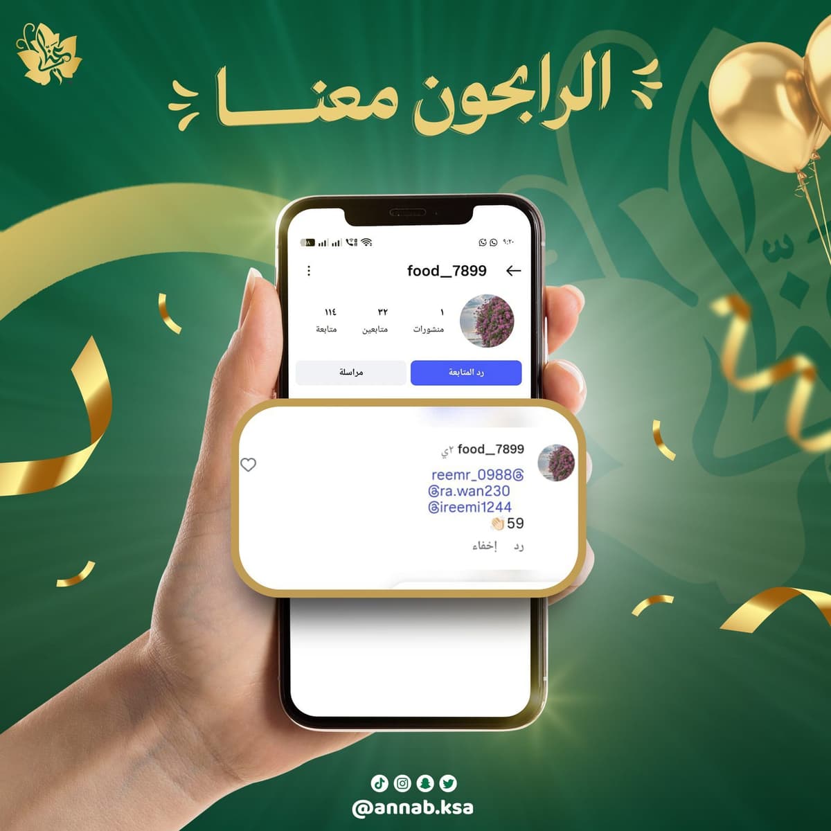
- Engagement Content
Content based on comparison, questions and interaction, such as:
Do you choose grape leaves or cabbage?
Delicious challenge.
Compare more than one product.
- Ordering & Availability
Publications explaining:
Delivery apps available.
Request means.
QR Codes.
Social media accounts.
Quick access to the application.
Photography & Art Direction
Food was photographed in a way that makes the product the hero of the scene.
- Photography Direction
- Close-Up Food Shots
- Warm Directional Lighting
- Rich Food Textures
- Dark Premium Backgrounds
- Natural Garnishing
- Visible Packaging
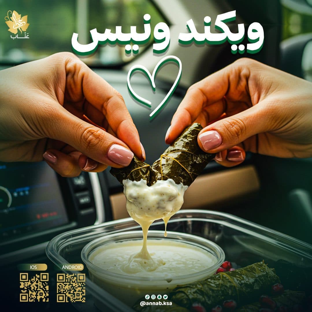
- Lifestyle Contexts
Items such as:
Lemon.
Pomegranate.
parsley.
Sauces.
Marble surfaces.
Warm restaurant lighting.
These details added a sense of freshness and quality, and made the images more realistic and delicious.
Food Styling & Garnishing Explorer
Lemon slice
Hover to explore styling logic
Pomegranate seeds
Hover to explore styling logic
Glistening syrup gloss
Hover to explore styling logic
Dark marble surface
Hover to explore styling logic
Layout Grid System
A flexible Layout System is designed to suit different content types.
- Split Layout
Use it in posts comparing two products, to help the audience make a decision and interact with the content.
- Product-Focused Layout
The product is placed in the middle or largest part of the design, with surrounding elements minimized to maintain visual focus.
- Offer Layout
Rely on:
Clear and great price.
The previous price has been crossed out.
Badge is distinctive for display.
Comfortable white space.
Direct CTA for the order.
- Lifestyle Layout
The product is integrated into real-life situations such as a car, to convey the idea of ease of ordering and enjoying a meal anywhere.
Post Composition Blueprint Grid
Hover over the wireframe components to explore layout structure rules.
Campaign Applications
The campaign has been developed to be applicable to:
- Instagram Posts
- Instagram Stories
- Snapchat Content
- TikTok Visuals
- Promotional Ads
- Delivery App Announcements
- Digital Menus
- Offer Campaigns
- Website Banners
- Printed Promotional Materials
While maintaining the same colours, photography style, treatment of titles and introductory elements at all communication points.
Design Process
Discovery & Research
Understand the nature of the brand, products, target audience and ordering methods.
- Visual Research
Analyzing the content of restaurants and food brands within the Saudi market, and studying the methods of displaying food and offers.
Content Planning
Determine the types of publications and divide them between:
- Product — Offer — Engagement — Awareness — Ordering
Creative Direction
Determine the photography style, colors, word processing, and how to highlight the product.
- Design Development
Create multiple scalable Layouts, while maintaining campaign unity.
- Final Adaptation
Preparing designs in appropriate sizes for communication platforms and digital advertisements.
Design & Production Phases
1. Brand Positioning & Market Audit
Comprehensive analysis of competitor messaging and target demographics.
Design Outcome
The end result was a campaign:
It has a clear and distinctive visual presence.
Products are presented in a delicious and professional manner.
Maintains the authenticity of the brand in a modern way.
Offers and information are provided directly.
Flexible to fit multiple types of content.
Enhances ease of access to ordering and delivery methods.
Create visual consistency between different posts.
The campaign was able to build a digital experience that makes the audience recognize Inab through the colors, photography style, and way of displaying the products before seeing the logo.
Final Statement
The goal was not only to create attractive food posts, but to build a complete social media visual system that presents ANNAB as an authentic, premium and accessible food brand.
Every element—from photography and typography to promotional layouts and ordering touchpoints—was designed to strengthen brand recognition, highlight the quality of the products and create a consistent, appetizing experience across all digital platforms.