
DR. MAHMOUD ELNAGAR
Building a Modern, Human-Centered Physical Therapy Brand
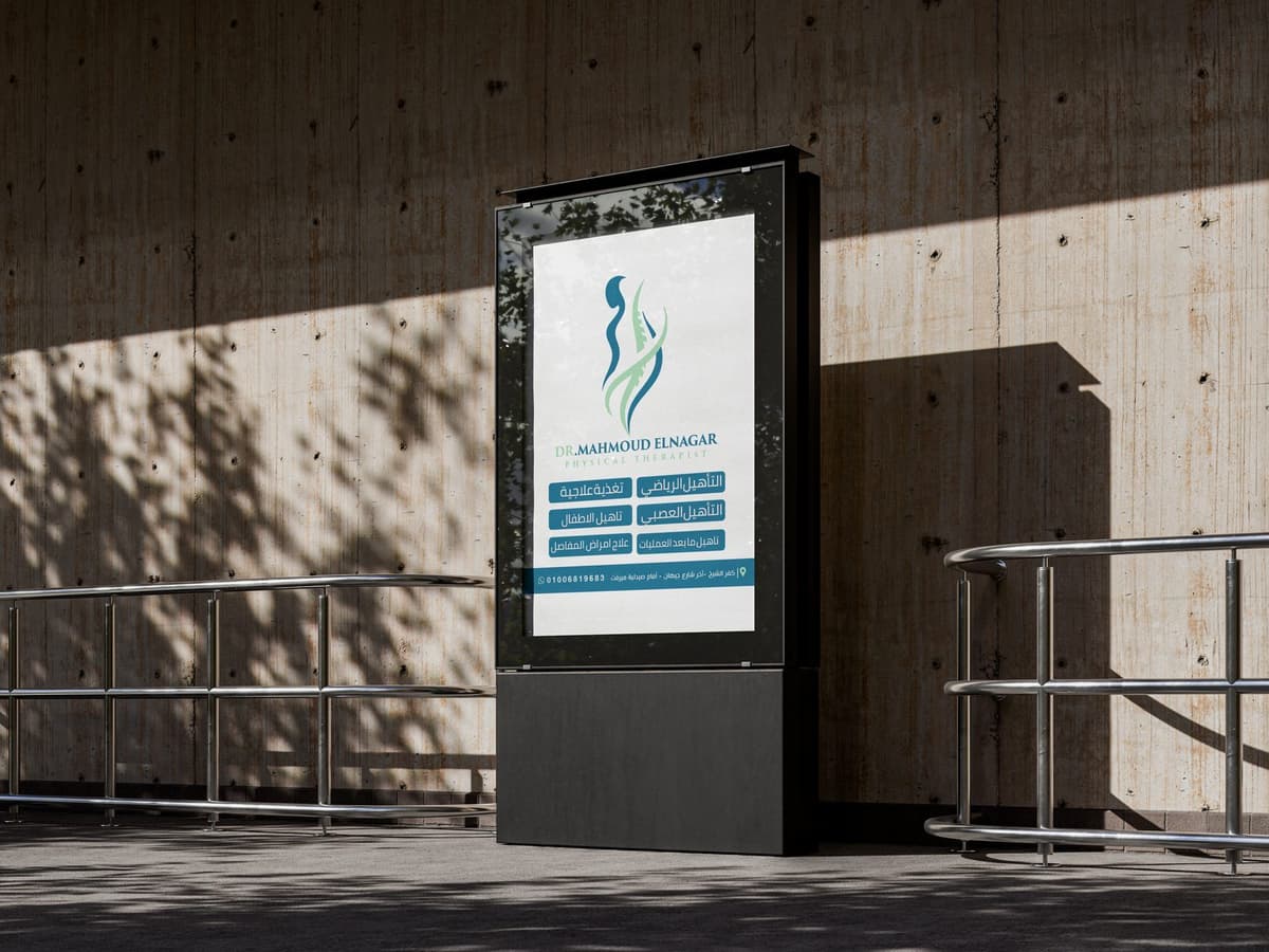
Clinical Signage
A warm medical brand identity for physical therapy and body wellness.
Identity Overview
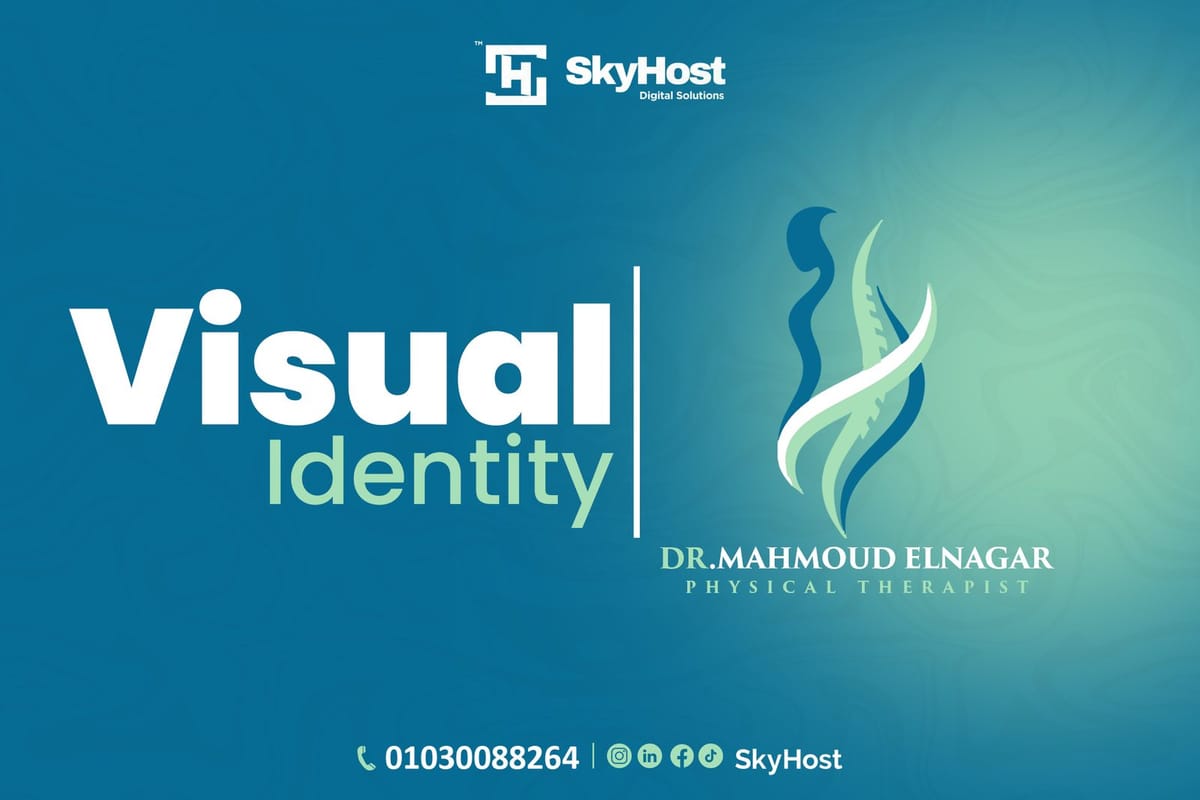
Dr. Mahmoud Elnagar is a personal physical therapy brand aiming to present a professional medical image reflecting clinical expertise and human-centered care. The objective was to build a comprehensive visual identity system reflecting movement, recovery, balance, trust, and care.
Design Challenge
The primary challenge was to design a healthcare identity that looks highly professional and medical without feeling cold or rigid, balances clinical accuracy with human warmth, adapts seamlessly to physical clinic walls, and stands out among competitors.
Brand Strategy & Keywords
Minimal Organic Spine Concept
The identity merges the spine pathway and human silhouettes within an organic curves system.
Human Silhouette
Abstract curved curves forming the chest and shoulder alignment of a patient.
Spinal Column
A central segmented path linking the body segments, representing specialized therapy.
Fluid Balance
Loop pathways denoting the transition from clinical physical pain to absolute recovery.
Human Silhouette
Abstract curved curves forming the chest and shoulder alignment of a patient.
Teal & Mint Color Strategy
A clinical scheme pairing calming medical teal and soothing recovery mint.
Primary: Medical Teal
Deep teal tone delivering immediate clinical trust, security and clarity.
Secondary: Recovery Mint
Soothing clinical mint highlighting physical rehabilitation, positive energy and recovery.
Neutral: Soft Clinical Gray
Comfortable clinical gray establishing cleanliness, wide space and reading balance.
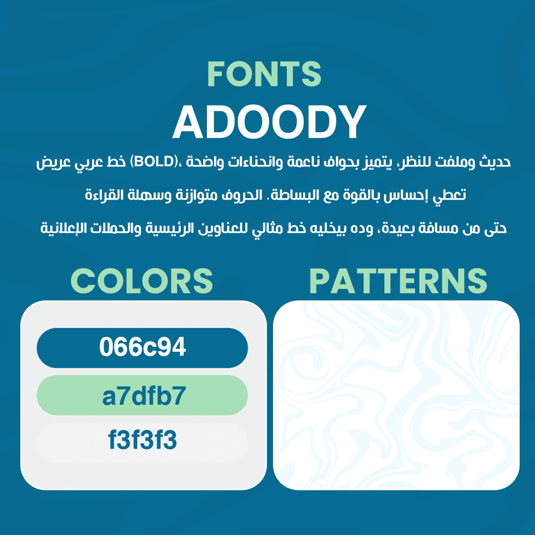
Clinical Typography
ADOODY Bold
يستخدم للعناوين البارزة والإعلانات والروشتات بفضل حوافه الناعمة.
Cairo Regular
أ ب ت ث ج ح خ د ذ ر ز س ش ص ض ط ظ ع غ ف ق ك ل م ن هـ و ي
Elegant Serif
Doctor's Name (Trust & expertise)
Clean Sans Serif
Aa Bb Cc Dd Ee Ff Gg Hh Ii Jj Kk Ll Mm Nn Oo Pp Qq Rr Ss Tt Uu Vv Ww Xx Yy Zz
Visual Language
An organic digital system built around curved lines representing body kinetics.
Clinical Brand Pattern
A linear layout pattern representing spine paths and human kinetics, used for:
Art Direction of Photography
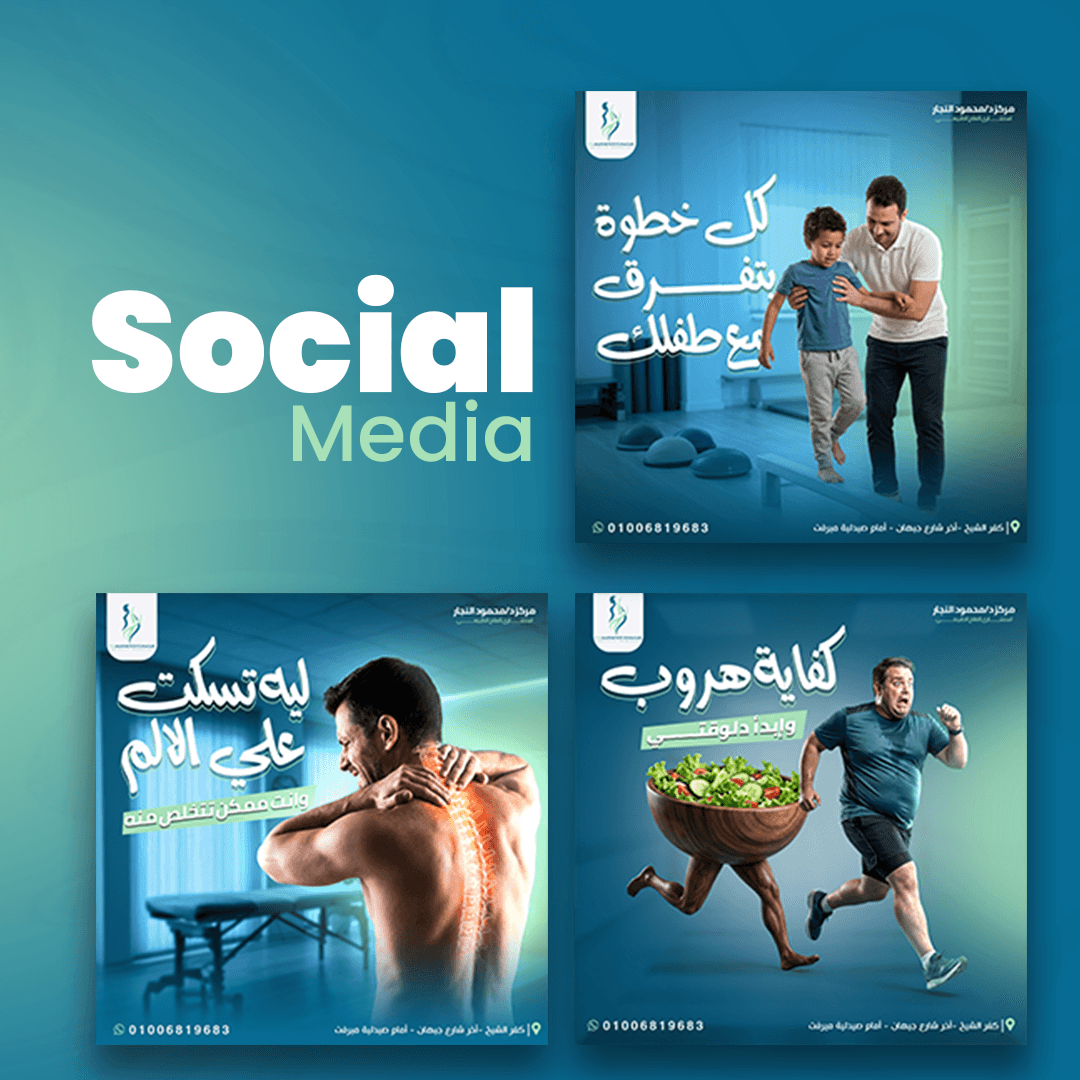
Focusing on human warmth, dynamic kinetic movements, and positive rehabilitation moments:
Branded Medical Placements
A unified system scaled across clinical items, administrative folders, and physical uniform tags.
Clinical Design Process
Discovery
Grasping physical therapy targets, patient niches, and brand core guidelines.
Research
Analyzing physiotherapy clinic brands to avoid cold, scary medical designs.
Concept
Weaving spine segments with human silhouette lines in organic curves.
Logo Development
Simplifying curves to guarantee readability on clinic labels and files.
Visual Identity
Formulating clinical gray patterns, Medical Teal palette, and font setups.
Guidelines
Setting strict rules for typography, uniform codes, and signage placement.
Identity Assets & Mockups
Browse official clinic posters, appointment cards, files, and branded office mockup layouts.
3Artboard 1
Visual guidelines presentation depicting layout grid configurations and margins.
3Artboard 2
Typography guidelines illustrating hierarchies for clinical files and headlines.
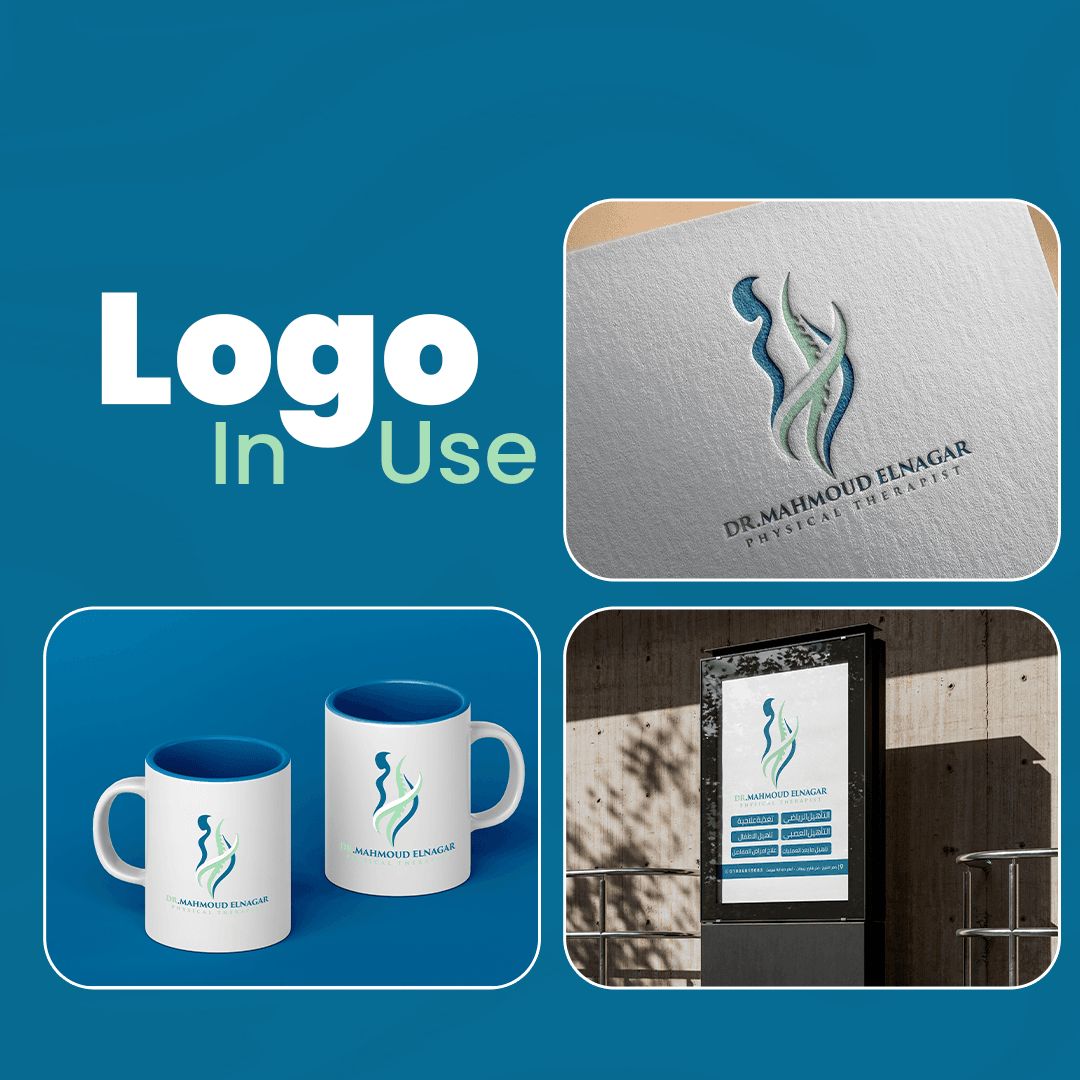
3Artboard 3
Corporate colors parameters, contrast grids and color proportions check sheets.
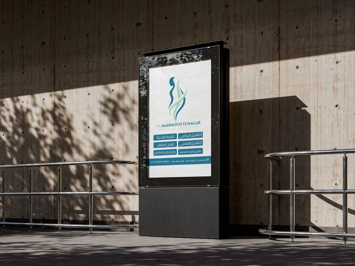
Free Citylight Mockup 2
Outdoor clinical light box poster mockup demonstrating identity consistency.
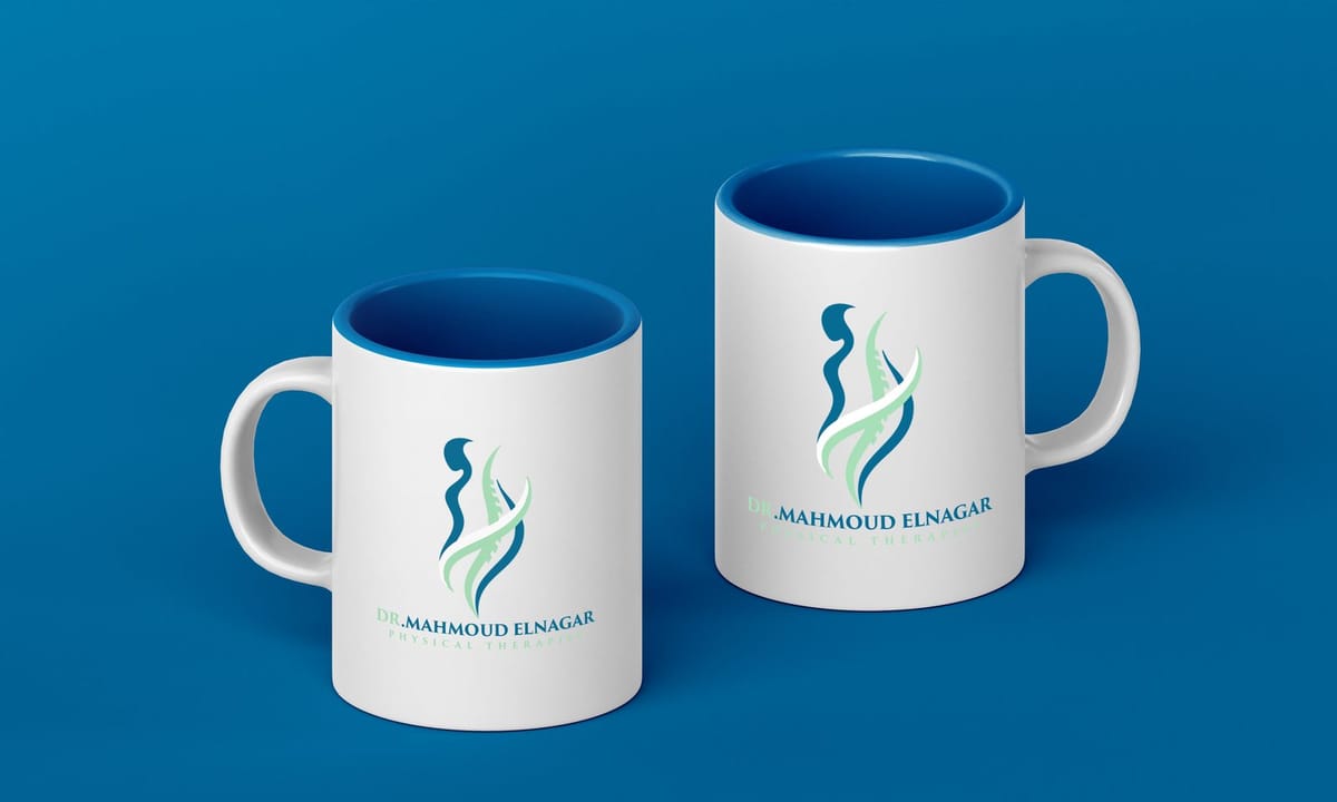
Branded Mug Showcase
Clinic mugs and administrative tools displaying logo placements.
Clinical File & Envelopes Layout
Official documents folders, envelopes and correspondence sheets.
Business Card & Letterhead
Medical appointments card and executive business card layouts.
Empathy & Precision in Physiotherapy
The final system presents Dr. Mahmoud Elnagar as a modern and professional physical therapy brand while delivering a calm, human-centered and consistent experience across every patient touchpoint.