

DR. AHMED SAMIR
Building a Professional Healthcare Brand
Healthcare Vision
A modern minimal healthcare system combining movement and diet.
Identity Overview
Dr. Ahmed Samir is a specialist in physical therapy and nutrition, dedicated to improving quality of life through healthy movement and nutrition. The objective was to design a professional medical brand that communicates healthcare excellence, movement & recovery, and expert trust.
Visual Challenge
The primary challenge was to combine physical therapy (spinal movement) and nutrition (health/wellness) into a single, cohesive medical mark that avoids traditional clinical clichés, maintains high readability, and adapts seamlessly across digital clinic portals and physical uniforms.
Brand Personality
Designed to represent the connection between clinical therapy, general wellness, and patient lifestyle.
Integrated Logo Concept
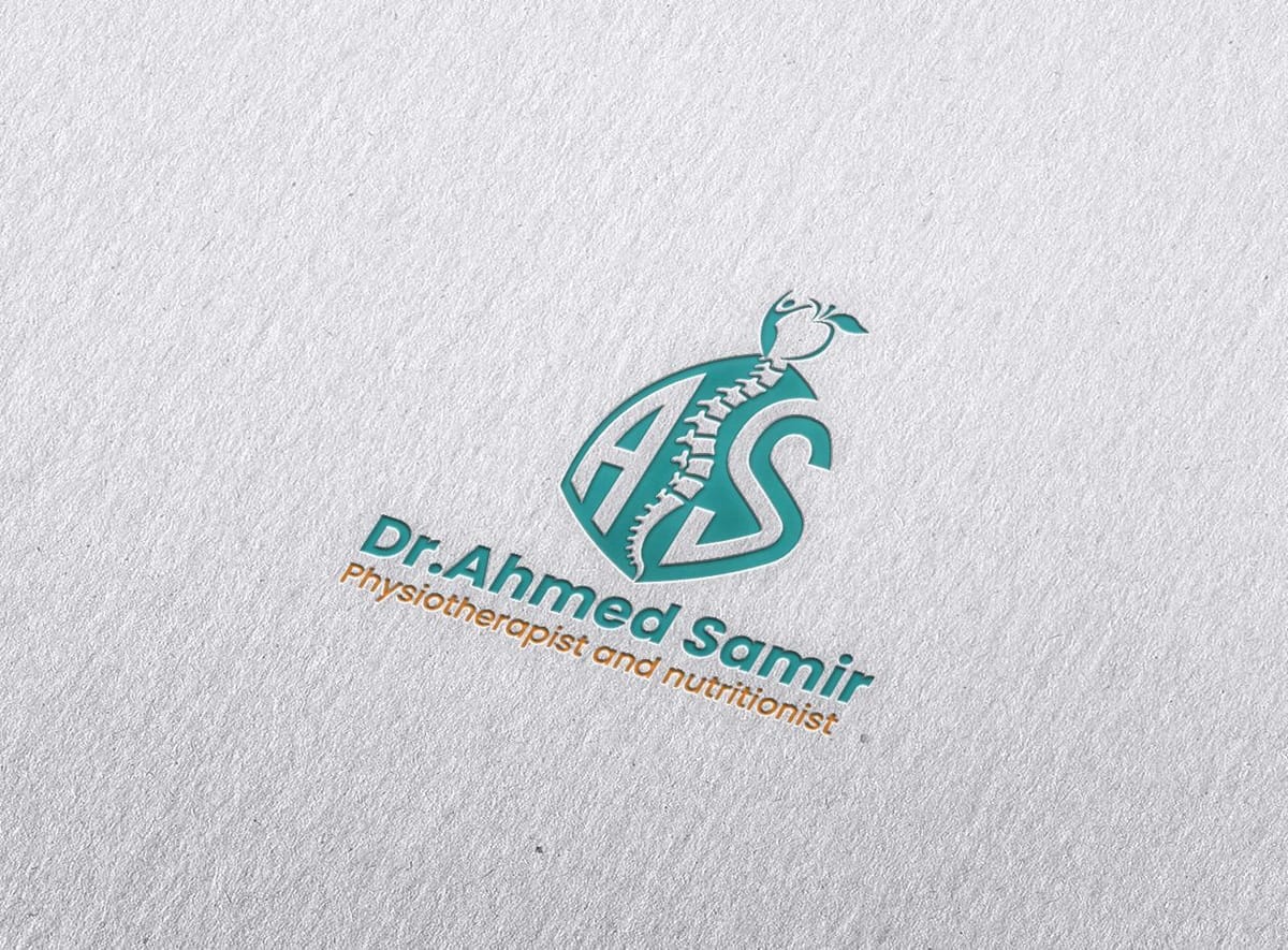
The symbol weaves the spinal column, initials A+S, and nutrition geometry together.
Initials A+S
Forming the doctor's personal identity initials dynamically inside the curves.
Spinal Column
Represents physical therapy, healthy spinal alignment, and recovery movements.
Apple Silhouette
Symbolizes healthy diet, nutrition sciences, and long-term wellness.
Initials A+S
Forming the doctor's personal identity initials dynamically inside the curves.
Medical Color Palette
A clinical teal palette integrated with high-vitality warm orange accents.
Primary: Medical Teal
Teal tone symbolizing scientific integrity, clinical precision, calm healing, and healthcare safety.
Secondary: Warm Orange
Warm orange tone injecting energy, motivating exercise movement, and encouraging healthy recovery.
Digital Typography
Bold Sans
Clean headings & clinical signs
Modern Sans
Aa Bb Cc Dd Ee Ff Gg Hh Ii Jj Kk Ll Mm Nn Oo Pp Qq Rr Ss Tt Uu Vv Ww Xx Yy Zz
Cairo (القاهرة)
للعناوين والمحتوى الإعلاني للعيادة
DIN Next LT Arabic
أ ب ت ث ج ح خ د ذ ر ز س ش ص ض ط ظ ع غ ف ق ك ل م ن هـ و ي
Visual Language
A medical system based on clean layouts, white spaces, and balanced health colors.
Graphic System
A custom set of graphic elements extracted directly from the curves of the A+S spine mark:
Photography Art Direction
Art direction designed to showcase active patient recovery, healthy diets, and clean clinical spaces in:
Clinic Placements
Designed to adapt seamlessly across physical and digital clinical touchpoints.
Design Process Stages
Discovery
Understanding the doctor's specific clinic services and core value proposals.
Research
Analyzing competitor clinic profiles and modern healthcare design patterns.
Concept
Drafting layouts combining spine vertebra, initials A+S, and nutrition symbols.
Logo Design
Developing the vector mark, matching medical teal and orange color coordinates.
Guidelines
Building parameters for prescription sheets, medical folders, and uniforms.
Clinical Assets & Mockups
Browse official guidelines layouts, medical folders, and clinic uniform print placements.
Ahmed Samir Card Back
Official business card mockup displaying the Teal and Orange healthcare color scheme.
Ahmed Samir Logo
The primary integrated logo combining initials A+S, spine segment, and health symbol.
Ahmed Samir Logo Specimen
Logo configuration demonstrating spacing guidelines and margin alignments.
Clinic Staff Uniform Branding
Mockup of Dr. Ahmed Samir clinic staff uniforms showing logo placement.
Medical Report & Prescription Pad
Official clinical folder, patient medical records, and prescription pad design.
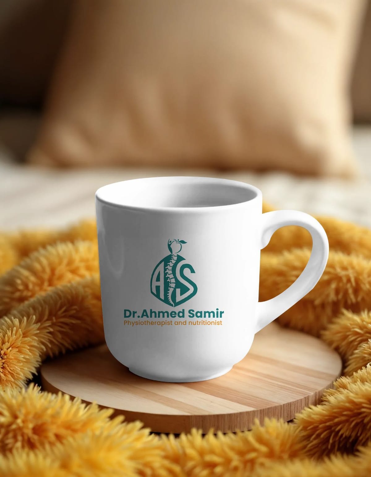
Branded Clinic Accessories
Official office mug mockup displaying corporate medical branding elements.
Unified Clinical Healthcare Experience
The goal was not only to design a logo, but to create a memorable visual identity that reflects Dr. Ahmed Samir’s expertise in physiotherapy and nutrition, communicates trust and professionalism, and delivers a consistent healthcare brand experience across every patient touchpoint.