

Project Overview
AGWAN Sports Club is a sports club that offers a variety of sports activities and academies, in addition to organizing the AGWAN Champions League, which combines competition, enthusiasm and sports community spirit.
The goal was to design an integrated Social Media Campaign that expressed:
- Sports Energy
- Competitive spirit
- Youth Development
- Community Engagement
- Professional Tournament Coverage
- Inclusive Sports Experience
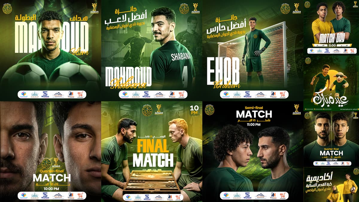
The campaign was developed to present club activities, announce matches, display results, honor players and promote sports academies through strong, impactful visual language.
The Challenge
The main challenge was to build a visual system that could handle a large number of content types, such as:
Match announcements.
Tour results.
Best Player and Best Goalkeeper awards.
Announcing tournaments and finals.
Promoting sports academies.
Motivational content and events.
View sponsors and partners.
It was also necessary that the designs be:
Strong, full of movement and enthusiasm.
Easy to read in seconds.
Visually diverse without losing the unity of the campaign.
Suitable for adult players, children and sports audiences.
Able to accommodate logos, information and sponsors without crowding.
Valid for organic content and sponsored ads.
The challenge was also to maintain the presence of the club's identity, while presenting the AGWAN Champions League as an independent sporting event with a strong, professional character.
Campaign Strategy
Campaign Personality
- Bold
- Energy
- Competitive
- Youthful
- Professional
- Motivational
- Community-Driven
The campaign was built on presenting the club as a space that helps players train, compete, develop and reach the championship moment.
Communication Tone
Enthusiastic and direct.
Close to the language of the sports audience.
It relies on short, powerful phrases.
Encourages participation and interaction.
Celebrates players and achievements.
It gives tournaments a sense of strength and professionalism.
This tone appeared in letters such as:
Break: There are no matches today.
Ready to Be a Champion.
Kung fu.
Fitness.
Best Player Award.
Best goalkeeper award.
Women's Football Academy.
The Big Idea
The main idea of the campaign is based on the concept:
- From Training to Championship
The player's journey begins with training within the academy, then participating in competitions and achieving results, all the way to coronation and recognition.
This journey is expressed through an interconnected series of content including:
- Join the Academy
- Train & Improve
- Compete in Matches
- Achieve Results
- Earn Recognition
- Become a Champion
In this way, the campaign was not just a collection of match advertisements, but rather became an integrated sports story that illustrates the player’s journey within the Ajwan sports community.
Content Direction
The campaign covered a variety of sports activities and content, including:
- Tournament Content
- Match Announcements
- Quarter-Final Matches
- Final Match Promotion
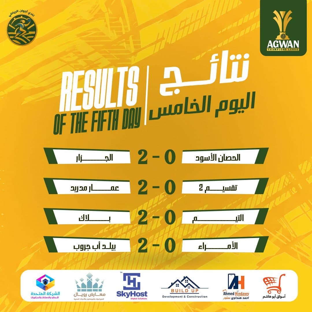
- Daily Results
- Tournament Brackets
- Championship Updates
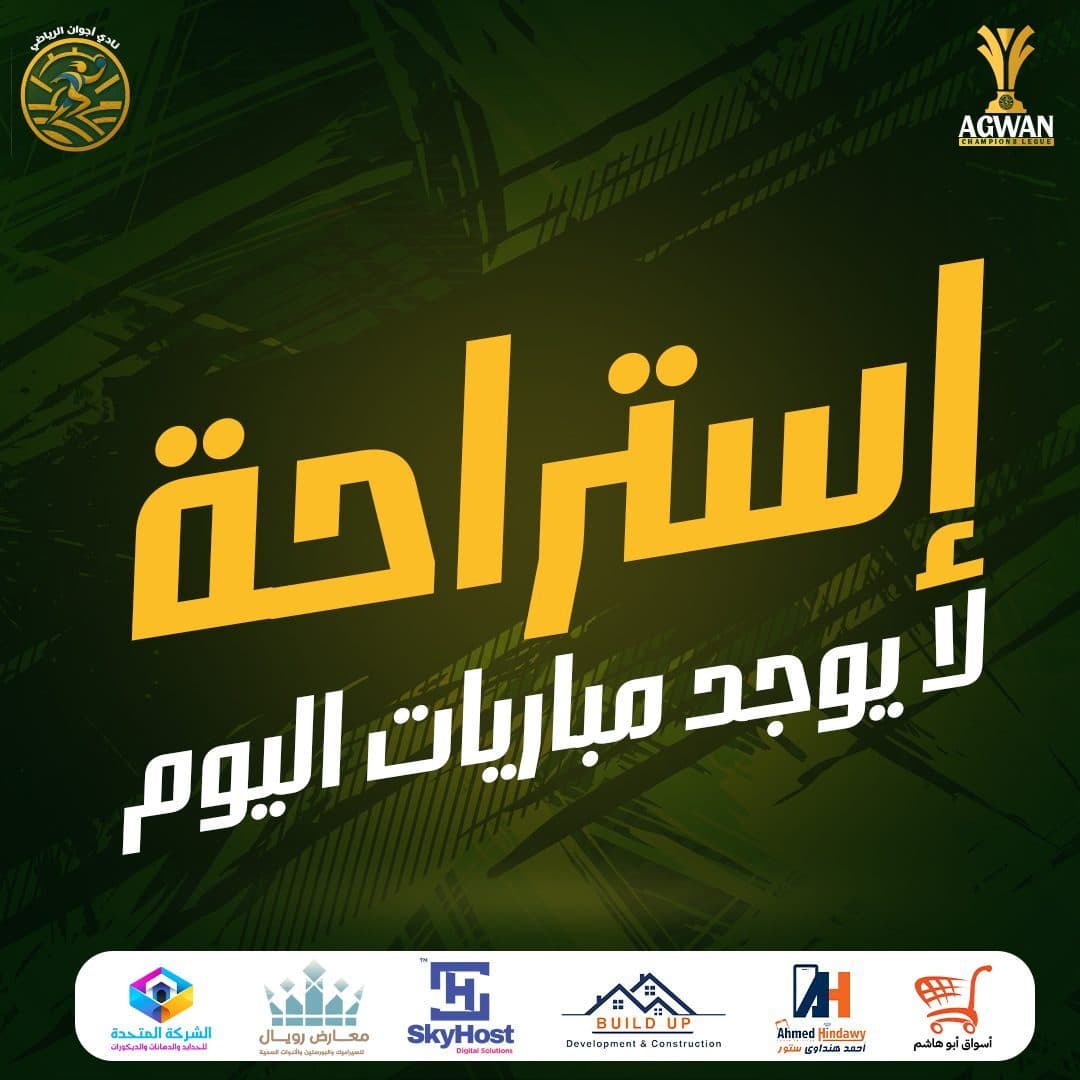
- Rest-Day Announcements
- Player Recognition
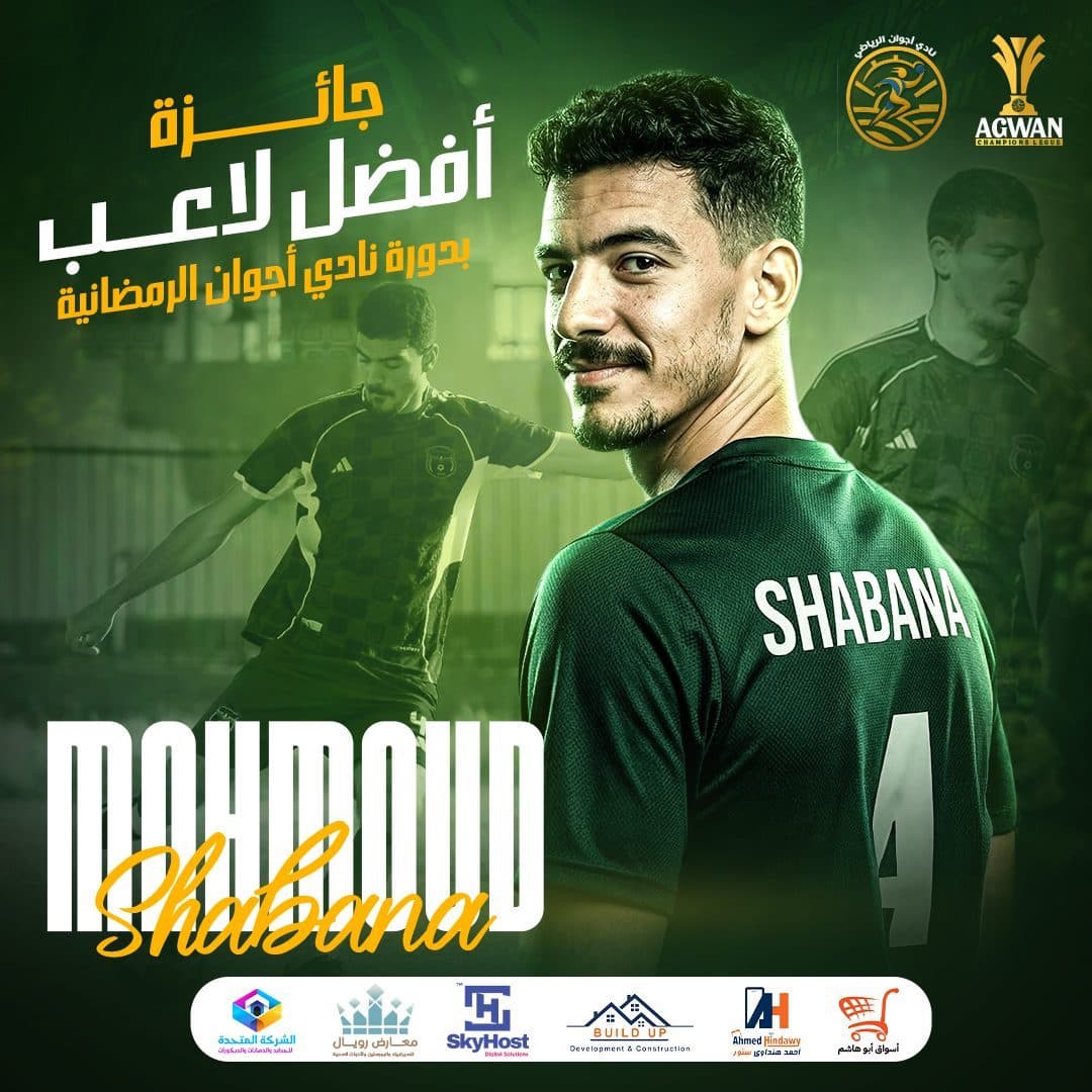
- Best Player Award
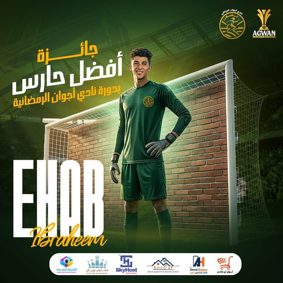
- Best Goalkeeper Award
- Player Spotlights
- Performance Celebrations
- Academy Promotion
- Football Academy
- Women’s Football Academy
- Kung Fu Training
- Fitness Programs
- Individual Sports
- Kids’ Sports Activities
- Community Content
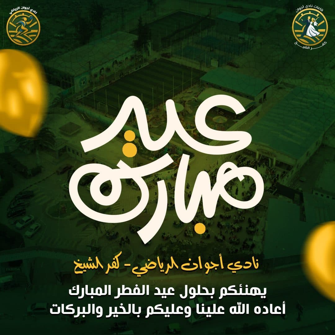
- Seasonal Greetings
- Motivational Posts
- Club Announcements
- Registration campaigns
- Sponsor Visibility
Each type of content was approached through a Visual Concept that suited its message, while maintaining the unified color and visual scheme of the campaign.
Visual Direction
The visual direction of the campaign was built based on:
- Bold Sports Typography
- Cinematic Player Portraits
- Dynamic Photo Manipulation
- High-Contrast Lighting
- Stadium & Training Environments
- Strong Color Grading
- Large Hero Headlines
- Energetic Compositions
- Consistent Sponsor Footer
The player has been used as the central element within most designs, as it represents energy, competition and achievement.
Angles and designs that mimic international sports posters were also relied upon, such as:
Direct confrontations between players.
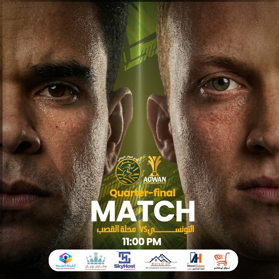
Close-up photos of faces before matches.
Strong backlight.
Action shots of children during training.
Integrating the player with the field or locker room environment.
Use sports elements as part of the composition.
This contributed to giving the campaign a cinematic feel that makes each post appear as part of a professional tournament.
Campaign Strategy
The color palette was built based on the identity of the Ajwan Club and the championship logo.
Primary Color
- Deep Sports Green
Dark green was used to express:
Strength.
stability.
Club affiliation.
Sports character.
Confidence and discipline.
Color appeared in backgrounds, player clothing, key shadows and tones, helping to build a unified, easily recognizable visual presence.
Secondary Color
- Championship Yellow
Yellow and gold were used to express:
Energy.
Victory.
Excellence.
Enthusiasm.
Championship and coronation.
Color appeared in titles, lighting, numbers, match details and directional elements.
Supporting Colors
White was used to achieve the highest level of legibility, especially in headlines and match information.
Black, olive, and light green shades were also used to add depth, improve contrast, and link the images to the backgrounds.
The combination of green and yellow helped provide a sporting identity:
- Powerful
- Recognizable
- Energy
- Championship-Oriented
Typography Strategy
The campaign relied on a strong, direct typography style that suits fast-paced sports content.
- Arabic Headlines
Geometric and bold Arabic lines were used to achieve:
- Strong Impact
- Fast Readability
- Bold Sports Personality
- Clear Visual Hierarchy
Arabic titles appear in large sizes, with the use of tilt, horizontal span and shadows to add a sense of movement.
White and yellow colors were used within one title to identify key words and direct the viewer's eye.
- English Headlines
Long, condensed English lines have been used in phrases such as:
- RESULTS
- READY
- MATCH
- FINAL
- TO BE A CHAMPION
This style helped give the campaign a character similar to the designs of international sports tournaments and posters.
- Supporting Text
Lighter weights and smaller sizes have been used in:
Team names.
Match dates.
Results.
Contact numbers.
Addresses and locations.
Registration details.
Photography & Art Direction
The campaign relied on Photo Manipulation and image merging to produce powerful and realistic sports scenes.
The visual style included:
Isolate players carefully.
Integrating characters with stadiums and training environments.
Unifying lighting and skin tones.
Add backlighting and edge lighting.
Apply green and yellow color treatment.
Add fog and shadows to increase depth.
Merging more than one snapshot of the player within one design.
Using close-up images to heighten the sense of confrontation and challenge.
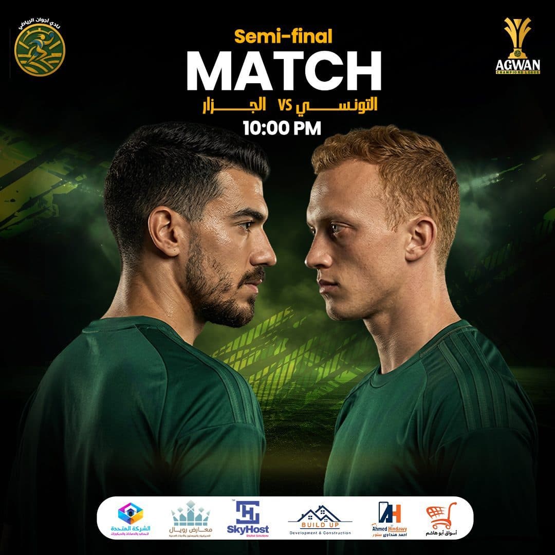
The match designs relied on Face-Off Composition, where the two players appear in a direct confrontation to highlight the tension and excitement before the start of the match.
In the award designs, the player was placed as the main hero, with secondary images of him being used during play to support the visual story and show his performance within the tournament.
As for the designs for children and academies, they relied on shots full of movement and energy, to present sports as an enjoyable experience that helps the child build strength, confidence and discipline.
Matchday VS Face-Off Layout Builder
Arranging opponent portraits in dramatic side-by-side vertical crops under stadium floodlights, with a dedicated Sponsor strip aligned along the bottom edge.
Layout Grid System
A fixed system has been developed that helps standardize campaign publications, with the possibility of changing it depending on the nature of the content.
- Logo Placement
The AGWAN FC logo is installed at the top of the design, with the AGWAN Champions League logo added in the tournament flyers.
The two logos are distributed in a clear way that maintains their presence without affecting the main element.
- Main Headline
The title occupied a large space within the design, being the first element that caught the viewer's attention.
Repositioned between top, middle and sides depending on player movement and composition.
Hero Visual
A player, child, faceoff or sports element was used as the primary focus point within the design.
- Match Information
In match announcements, the following was highlighted:
Stage name.
Names of the two teams.
Match date.
the hour.
Type of competition.
- Results Section
The results are organized into clear units that help the audience quickly read the team names and results.
Contact Footer
In the academy's flyers, contact numbers and the club's address are pinned at the bottom.
- Sponsor Footer
A separate white space has been allocated for sponsors’ logos, to ensure that they are clear and do not interfere with the sports background.
Check this system:
- Brand Consistency
- Fast Content Recognition
- Clear Information Hierarchy
- Sponsor Visibility
- Easy campaign expansion
Creative Concept
A different theme was developed for each category of posts to suit the nature of the message.
- Match Announcements
Use a close encounter between two players with serious expressions and dramatic lighting, to create a sense of challenge before the match.
- Final Match
A competitive scene inside the training room, with players pitted against each other around the playing table, was used to show the importance of the final match and turn it into an anticipated event.
- Daily Results
The results are designed using an organized system based on white blocks, large numbers and strong contrast, so the audience can quickly see the results.
- Tournament Bracket
The championship cup was placed in the center of the formation, with the qualified teams distributed around it to show the journey of the competition and reaching the final.
- Rest-Day Announcement
A large Arabic title was used, occupying most of the design space, to quickly convey the information while preserving the campaign’s character.
- Best Player Award
The player was placed in the foreground of the design, with pictures of him during the match used in the background, and his name added in large English letters to create a celebratory poster befitting the achievement.
- Best Goalkeeper Award
The goal was used as a main part of the composition, with the goalkeeper placed in front of him in a confident position, directly illustrating his role and sporting position.
- Women’s Football Academy
The female players were presented in a strong and confident way, far from stereotypes, to express professionalism, empowerment and provide girls with the opportunity to participate in football.
- Kids’ Individual Sports
The children are used in strong movement poses while practicing kung fu and physical exercises, with enthusiastic expressions to attract children and parents.
Seasonal Content
Event flyers are designed in a simple style based on large typography, while maintaining the colors and backgrounds of the sports identity.
Campaign Applications
The optical system is designed to be usable and expandable across:
- Facebook Posts
- Instagram Posts
- Sponsored Ads
- Instagram Stories
- Match-Day Announcements
- Tournament Coverage
- Player Spotlights
- Results Graphics
- Academy Registration Ads
- Sports Activity Promotions
Seasonal Content
- Club Screens
- Printed Posters
- Tournament Banners
- Sponsor Presentations
The system also allows the production of new posts for teams, players, activities and different stages without losing the unity of the campaign.
Design Process
Discovery & Research
Understand club activities, age groups, nature of the tournament and types of content required.
Research & Market Audit
Analyzing the designs of sports clubs and tournaments, and studying the methods used to present matches, results, and players.
- Content Classification
Divide the content into:
- Tournament
- Academies
- Awards
- Results
- Announcements
- Community Content
- Visual Concept Development
Develop a different visual theme for each type of post, while maintaining a unified mathematical character.
- Image Selection
Choose images that feature movement, strong expression, and the ability to clearly represent the sporting activity.
- Photo Manipulation
Implementing isolation, merging, lighting unification, adding shadows and color processing.
- Typography System
Choose strong fonts and determine the sizes and weights of headings and secondary information.
- Layout System
Locate logos, match information, contact information and sponsor space.
- Color Grading
Unifying images using shades of green and yellow to produce a cohesive visual presence.
- Final Adaptation
Preparing designs in appropriate sizes for communication platforms and digital advertisements.
Design Outcome
The end result was a Social Media Campaign:
Uniform and easy to recognize.
Reflects energy and athletic enthusiasm.
Tournaments are presented professionally.
Celebrates players and achievements.
Shows results and information quickly.
Supports the promotion of various academies and activities.
It addresses children, youth, women and parents.
Maintains club and tournament attendance in all publications.
Provides a clear space for sponsors and partners.
Flexible and scalable with upcoming leagues and seasons.
Suitable for organic content and sponsored ads.
Final Statement
The goal was not only to announce matches or promote sports activities, but to create a complete social media system that captures the energy of competition, celebrates player achievements and presents AGWAN Sports Club as a professional and inspiring sports community.
The campaign combines bold sports typography, cinematic visual storytelling, dynamic photo manipulation and consistent brand communication to strengthen AGWAN’s digital presence, increase audience engagement and encourage more players to begin their journey from training to championship.