

Project Overview
Khaled Abo Elezz Jewelery is a brand specialized in providing gold jewelry, studded pieces, sets and gifts, in addition to silver products intended for savings and investment.
The goal was to design a Social Media Campaign that presents the products in a luxurious and clear way, and builds a visual presence that reflects:
- Luxury & Elegance
- Product Quality
- Trust & Authenticity
- Timeless Beauty
- Emotional Value
- Modern Visual Communication
The campaign was developed to showcase the details of each piece, presenting the jewelery as more than just a product; It is a gift, a memory, an expression of taste and an investment that retains its value.
The Challenge
The primary challenge was to present a variety of products within a unified visual system, while maintaining the individuality of each piece and design.
It was necessary that the designs be:
Luxury without the use of exaggerated visual elements.
Simple while maintaining a sense of value.
Able to show details of gold and stones clearly.
Suitable for everyday products, gifts and occasions.
Consistent despite the different methods of photographing the products.
Attractive while quickly browsing on social media platforms.
Flexible to accommodate seasonal campaigns and new offers.
It was also important to achieve a balance between Product Photography and Typography, so that the piece was the main element without the marketing message losing its strength.
Campaign Strategy
Campaign Personality
- Luxurious
- Elegant
- Refined
- Warm
- Modern
- Trustworthy
- Timeless
The campaign was built on a calm visual identity that reflects the luxury of jewelry through details, clean spaces and neutral colors.
Luxury did not depend on the abundance of elements, but rather on the quality of composition, the choice of images, the clarity of the product, and the precise treatment of lighting and materials.
Communication Tone
The language of communication is based on:
Simple and straightforward.
Emotional without exaggeration.
Close to the public.
Classy and easy to remember.
Related to personal occasions and moments.
Focusing on the beauty and value of the piece.
Short phrases such as:
Light and simple, it complements any look.
Simplicity is the secret of beauty.
An elegance that is guided and immortal.
Cut with a calm touch.
Don't delay the gift of a lifetime.
This language helped connect the product to the needs and feelings of the audience, rather than simply displaying the visual specifications of the piece.
The Big Idea
The main idea of the campaign is based on the concept:
Every Piece, A Timeless Moment
Every piece of jewelry can be part of an important moment; An everyday look, a special occasion, a sentimental gift or a memory that will last for years.
Products are presented through messages that reflect a set of values:
Simplicity that completes the look.
Luxury that lasts over time.
A gift that carries meaning.
A different piece that reflects the personality of its owner.
The value that combines beauty and investment.
In this way, jewelry became linked to the moment and memory, and not just to its shape or price.
Content Direction
The campaign covered a variety of products and topics, including:
- Gold Bracelets
- Gold Bangles
- Rings
- Necklaces
- Jewelery Sets
- Gemstone Pieces
- Gift Collections
- Silver Investment Bars
- Seasonal Collections
Each category was approached through a Visual Concept that suited the nature of the product, while maintaining the overall visual system of the campaign.
The plan also combined:
- Product Spotlight Content
- Collection Promotion
- Lifestyle Content
- Seasonal Campaigns
- Occasion-Based Posts
- Gifting Content
- Investment Awareness
- Brand Awareness Posts
This diversity allowed the brand to display its products in a continuous manner without the content becoming repetitive or dependent on one template.
Campaign Content Pillars
Crafted Luxury Showcase
Primary Focus AxisLifetime Gift Campaigns
Primary Focus AxisGold Price & Investment Ads
Primary Focus AxisSeasonal Offer Cards
Primary Focus AxisVisual Direction
The campaign's visual system was built based on:
- Clean Luxury Composition
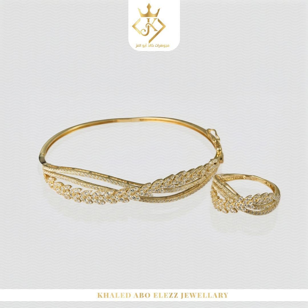
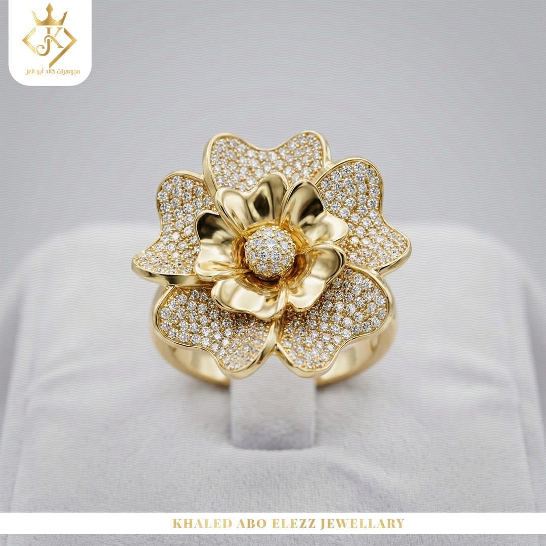
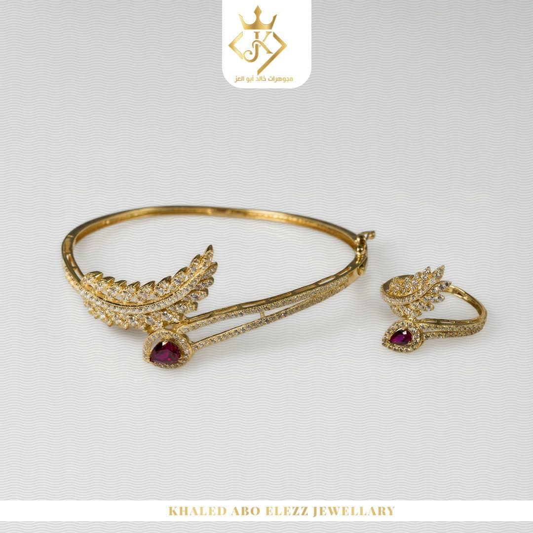
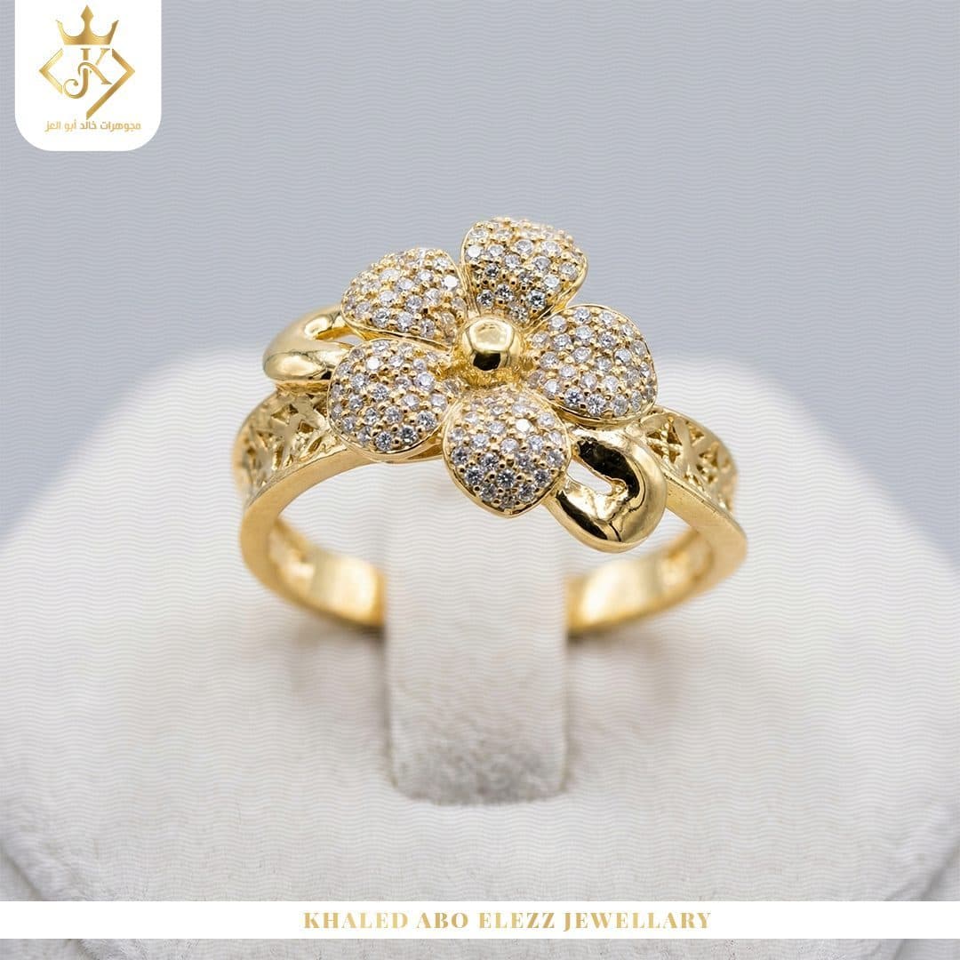
- Hero Product Photography
- White Fabric Textures
- Metallic Gold Typography
- Editorial Text Layouts
- Soft Shadows
- High Product Clarity
- Balanced Negative Space
- Consistent Brand Placement
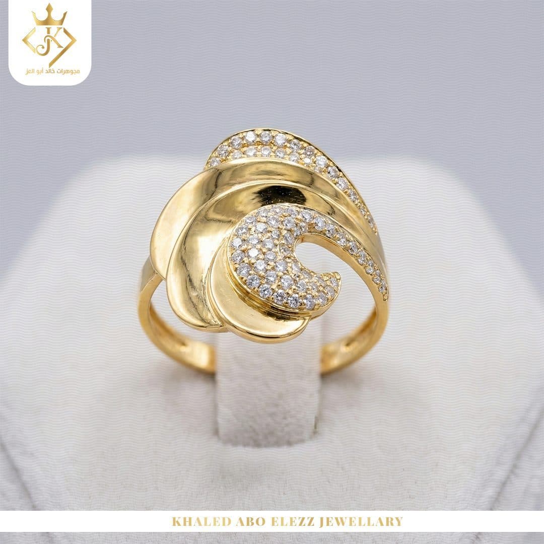
White backgrounds and wavy textures inspired by soft fabrics were used to create a sophisticated visual environment that matches the nature of the jewelry.
These backgrounds helped:
Reflect light around gold pieces.
Highlighting fine details.
Giving the content a sense of purity and luxury.
Provide a stable background that can be used with different products.
Strengthening the golden presence of the brand.
In some designs, dark backgrounds and black stands were used, to create a strong contrast that highlights the shine of gold and gives the products a bolder presence.
Campaign Strategy
Primary Color
- Metallic Gold
Gold was used as the primary color of the campaign, because it directly expresses:
- Luxury
- Value
- Prestige
- Craftsmanship
- Timelessness
Color appeared in:
Headlines.
Letter boundaries.
Shadows and effects.
Logo.
Decorative lines.
Frames and secondary elements.
Multiple shades of gold were used, rather than relying on a flat tone, to simulate the reflections of the metal and give the texts visual depth.
Secondary Color
- Pearl White
We relied on white and off-white to create a clean background that expresses:
- Purity
- Sophistication
- Simplicity
- Visual Comfort
- Premium Presentation
The white space also helped the products stand out and not distract the viewer's attention away from the main piece.
- Contrast Color
- Deep Black
Black was used in the jewelry display stands and some shades and details, to express strength and luxury, achieving a clear contrast with gold.
Supporting Colors
Some supporting colors appeared through the nature of the products, such as:
- Emerald Green
- Ruby Red
- Silver Grey
- Soft Beige
- Warm champagne
It was used in a limited way, so that the gold and white identity remained dominant in all publications.
Color Palette & Gold Psychology
Typography Strategy
The campaign relied on a typography system that combines boldness and elegance.
- Arabic Headlines
Wide and clear Arabic fonts were used to suit short messages, and achieved:
- Fast Readability
- Strong Visual Impact
- Clear Hierarchy
- Modern Arabic Presence
The titles appear in gold with simple shadows and borders, giving them a three-dimensional feel that matches the shine of the products.
Large sizes are used in key messages, such as:
An elegance that is guided and immortal.
Cut with a calm touch.
Simplicity is the secret of beauty.
This helped make the message a core part of the composition, not just extra text next to the product.
English Typography
Editorial serif fonts have been used in words such as:
- ELEGANT
- UNIQUE
- VALENTINE'S DAY
This style reflects the character of classic jewelry houses, and gives the design a sophisticated presence close to fashion advertisements and luxury magazines.
In seasonal content, large, repeating Sans Serif fonts were used, as appeared in the SUMMER design, to add a more vibrant and modern character.
Typography Sandbox
Photography & Art Direction
The campaign relied primarily on Product Photography and Photo Manipulation to show product details as clearly as possible.
Processing method included:
Insulate products strictly.
Clean up images and remove distracting elements.
Improved gold and stone details.
Adjust golden color tones.
Processing reflections and lighting.
Add natural shades underneath products.
Combine pieces with fabrics and backgrounds.
Uniformity of color temperatures.
Improve the sharpness of stones and fine engravings.
Maintaining the realistic appearance of the product.
The gold has been treated so that it appears shiny and luxurious, without over-saturating it so that it loses its natural appearance.
More than one direction of photography was also used:
- Lifestyle Photography
Such as photographing the bracelet on the hand, to display the size of the piece and the way it appears during use.
- Product Display Photography
Such as displaying bracelets on black stands, to show the variety and detail available.
- Editorial Product Scenes
Such as placing the ring inside a luxurious box, or displaying the piece over a stone and soft fabrics, to build an integrated scene around the product.
- Jewelery Sets
Wide configurations were used that allow more than one piece to be displayed together, while maintaining the clarity of each element within the set.
Jewelry Editorial Studio Simulator
Select Backdrop Fabric:
Select Lighting Setup:
Sharp metallic contour highlighting jewelry silhouette against dark absorptive black velvet.
Layout Grid System
A flexible system has been developed that helps standardize publications without restricting creative ideas.
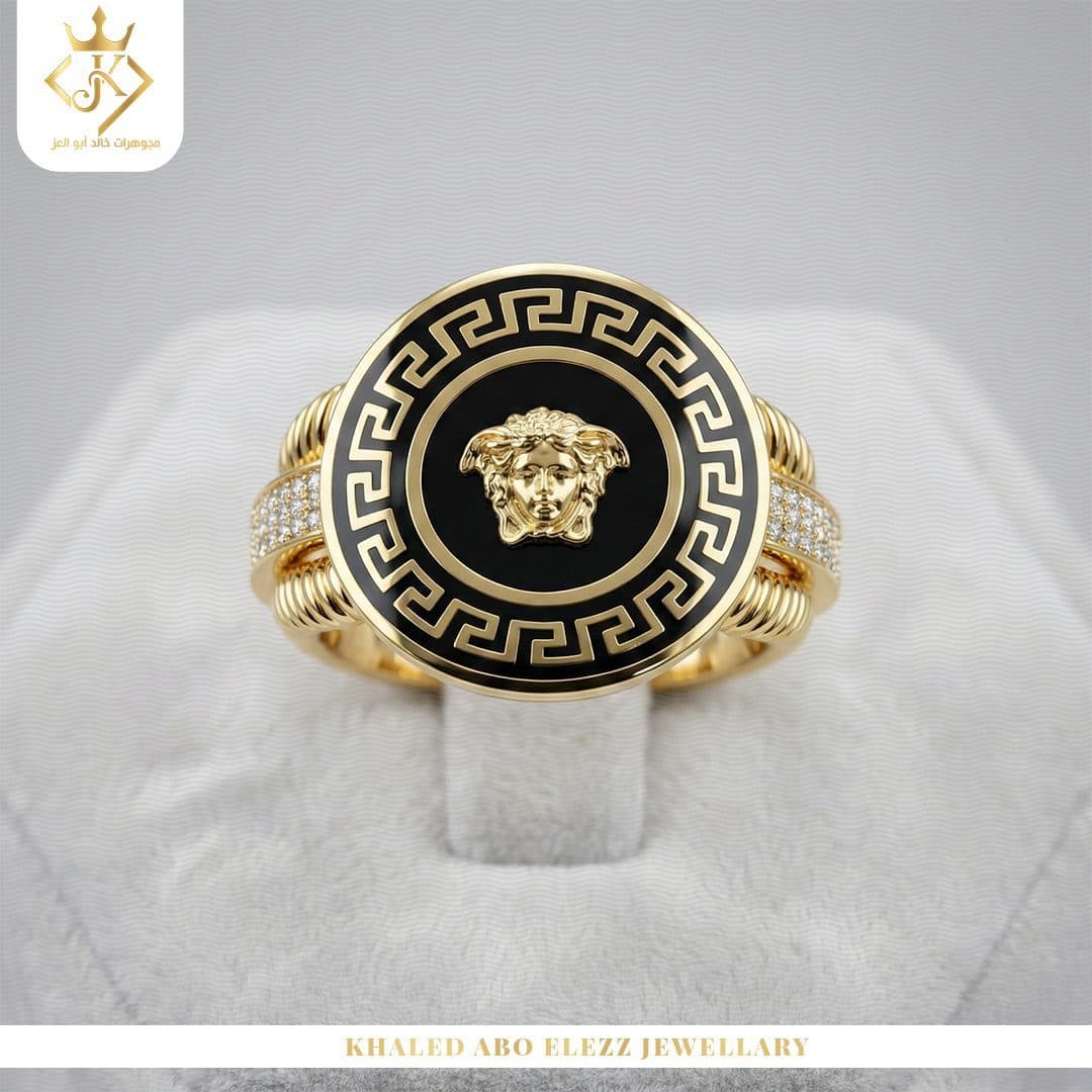
- Logo Placement
The logo is placed within a separate white space at the top of the design, either in the middle or one of the sides.
This space helped:
Ensure logo clarity.
Separate it from the background.
Increase the recognizability of the mark.
Maintain a relatively fixed position within the campaign.
- Main Headline
The title is placed in a clear space within the design, using large sizes and strong contrast.
The location of the title changed according to the composition of the product, but it always remained one of the first elements that caught the viewer's attention.
- Hero Product
The piece of jewelry took up the main space in each post, and the lighting and composition were directed toward it as the primary focal point.
- Background Texture
The crisp white fabric was used as a recurring element that ties the designs together, giving the campaign an easily recognizable personality.
- Brand Footer
Name installed:
- KHALED ABO ELEZZ JEWELLERY
Inside a white stripe at the bottom of the posts, it acts as a closing element that unifies all the designs.
Check this system:
- Brand Consistency
- Strong Product Focus
- Clear Visual Hierarchy
- Easy Content Recognition
- Flexible Campaign Expansion
Post Composition Blueprint Grid
Hover over wireframe elements to reveal design guidelines.
Creative Concept
A different idea was developed for each post according to the type of product and marketing message.
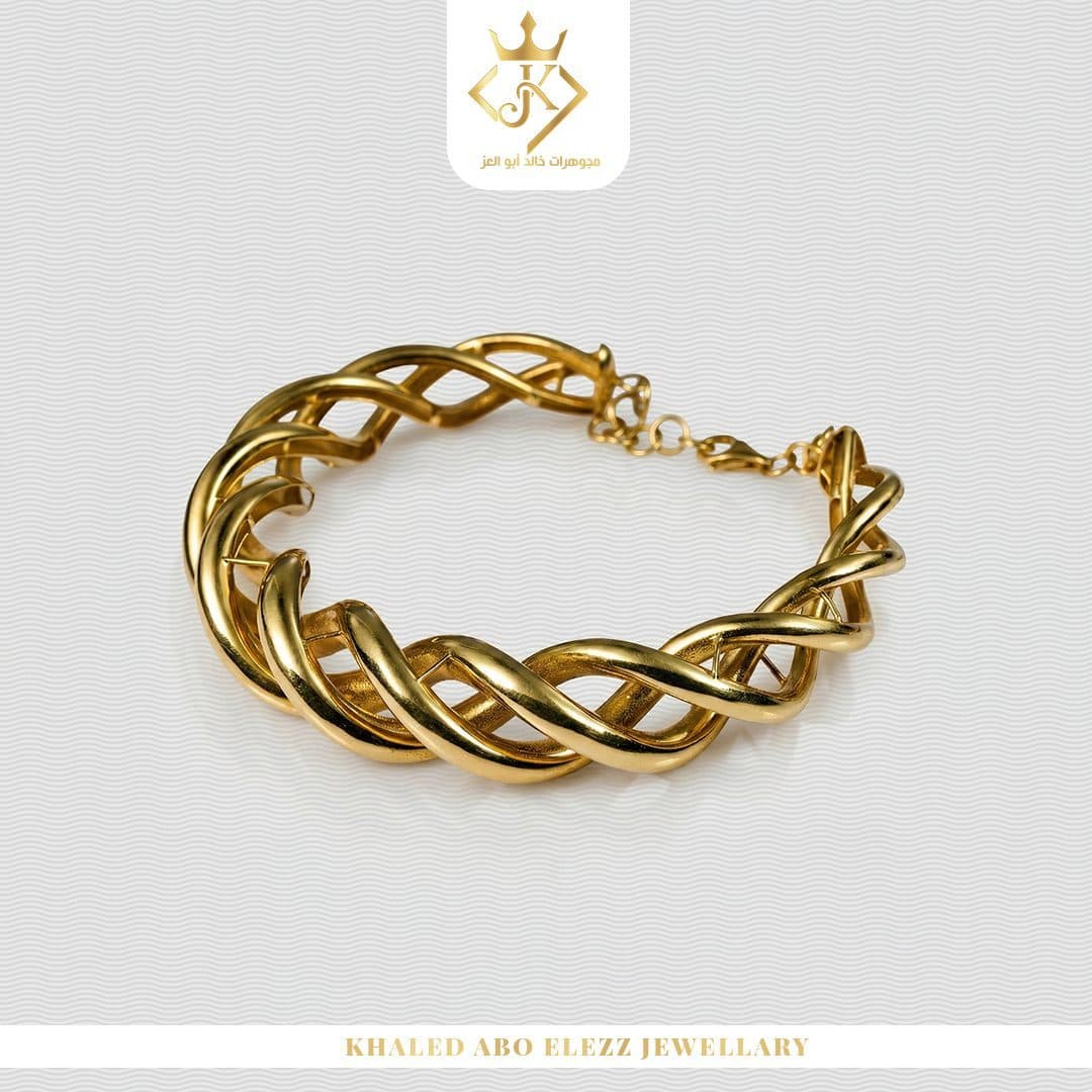
- Delicate Bracelet
The bracelet was displayed on the hand to show the lightness of the piece and how it complements everyday looks.
The design relied on a simple composition and large white areas, so that the bracelet remains the most visible element.
- Simple Gold Bracelet
Use a sentence:
- Simplicity is the secret of beauty
With a gold bracelet with a calm design, to connect the simplicity of the piece with everyday elegance.
- Elegant Collection
An image of gold bracelets was used on a black stand, with the word ELEGANT in large size.
The design relies on the contrast between gold and black, to show the fine details and give the collection a luxurious feel.
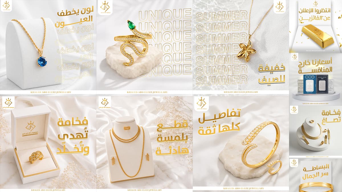
- Unique Collection
The word UNIQUE was used in a large typography style, to express the difference in designs and the uniqueness of each piece.
In the design of the ring studded with a green stone, the word is repeated in the background to create a modern visual rhythm without competing with the product.
- Summer Collection
A floral-inspired pendant is used, repeating the word SUMMER in Outline font.
The design reflected the lightness and bright nature of the season, while maintaining the primary colors of the campaign.
- Valentine's Day
A set bearing the heart symbol is displayed on a black stand, with large English Typography.
The design links jewelry with an emotional gift, without relying on the traditional and direct use of red in the background.
- Investment Silver
Silver bullion is presented within a clean, modern scene, with the title:
Our prices are beyond competition
The nature of the design differed slightly from the jewelry content, while maintaining the logo, footer, and golden language, to link the investment category to the public identity.
- Timeless Gift
The ring was placed inside a luxury jewelry box, with the message:
- An elegance that is guided and immortal
To express that the value of the gift is not related to the occasion only, but rather continues as a memory for years.
- Statement Jewelery Set
A complete set was displayed amidst soft fabrics and light floral elements, with the title:
- Cut with a calm touch
The composition achieved a balance between the density of the set’s details and the calmness of the surrounding environment.
The Gift of a Lifetime
A box was used containing a collection of gold coins with a message:
- Don't delay the gift of a lifetime
The design focuses on motivating a purchase decision by associating the collection with an emotional moment and long-term value.
Campaign Applications
The optical system is designed to be usable and scalable across:
- Facebook Posts
- Instagram Posts
- Sponsored Ads
- Instagram Stories
- Product Highlights
- Seasonal Campaigns
- Jewelery Collections
- Digital Catalogs
- Store Screens
- Printed Promotional Cards
- Occasion-Based Offers
- Gift Guides
Designs can be easily converted to vertical and horizontal sizes, redistributing text and products without losing the core identity of the campaign.
The system can also be used to launch new collections or seasonal offers, changing only the product and message and keeping the elements constant.
Design Process
Discovery & Research
Understand the nature of the products, brand personality, photography style and the needs of the target audience.
- Visual Research
Analyzing methods for presenting jewelry digitally, and studying lighting and backgrounds used in luxury campaigns.
Content Planning
Divide content into posts for products, occasions, gifts, seasons, and investments.
Concept Development
Develop a different idea and message for each publication according to the nature of the piece and the marketing goal.
- Image Selection
Choose pictures that clearly show the details of the product, its size and how to use it.
- Photo Retouching
Clean up images, enhance gold and stones, and adjust lighting and reflections.
- Visual Composition
Determine product positioning, title, logo and supporting elements within each design.
- TypographyStyling
Choose the appropriate style for each message, between strong Arabic fonts and an editorial English style.
- Visual Consistency
Standardize backgrounds, gold tones, ID locations and footer across all posts.
- Final Adaptation
Prepare designs with appropriate sizes for organic content and sponsored ads.
Design Execution Pipeline
1. Brand Positioning & Market Audit
Comprehensive analysis of competitor messaging and target demographics.
Design Outcome
The end result was a Social Media Campaign:
Uniform and easy to recognize.
It reflects the luxury and quality of the brand's products.
Puts jewelry at the center of attention.
Combines classic style with modern trends.
Offering everyday products and gifts within one identity.
It uses photography and visual processing to highlight details.
Maintains the clarity of the logo and brand name.
Flexible to add new collections and products.
Suitable for organic content and sponsored ads.
Each piece connects with an emotional message or real value.
Build a more professional and distinguished digital presence.
Final Statement
The goal was not only to display jewelery products, but to create a complete social media system that transforms every piece into a refined visual story.
The campaign combines elegant product photography, timeless typography and consistent brand communication to present Khaled Abo Elezz Jewelery as a trusted destination for meaningful gifts, distinctive designs and lasting value.
Every visual was designed to highlight the beauty of the product, strengthen brand recognition and connect each piece with a moment worth remembering.