

REEFNA FOOD
Rooted in Nature. Built for Trust
Glass Product Jars
Custom forest green labels with harvest beige details for high shelf visibility.
Identity Overview
REEFNA is a premium brand specializing in food products, deriving its identity from fertile land and natural yields. The objective was to design a visual identity system communicating natural quality, authentic food heritage, trust, and a bold contemporary market presence.
Visual Challenge
The primary challenge was to design a food brand identity that communicates organic harvest and earthy heritage without falling into obvious clichés, ensuring maximum legibility on physical food jars, carton boxes, and tiny packaging labels.
Brand Strategy & Positioning
Reefna represents natural yield from fertile fields, delivered through modern clinical safety standards.
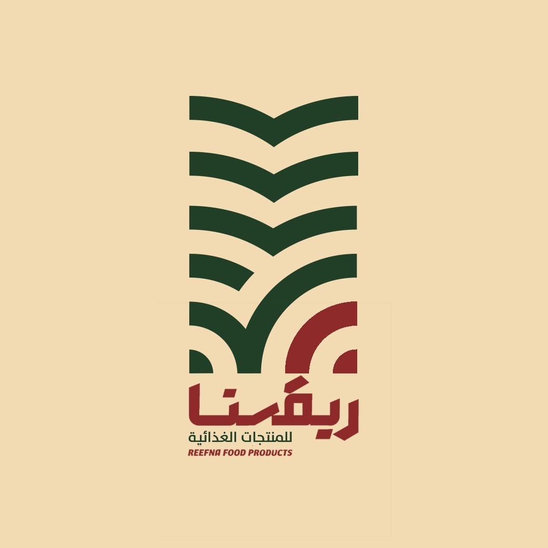
Sunset & Crop Field Lines
Integrating agricultural crops rows, seeds growth, and sunset curves in a vertical grid.
Agricultural Field Lines
Parallel repeating linear rows representing constant plant growth and land extension.
Sunset Path & Irrigation
Circular bottom curves denoting agricultural irrigation streams and sunrise freshness.
Bold Geometric Wordmark
Custom Arabic lettering designed dynamically to match the logo curves rhythm.
Agricultural Field Lines
Parallel repeating linear rows representing constant plant growth and land extension.
Logo Formats & Layouts
Earthy Agricultural Color System
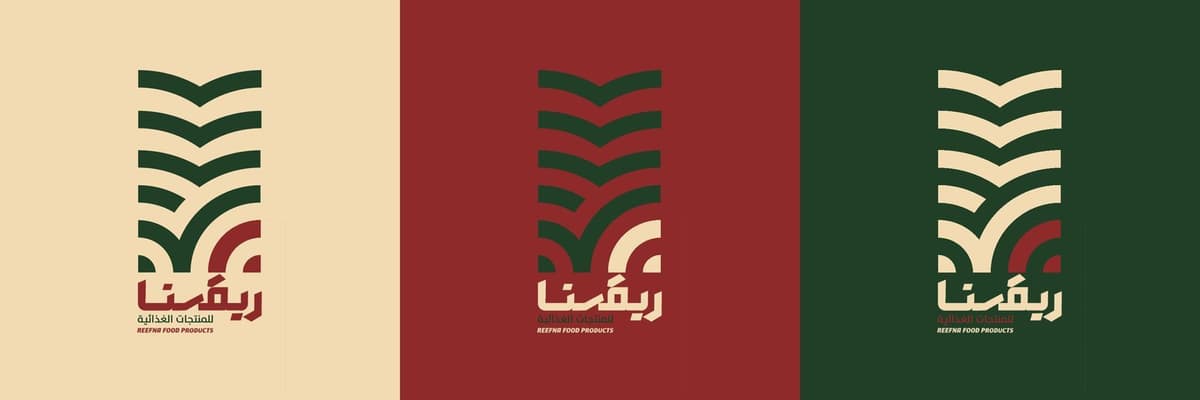
Forest green paired with harvest beige and deep burgundy for commercial appeal.
Primary: Forest Green
Deep green representing fertile land, fresh products and high quality trust.
Secondary: Harvest Beige
Harvest wheat tone providing visual comfort, local heritage and organic styling balance.
Accent: Deep Burgundy
Deep burgundy styling triggering appetite and bold commercial presence.
Earthy Typography
Custom Arabic Wordmark
تم تصميم اسم ريفنا يدوياً بأسلوب هندسي جريء ومميز.
DIN Next LT Arabic
أ ب ت ث ج ح خ د ذ ر ز س ش ص ض ط ظ ع غ
Montserrat
English descriptions and texts.
Barlow Condensed
Used on weights, volumes and packaging layout grids.
Visual Language
Earthy layout grid utilizing bold color blocking.
Agricultural Crop Pattern
A dynamic patterns grid drawn from crop rows and sun rays curves, used inside:
Art Direction of Photography
Focusing on honest clinical safety and fresh agricultural food details:
Food Products Placements
Designed to adapt dynamically across cargo shipments, company document folders, and storefront signage.
Agricultural Design Process
Discovery
Grasping product ranges, organic origins, target consumers, and core values.
Market Research
Analyzing food markets and competing brands packaging templates.
Concept
Exploring ideas combining seed paths, fields, and custom Arabic script.
Logo Development
Smoothing geometry to make the mark instantly recognizable on tiny labels.
Visual Identity
Formulating Forest Green, Harvest Beige, patterns and photography direction.
Guidelines
Documenting rules for packaging box wraps, jars, and delivery vehicles.
Identity Assets & Mockups
Browse official product jars, corrugated boxes, correspondence folders and vehicle wraps.
Reefna Packaging Jars
Glass product jars presenting forest green labels and harvest beige details.
Reefna Delivery Boxes
Corrugated packaging boxes displaying the primary forest green brand theme.
Product Identity & Labeling System
Official tag design utilizing deep burgundy accent borders and Barlow condensed font hierarchies.
Corporate Correspondence Stationery
Business letterhead, billing invoices and corporate mail envelopes layouts.
Promotional Banner & Store Signage
Outdoor clinical visual board showing logo visibility in natural lighting.
Delivery Vehicle Graphics
Logistics vehicle wrap featuring the repeated agricultural lines pattern.
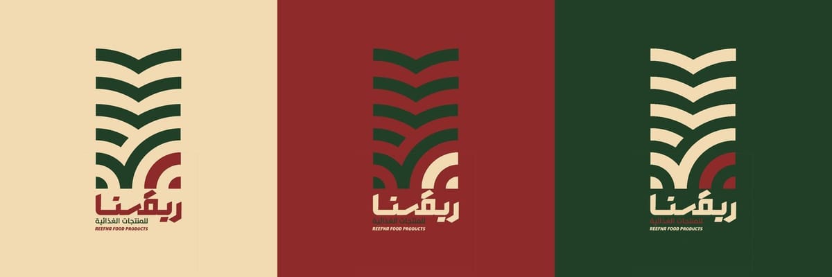
Official Logo Variations System
Primary vertical layout, secondary horizontal wrap and symbol-only icons spec sheets.
Brand Logo Mockup
Textured paper layout showing custom Arabic lettering layout and geometric curve balance.
Rooted in Nature. Built for Trust.
The goal was not only to create a food logo, but to build a complete visual identity rooted in nature, inspired by the land, and designed to communicate quality, authenticity, and trust across every brand touchpoint.