

Project Overview
OLEO is a brand specialized in automotive engine oils, offering a range of products designed to suit different viscosities and operating needs, such as:
- SAE 10W-30
- SAE 20W-50
- SAE 5W-30
- API SL & API SP
The goal was to design a Social Media Campaign that reflects:
- Engine Protection
- Reliable Performance
- Driving Confidence
- Technical Expertise
- Modern Automotive Identity
The campaign was developed to present OLEO products in a powerful and easy-to-understand way, while transforming technical information about motor oils into marketing messages relevant to the daily situations experienced by motorists.
The Challenge
The main challenge was to promote a technical product within a highly competitive market, and to transform engine oil from a product that the public might see as similar between different brands to a choice directly linked to vehicle performance and engine safety.
It was necessary to design a campaign:
Explains the importance of choosing the right oil without complications.
It quickly attracts the attention of car owners.
OLEO packaging stands out as the main item.
Combines awareness and promotional content.
It maintains a strong character that suits the automotive sector.
Present each product clearly without losing the unity of the campaign.
The sign is associated with the concepts of strength, stability and protection.
Suitable for organic content and sponsored ads.
The challenge was also to create visual diversity between the posts, while maintaining a consistent, instantly recognizable personality.
Campaign Strategy
Campaign Personality
- Powerful
- Reliable
- Technical
- Bold
- Dynamic
- Confident
- Performance-Oriented
The campaign is built on a visual character that reflects the power of the engine and the movement of the road, presenting OLEO as a brand that understands the needs of the car and gives the driver greater confidence on every journey.
Communication Tone
Direct and powerful.
Close to everyday driver language.
Technical without using complicated terminology.
My warning when talking about engine issues.
Motivating when presenting the benefits of the product.
It relies on short, quick-to-remember phrases.
It links the product to the driving experience, not just maintenance.
A communication method was used that makes the audience feel that choosing engine oil is a fundamental decision that affects performance from the moment the car is started.
The Big Idea
The main idea of the campaign is based on the concept:
- Power Starts with the Right Choice
Or:
- Power starts with choosing the right oil
Each design links OLEO to a real moment or situation facing the driver, such as:
start the car.
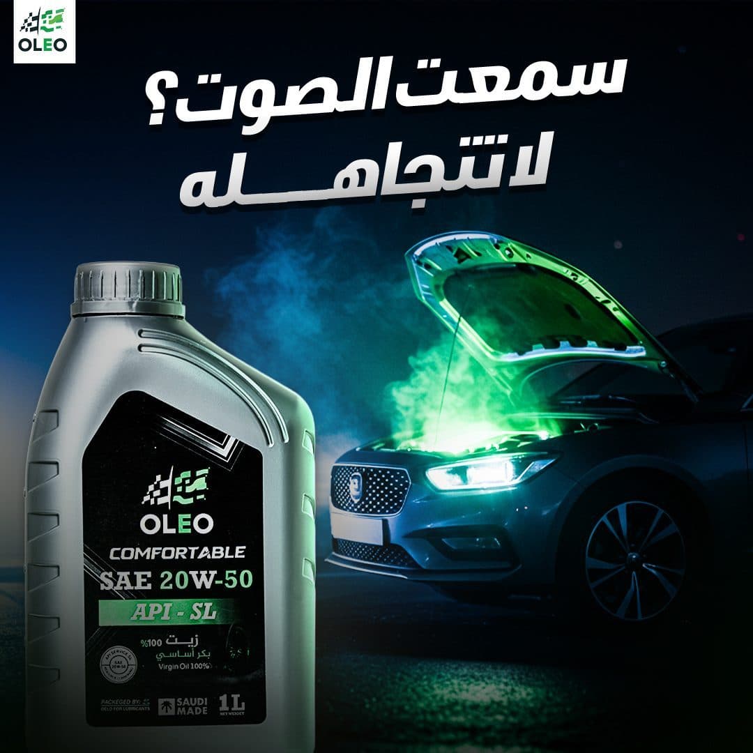
Hearing an abnormal sound from the engine.
Long distance driving.
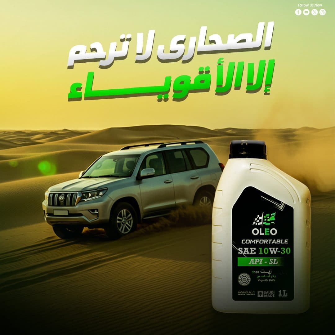
Moving between the desert and the city.
Search for consistent performance.
Desire to preserve the engine.
Choose the appropriate oil for each type of operation.
This concept appeared through messages such as:
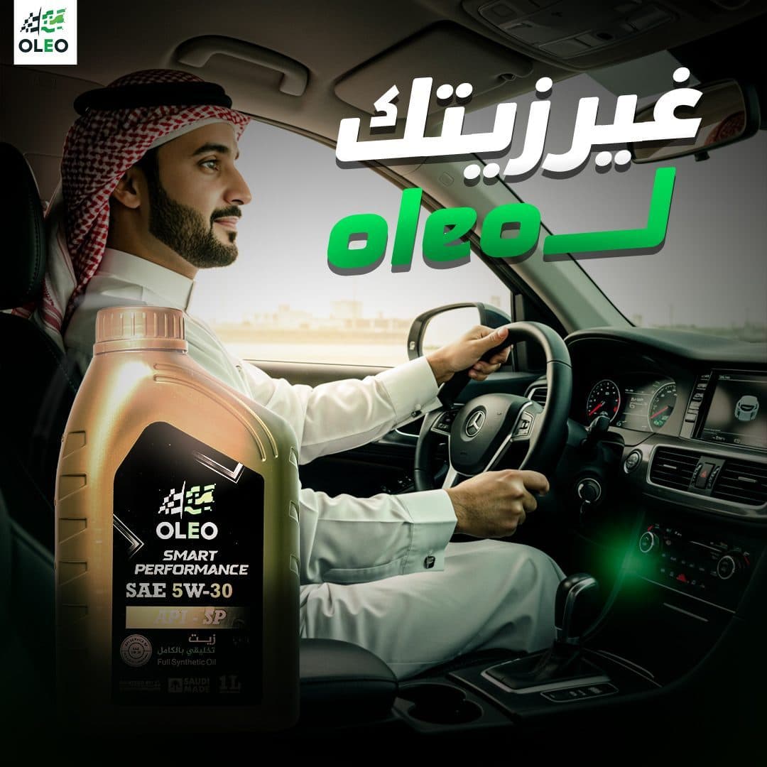
Start right with OLEO.
OLEO is your first choice.
Safety returned with one change.
OLEO oil is the oil that saves.
Fast…steady…whatever lets you down.
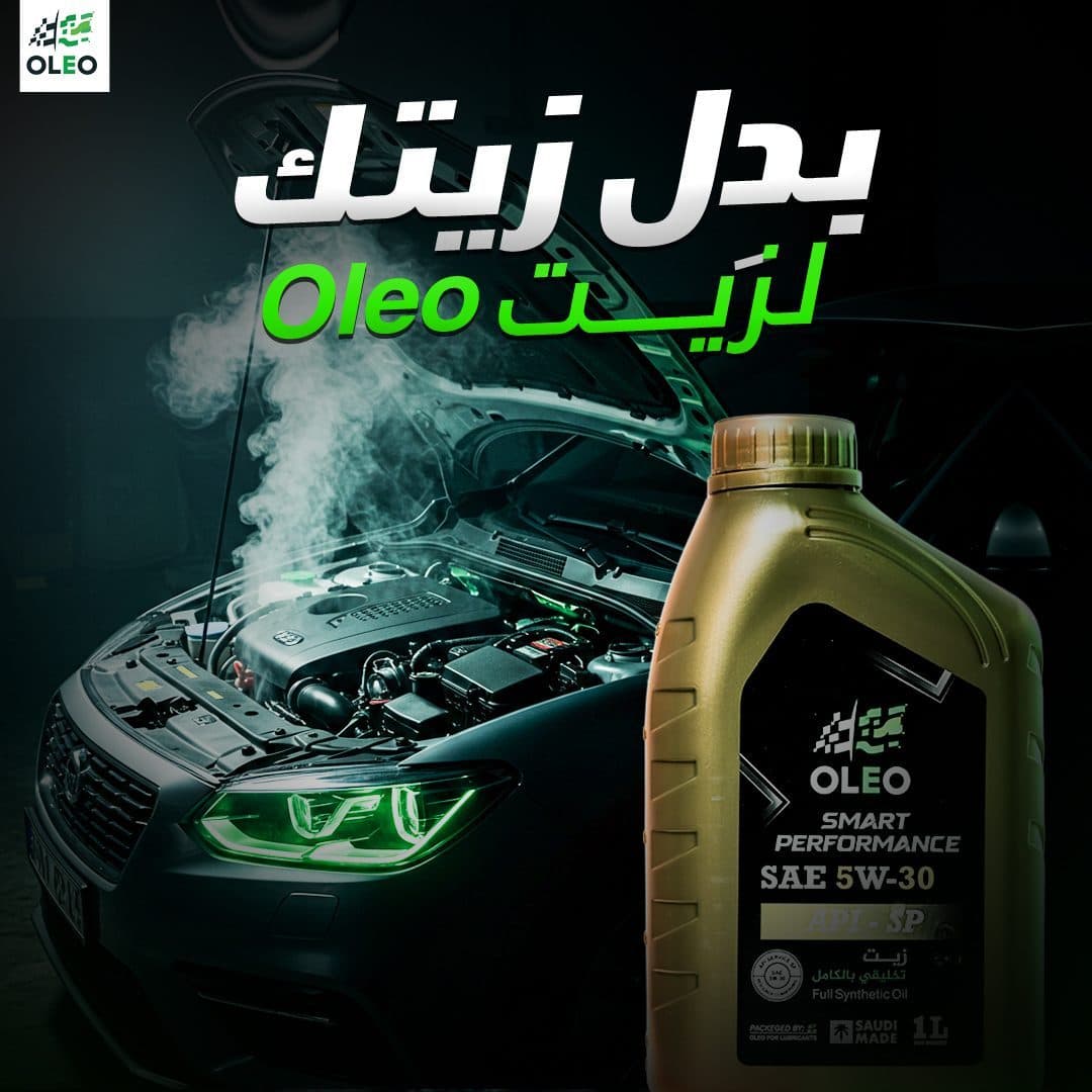
Did you hear the sound? Don't ignore it.
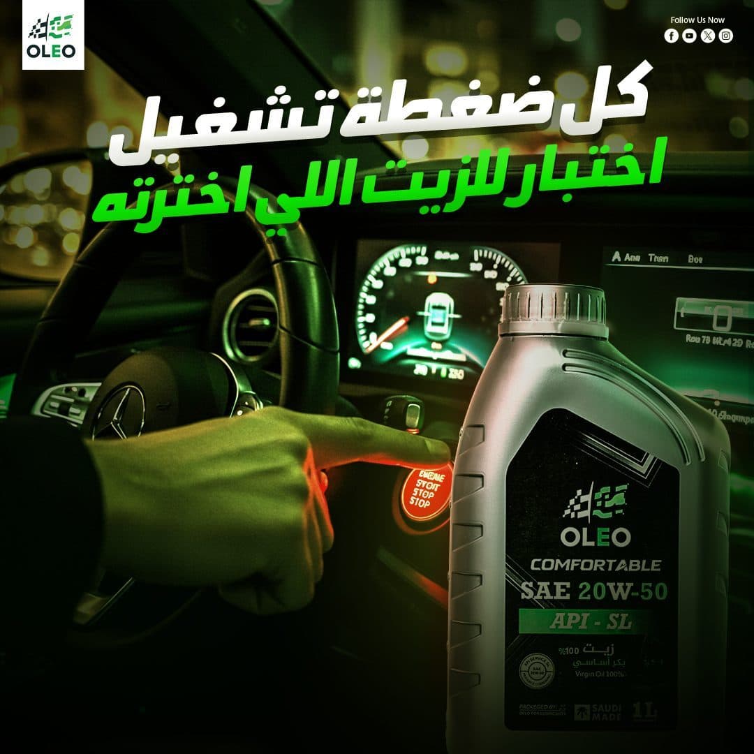
Power releases with every run.
Every press of play...select the oil you chose.
Why should you care about engine oil?
Not every oil understands the engine.
From the desert to the city... the same confidence.
In this way, the product becomes part of the daily driving experience, and not just an oil bottle used during maintenance.
Content Direction
The campaign covered a variety of marketing and awareness topics, including:
- Product Awareness
Introducing the different OLEO products and showing the available viscosity grades and classifications.
- Engine Protection
Emphasizing the importance of oil in protecting engine components and maintaining operating efficiency.
- Performance Content
Linking the product to strength, stability and responsiveness from the moment the car is started.
- Problem–Solution Content
Use engine sounds, vehicle indicators and operating problems as a starting point, then introduce the oil change as an important engine care step.
Educational Content
Explain the importance of motor oil and encourage the public not to ignore warning signs.
- Driving Lifestyle
Connecting the product to roads, travel, speed, night driving and different climates.
- Product Comparison
Show the variety of packages and grades to help the audience understand that each engine has an appropriate need.
The plan also combined:
- Awareness Posts
- Educational Posts
- Product-Focused Designs
- Problem–Solution Content
- Performance Messages
- Engagement-Oriented Posts
- Conversion-Oriented Ads
Campaign Content Pillars
Desert Endurance Ads
Primary Campaign FocusEngine Protection Visuals
Primary Campaign FocusOil Change Timers & Tips
Primary Campaign FocusDistributor & B2B Campaigns
Primary Campaign FocusVisual Direction
The visual direction of the campaign was built based on:
- Dark Automotive Atmosphere
- Neon Green Lighting
- Bold Arabic Headlines
- High-Contrast Compositions
- Creative Photo Manipulation
- Dynamic Car Imagery
- Dashboard & Engine Details
- Cinematic Road Environments
- Hero Product Placement
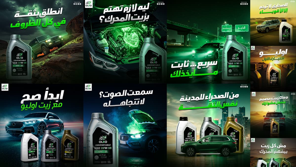
Most of the designs were based on dark environments inspired by the world of cars, with the use of luminous green to direct the eye towards the product and important elements.
OLEO packaging is combined with scenes including:
Sports cars.
Speedometers.
Fuel indicators.
Engines.
Night routes.
Desert roads.
City scenes.
Road signs.
Car start-up moments.
This helped build an integrated visual world through which the audience feels that the product is linked to strength, movement, and performance.
Color Psychology Strategy
Campaign Strategy
The color palette was developed based on the basic identity of the brand, enhanced with dark tones suitable for the automotive sector.
Primary Color
- OLEO Green
The color green was used in strong and luminous shades to express:
Energy.
Movement.
Efficiency.
Performance.
Regeneration.
Protection.
Technology.
Green appeared in:
Headlines.
Automotive ambient lighting.
Speedometers.
Engine details.
Reflections of packages.
Lighting effects.
Items that need to attract attention.
Secondary Color
- Deep Black
Black was used as the primary color for the backgrounds, to express:
Strength.
Professionalism.
Luxury.
Hardness.
Industrial character.
The world of engines.
The black color also helped the product packaging and white and green text stand out with the highest degree of contrast.
Supporting Colors
White has been used in headings and main texts to achieve quick legibility, along with:
Gray and metallic tones.
Petroleum blue.
Heavenly lighting.
Red associated with warning indicators.
Gold and bronze to distinguish certain products and scenes.
Yellow and orange in desert and sunset scenes.
This diversity gives each design an independent character, while keeping green and black as constant elements in the campaign.
Bilingual Typography Sandbox
Typography Strategy
A strong and broad typography style was chosen that suits the world of speed and engines.
- Arabic Headlines
Arabic titles are based on the following lines:
Petition.
Geometric.
Tilt or have a sense of movement.
Clear when viewed on phones.
Able to occupy a large space within the composition.
Achieve typographical style:
- Strong Visual Impact
- Fast Readability
- Dynamic Feeling
- Clear Hierarchy
- Automotive Personality
White is used for the main part of the message, while green is used to highlight the most important word or sentence.
Such as:
- Start right
With OLEO oil
And:
- From the desert to the city
- Same confidence
- Text Effects
Added:
Drop Shadows.
Soft Extrusion.
Dark Outlines.
Subtle Gradients.
Perspective Adjustments.
These effects helped separate texts from busy backgrounds, and gave the titles a visual weight commensurate with the strength of the product.
- Supporting Text
Lighter weights have been used in:
Product names.
Viscosity grades.
Technical classifications.
Communication accounts.
Secondary messages.
Calls to action.
Photography & Art Direction
The campaign relied primarily on Photo Manipulation to produce cinematic scenes linking the product to the world of driving and performance.
Implementation method included:
Strictly insulate product packaging.
Processing the colors of packages and backgrounds.
Merging cars with road scenes.
Unifying lighting directions.
Add realistic reflections to packaging.
Adding green lighting related to the identity.
Build realistic contact shadows.
Create fog and smoke effects.
Use Light Trails to express speed.
Enhanced details of engines and instrument panels.
Add Glow around key elements.
Use Depth of Field to increase the depth of the scene.
Standardize color grading with Cinematic Color Grading.
The product is presented in a clear size within most designs, to be the hero element and not a secondary element within the scene.
Engine Performance Dashboard
Recommended viscosity is OLEO SAE 5W-30 for maximum fuel economy and cold-start protection.
Layout Grid System
A flexible Layout system was designed that maintains the identity of the campaign, while allowing the configuration to be changed according to the idea of each post.
- Logo Placement
The logo is often installed in the top corner, within a clear white space that includes:
Easy to recognize the mark.
Logo clarity over dark backgrounds.
Consistency of visual presence across publications.
- Main Headline
Headings occupy the top part of the design, with large sizes and clear spaces, to be the first element that the viewer reads.
Hero Visual
One of the following was used as the main focus point:
One package.
Package set.
car.
engine.
Speedometer.
Road scene.
The moment the car starts.
- Product Placement
The oil bottle was often placed at the front, taking into account:
Label clarity.
The appearance of the name OLEO.
Possibility of reading the degree of viscosity.
Maintain packaging details.
Separate it from the background with lighting and shadows.
- Supporting Elements
Cars, engines, and meters were used as elements that supported the message, without competing with the product for center attention.
- Social Media Details
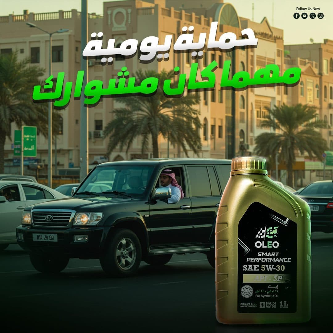
In some posts, social media accounts were placed at the top to maintain the brand's presence and encourage the audience to follow.
This system helped achieve:
- Brand Consistency
- Strong Product Visibility
- Fast Message Recognition
- Clear Visual Hierarchy
- Flexible Campaign Expansion
Post Composition Blueprint Grid
Hover over the wireframe components to explore layout structure rules.
Creative Concept
A different visual theme is developed for each post to match the core message.
- Start Right
A modern vehicle with a range of OLEO products was used, linking the start of the journey with the correct choice of oil.
Message:
- Start right with OLEO
The design showcases the diversity of products and presents the brand as a complete solution to different needs.
- Your First Choice
The OLEO canister was placed in the middle of a road extending toward the horizon, with repeating canisters on either side of the road.
The scene expresses:
Continuity.
Long distances.
trust.
OLEO's presence at every stage of the journey.
- Restore Smooth Performance
The vehicle's dashboard is used to offer oil changes as a straightforward step that helps restore the driver's sense of stability and safe operation.
The design links a simple decision with an outcome that the user notices while driving.
- One Change Makes a Difference
The packaging is presented next to a red and green instrument panel, with smoke and lighting effects used to illustrate the transition from warning to performance.
- Fuel-Efficiency Message
The product packaging is integrated with a fuel indicator, linking the selection of the appropriate oil to the concept of the most efficient operation.
The message was brief:
- OLEO oil...the oil that saves
- Fast, stable, reliable
A car is used on a night road within a local environment, with strong green lighting and reflections on the asphalt.
The scene expresses:
Speed.
Consistency.
Prepare for different methods.
Product presence during daily driving.
- Engine Warning
The design was based on a car with an open hood with smoke and green lighting.
The letter began with a question:
- Did you hear the sound? Don't ignore it
It is a method that helps arouse curiosity, and then links the content to the importance of paying attention to the condition of the engine and oil.
- Power with Every Start
A finger was used to press the car's start button, with the OLEO canister placed next to the start moment.
The idea symbolizes that engine power begins before moving on the road, specifically from choosing the appropriate oil.
Every Start Is a Choice
The play button idea was repeated in a more direct way, with the message:
Every press of play...select the oil you chose
Thus, the decision to buy oil has been transformed into an experience that the driver feels every time he starts his car.
- Why Engine Oil Matters
An exposed engine with an illuminated visual element at its centre, was used to represent oil as a vital part of the car's interior.
The publication provides an educational input by asking:
Why should you care about engine oil?
- Oil That Understands Your Engine
The engine and OLEO canister are highlighted next to it, with the phrase:
- Not every oil understands the engine
The idea is to diagnose the brand as an expert who understands the different needs of engines, rather than presenting the oil as a generic product.
- From Desert to City
Two different scenes combined within one design:
Desert and open roads.
The modern city and environment.
With the car and OLEO products placed in the middle, to deliver a message:
- From the desert to the city... the same confidence
The design expresses flexibility and stability across diverse driving conditions.
Campaign Applications
The optical system is designed to be usable and expandable across:
- Facebook Posts
- Instagram Posts
- Sponsored Ads
- Instagram Stories
- Product Launch Posts
- Educational Carousels
- Awareness Campaigns
- PerformanceAds
- Dealer Promotions
- Point-of-Sale Screens
- Automotive Exhibitions
- Printed Posters
- Product Catalogs
- Outdoor Advertising
- Digital Banners
The system also allows adding:
New viscosity grades.
New products.
Promotions.
Maintenance tips.
Seasonal content.
Campaigns related to travel and weather.
Publications directed to different car categories.
Without losing the core visual character of the campaign.
Design & Production Phases
1. Brand Positioning & Market Audit
Comprehensive analysis of competitor messaging and target demographics.
Design Process
Discovery & Research
Understand the nature of OLEO products, types of oils, viscosities and the target audience of car owners.
- Market Research
Analysis of the motor oils sector, competitors' methods and the visual language used in the field of automobiles and maintenance.
- Audience Insights
Identify problems and situations that the driver is concerned about, such as:
Engine sounds.
Poor performance.
Length of trips.
Fuel consumption.
start the car.
Driving in different temperatures and conditions.
Content Planning
Break the campaign into content:
Awareness.
Promotional.
Simplified technical.
Problem based.
Related to driving style.
Directed to display products.
Concept Development
Independent Concept development for each message, linking the product to a clear, quick-to-understand visual situation.
- Image Selection
Choosing cars, engines, roads and meters that match the messages and give the campaign a modern and strong character.
- Product Retouching
Clean up packaging images, enhance details, adjust lighting and highlight key product information.
- Photo Manipulation
Implementing merging, building scenes, adding effects, unifying lighting and applying color processing.
- Visual System
Define usage rules:
Logo.
Titles.
Green.
Packages.
Lighting.
Spaces.
Contact information.
- Final Adaptation
Preparing designs of the appropriate sizes and quality for organic use and digital advertising.
Design Outcome
The end result was a Social Media Campaign:
Powerful and easy to recognize.
It reflects the nature of the automotive and engines sector.
It puts the product in the center of attention.
Provides technical information in a simple manner.
OLEO connects to everyday driving situations.
Unites all publications within one visual world.
Use short, quick-to-remember messages.
Strive a balance between awareness and promotion.
Highlights the diversity of the brand's products.
Supports OLEO's image as a trusted and specialized brand.
Flexible to add new products and messages.
Suitable for organic content and sponsored ads.
It gives the brand a bold, modern digital presence.
Final Statement
The goal was not only to promote OLEO engine oils, but to build a complete social media system that connects the product with real driving moments, engine performance and everyday driver concerns.
The campaign combines bold automotive visuals, dynamic storytelling and clear product communication to transform technical information into powerful, relatable and memorable messages.
By maintaining consistent product visibility, a distinctive green-and-black visual identity and a confident communication tone, the campaign strengthens OLEO’s digital presence and positions the brand as a reliable choice for drivers seeking confidence, protection and performance with every start.