


Project Overview
FORN & FALAFEL is a restaurant that specializes in serving pancakes, crepes, sandwiches and fast food, and relies on providing an experience that combines quality, speed, and a modern character in communicating with customers.
The goal of designing the Social Media Campaign was to build a strong digital presence that reflects the brand's personality and transforms everyday products into attractive visual content that increases engagement and desire to purchase.
The campaign is designed to express:
- Delicious Food Experience
- Bold Brand Personality
- Appetite Appeal
- Modern social media communication
- Strong Promotional Presentation
The campaign was developed to present the offers and products in an attractive manner, while maintaining a unified visual identity that enhances brand recall.
The Challenge
The main challenge was to transform everyday food products into attention-grabbing visual content amidst the huge competition on social media platforms.
كان المحتوى بحاجة إلى أن يكون:
Quick to attract attention.
Stimulates appetite within seconds.
مناسب للإعلانات الممولة والمنشورات العضوية.
يعرض المنتج بطريقة احترافية دون ازدحام بصري.
يحافظ على هوية موحدة رغم اختلاف المنتجات والعروض.
يشجع الجمهور على الطلب مباشرة.
It was also necessary to achieve a balance between presenting the product, highlighting the marketing presentation, and building a distinctive personality for the brand.
Campaign Strategy
Campaign Personality
- Bold
- Friendly
- Energy
- Delicious
- Youthful
- Promotional
The campaign is built on a straightforward visual style that highlights the product as the main hero within each design, with short, easy-to-remember messages.
Communication Tone
Simple and clear.
مرح ومباشر.
It is based on the audience's everyday language.
Focuses on value versus price.
It stimulates experimentation and demand.
The Big Idea
The campaign is based on the concept of:
Every Meal is a Moment Worth Sharing
Each post turns the product into an experience or social event, not just a meal.
This was demonstrated through various ideas such as:
Fridays box.
Weekend offers.
Contests and audience expectations.
Economic Combo.
Participation offers.
Family meals.
In this way, products become associated with participation, gatherings, and special offers, which increases the audience’s connection to the brand.
Content Direction
The campaign covered a variety of content types, including:
- Combo Offers
- Weekend Promotions
- Family Meals
- Product Showcase
- Interactive Posts
- Engagement Questions
- Seasonal Campaigns
- Limited-Time Offers
- Brand Awareness Posts
The plan also combined:
Promotional Content
- Engagement Content
- Product Showcase
- Interactive Marketing
- Offer-Based Posts
- Conversion-Oriented Content
Campaign Content Pillars
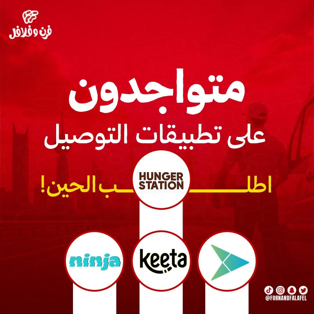
App Delivery Offer Banners
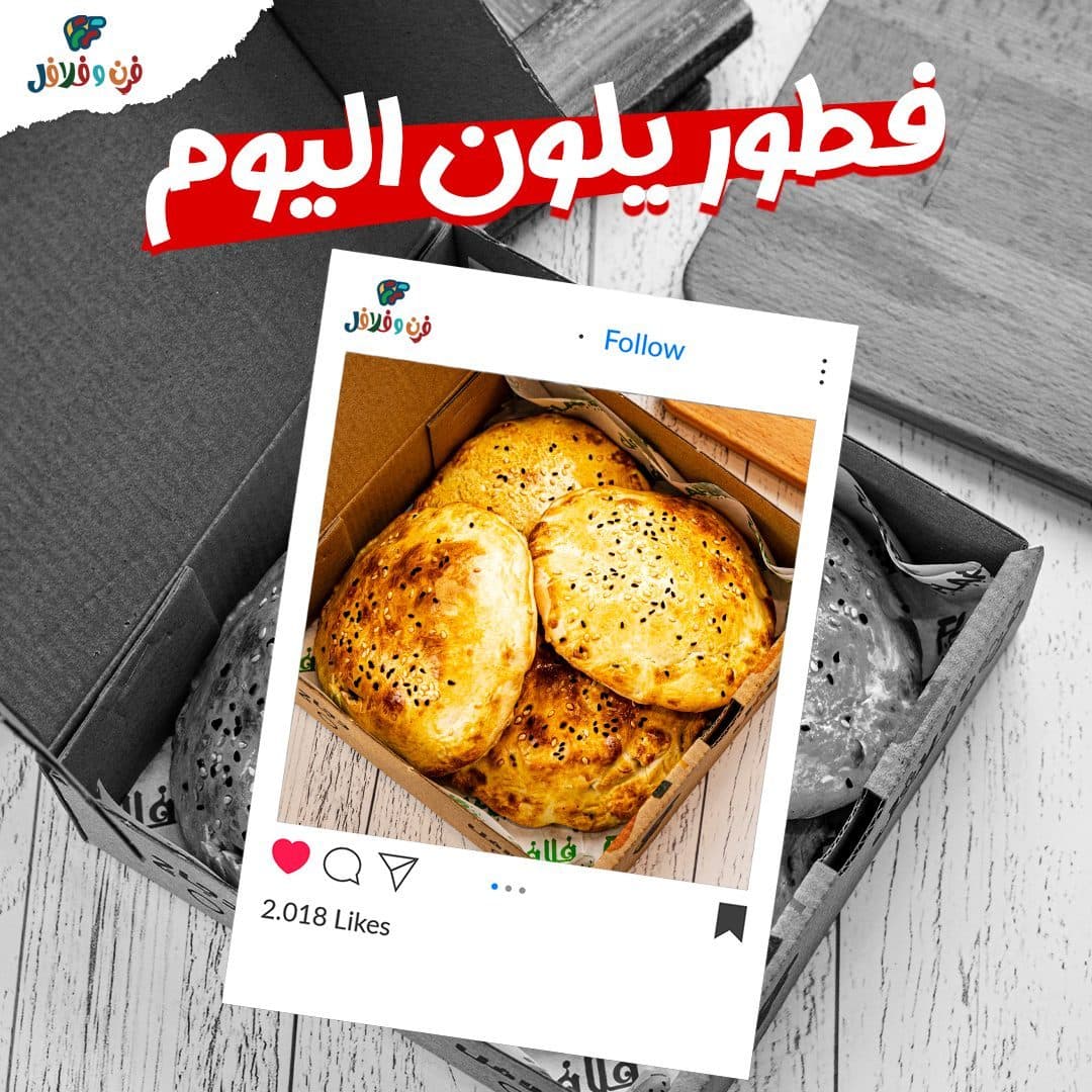
Primary Campaign FocusAuthentic Breakfast Showcases
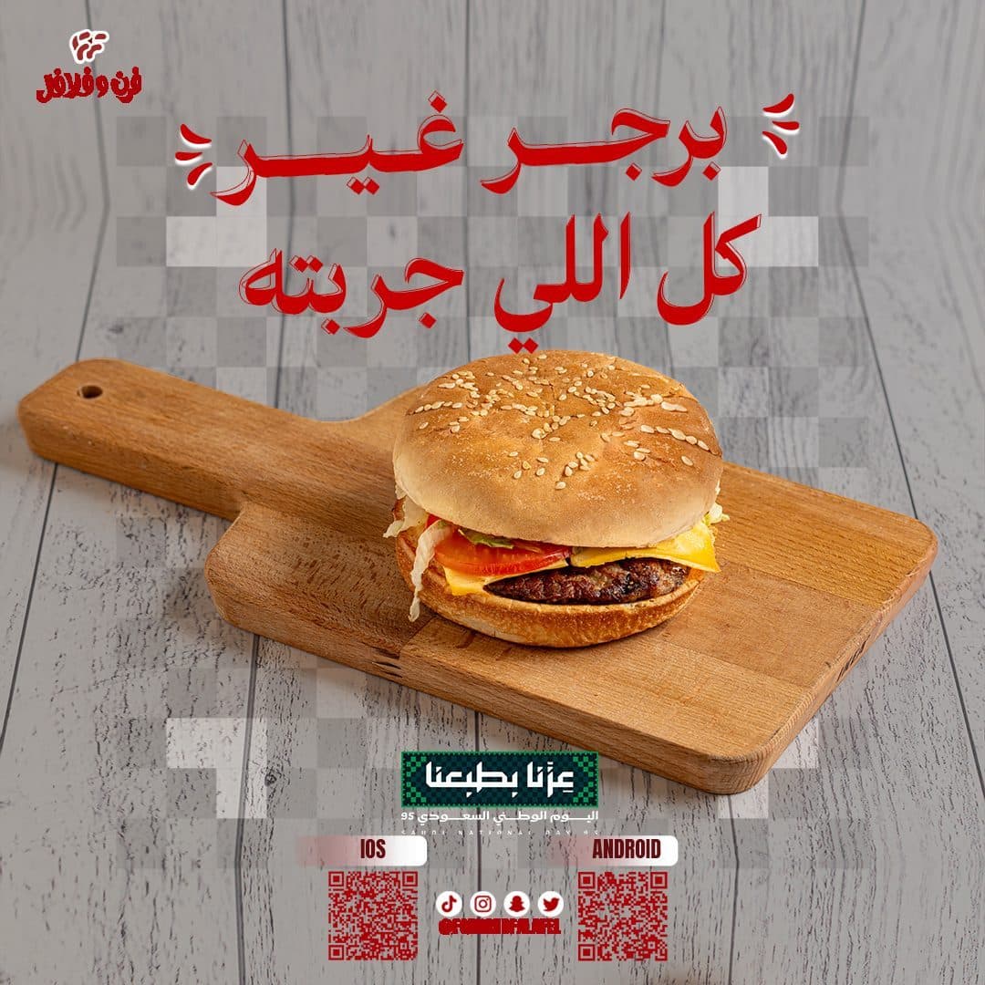
Primary Campaign FocusBurger & Sandwich Twists
Primary Campaign FocusSpecial Combo Campaigns
Primary Campaign FocusVisual Direction
The campaign's visual system was built based on:
- Bold Arabic Headlines
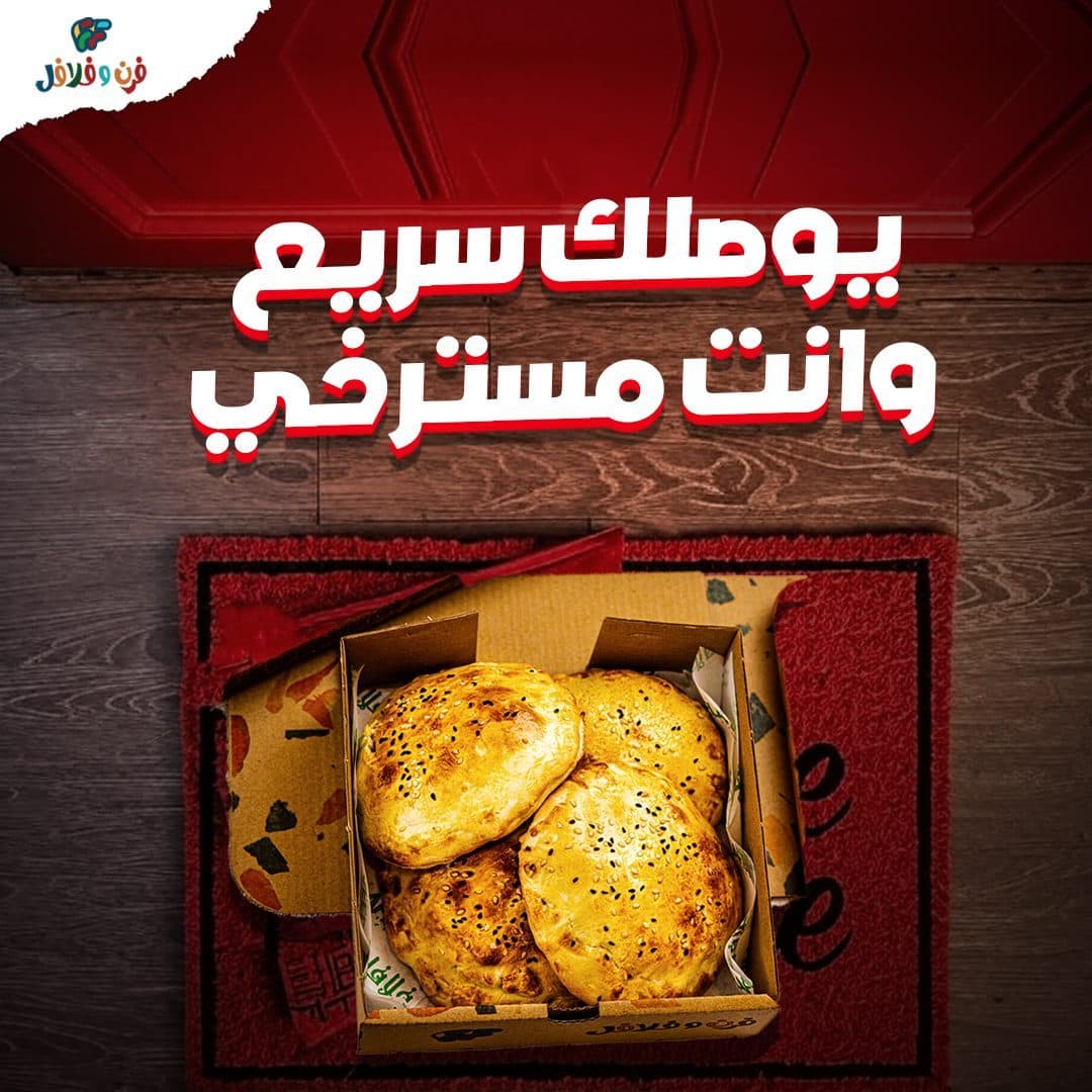
- Hero Food Photography
- Creative Food Composition
- High Contrast Layouts
- Warm Food Lighting
- Dynamic Background Shapes
- Strong Visual Hierarchy
- Consistent Brand Footer
All designs were based on making the product the primary focus, while using supporting elements that increase the sense of liveliness without distracting.
Color Psychology Strategy
Campaign Strategy
A color palette inspired by the restaurant's visual identity was adopted.
Primary Color
- Brand Red
The color red was used to express:
- Appetite
- Energy
- Speed
- Enthusiasm
- Brand strength
It also helped create a strong visual presence while browsing the content.
Secondary Color
- Warm white
استخدم لتحقيق:
Clarity of elements.
Highlight the product.
تحسين قابلية القراءة.
خلق توازن بصري.
Supporting Colors
تم استخدام درجات:
- Beige
- Brown
- Wood Tones
- Dark Shadows
To add a sense of warmth and natural character to food.
Bilingual Typography Sandbox
Typography Strategy
Broad and clear Arabic fonts were used to suit the nature of the advertising content.
- Arabic Headlines
Verification lines selected:
- Strong Visual Impact
- Fast Readability
- Clear Hierarchy
- Youthful Personality
The titles appear in white with shades of red to add visual depth and increase clarity over different backgrounds.
- Supporting Text
Lighter weights have been used in:
Description of offers.
Product names.
Combo details.
Call To Action.
Contact information.
Photography & Art Direction
The campaign relied on photographing the products in a way that makes them appear more appetizing, while processing the images to highlight the details.
Method included:
- Professional Food Retouching
- Background Replacement
- Color Enhancement
- Light & Shadow Balancing
- Realistic Food Composition
- Depth Creation
- Product Isolation
- Creative Scene Building
Different environments were also used such as:
Home.
Family sessions.
Wooden tables.
Abstract backgrounds.
To add visual diversity while maintaining the campaign's identity.
Crave-Worthy Appetite Builder
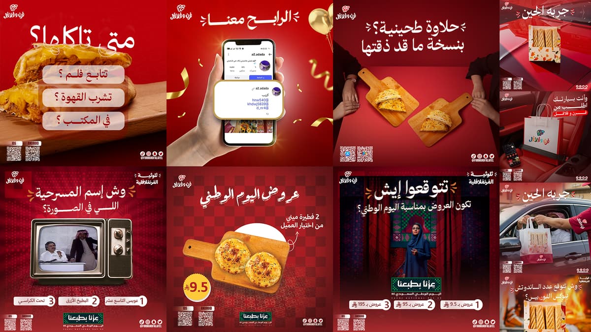
Warm ambient setup emphasizing family tables, social weekends, and sharing.
Layout Grid System
A consistent Grid system has been designed that helps standardize all campaign posts.
- Logo Placement
The logo is mounted at the top to ensure identification is clearly visible.
- Main Headline
The title takes up the most space within the design to quickly grab attention.
- Hero Product
The product is placed at the center of the design as the primary element.
- Promotional Area
A clear space is allocated for offers or marketing messages.
Contact Footer
Installed:
- QR Codes
- Social Media Accounts
- Applications
- Contact information
at the bottom to maintain visual consistency.
Check this system:
- Brand Consistency
- Fast recognition
- Strong Hierarchy
- Easy scalability
Post Composition Blueprint Grid
Hover over the wireframe components to explore layout structure rules.
Creative Concept
A different theme was developed for each publication while maintaining a unified identity.
- Gathering Box
Displaying a box of pies inside a warm home session with a bouquet of flowers and the message “Gathering Box” to link the product to the family atmosphere.
- Weekend Combo
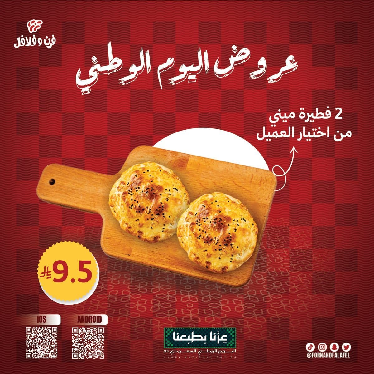
Highlighting the weekend's presentation using a simple visual composition that focuses on the combo with geometric lines that give the design energy and movement.
- Interactive Guess Post
Using the Four Piece box with an interactive question: “How many sandwiches do you expect?” To stimulate comments and increase the interaction rate.
- Product Showcase
Focus on product details and warm lighting to highlight quality and freshness.
- Promotional Offers
Integrating the product with display elements in a way that makes the price or offer part of the visual experience and not just text.
Campaign Applications
The system is designed to be usable across:
- Facebook Posts
- Instagram Posts
- Sponsored Ads
- Stories
- Offer Campaigns
- Interactive Posts
- Restaurant Screens
- Printed Promotional Materials
It also allows adding new products or offers easily while maintaining identity.
Design & Production Phases
1. Brand Positioning & Market Audit
Comprehensive analysis of competitor messaging and target demographics.
Design Process
Discovery & Research
Understand the restaurant's identity, target audience and core offerings.
Research & Market Audit
Analyze competitors' campaigns and study restaurant advertising design trends.
Content Planning
Divide content into offers, products, interactive posts, and events.
Concept Development
Creating a different visual idea for each post while maintaining a unified identity.
- Photography Selection
Choose product images and angles that highlight quality and delicacy.
- Photo Manipulation
Implement insulation, improve lighting, unify colors, and add visual effects.
- Visual System
Locate logo, titles, product, and promotional items.
- Final Adaptation
Preparing designs in appropriate sizes for different platforms and sponsored advertisements.
Design Outcome
The end result was a Social Media Campaign:
Uniform and easy to distinguish.
Visually enhances the audience's appetite.
Balance between advertising and entertainment.
Presentations are presented in an attractive and clear manner.
Supports the brand's presence on digital platforms.
Flexible to add future products and offers.
Suitable for sponsored ads and organic content.
Maintains identity consistency across all posts.
Final Statement
The goal was not only to promote FORN & FALAFEL's menu, but to build a complete social media system that transforms everyday meals into memorable visual experiences.
The campaign combines bold food photography, engaging promotional storytelling, and a consistent visual identity to strengthen the brand’s digital presence, increase audience interaction, and encourage customers to order with confidence.