
Project Overview
Dr. Mahmoud Al-Najjar Center is a center specialized in physical therapy and motor rehabilitation, providing therapeutic and rehabilitative services for various age groups and medical conditions.
The goal of the project was to design an integrated Social Media Campaign that would help build a strong visual presence for the center, and demonstrate the diversity of services in a modern and easy-to-understand way.
The campaign focused on expressing:
- Professional Medical Presence
- Sports & Physical Performance
- Recovery and Rehabilitation
- Trust and Patient Care
- Modern & Accessible Communication
The content is designed to combine professional medical character with sports energy, while maintaining a human identity close to the patient.
The Challenge
The primary challenge was to provide multiple medical services within a single optical system without the designs appearing repetitive or complex.
The campaign had to be:
Professional and suitable for the medical field.
Dynamic and reflects movement and recovery.
Suitable for athletes, children and the elderly.
Easy to read on phone screens.
Able to simplify medical information.
Visually consistent despite the variety of topics.
It was also important to achieve a balance between medical credibility and visual energy that captures the audience's attention on social media.
Campaign Strategy
Campaign Personality
- Professional
- Dynamic
- Trustworthy
- Supportive
- Modern
- Energy
- Human-Centered
The campaign is built around the idea that physical therapy not only reduces pain, but helps the patient:
Restore movement.
Back to activity.
Improving quality of life.
Regain body confidence.
Achieving better physical performance.
Target Audience
- Athletes & Fitness Enthusiasts
- Post-Surgery Patients
- Children & Parents
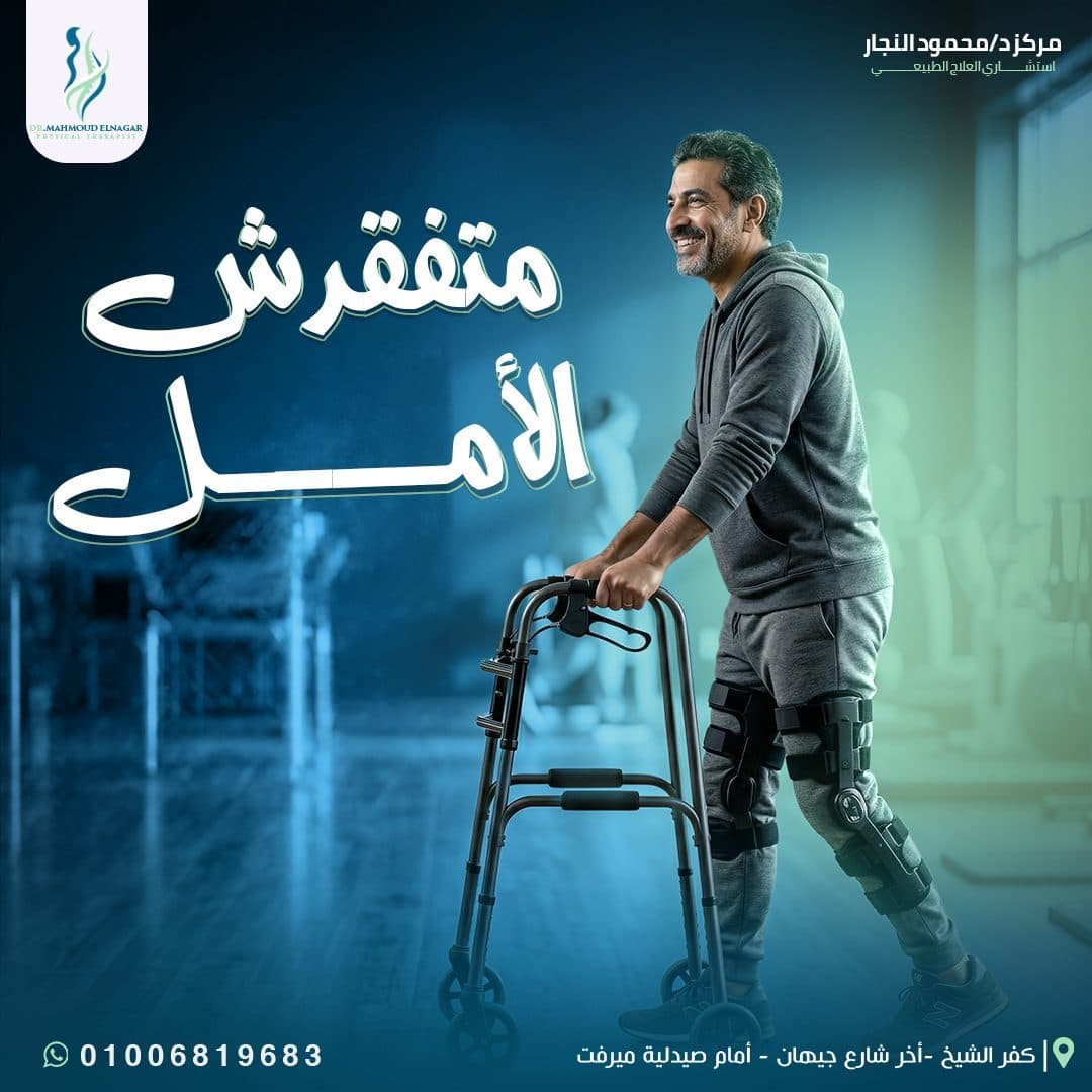
- Elderly Patients
- Neurological Rehabilitation Cases
- People with joint and muscle pain
Creative Concept
Move better. Recover Stronger.
The creative direction was based on depicting the patient's journey from pain or limited mobility to recovery and return to activity.
Movement was used as a key element within the design through:
Dynamic sports positions.
Screenshots showing the rehabilitation stages.
Visual compositions that express strength and balance.
Directed lighting towards the body or area of injury.
Lines and elements help guide the eye within the design.
The main idea of the campaign is to present the center as a partner for the patient in the journey back to his normal life, and not just a place to get a treatment session.
Campaign Strategy
The campaign is divided into a set of Content Pillars to ensure diversity and continuity.
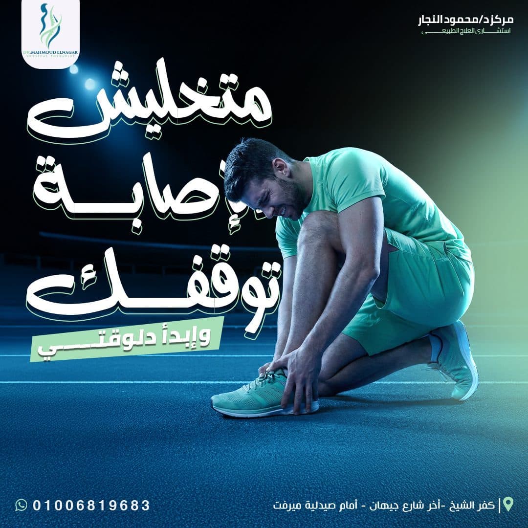
Sports Rehabilitation
Content targeting athletes and helping to clarify the importance of rehabilitation in improving performance and preventing injuries.
Such as:
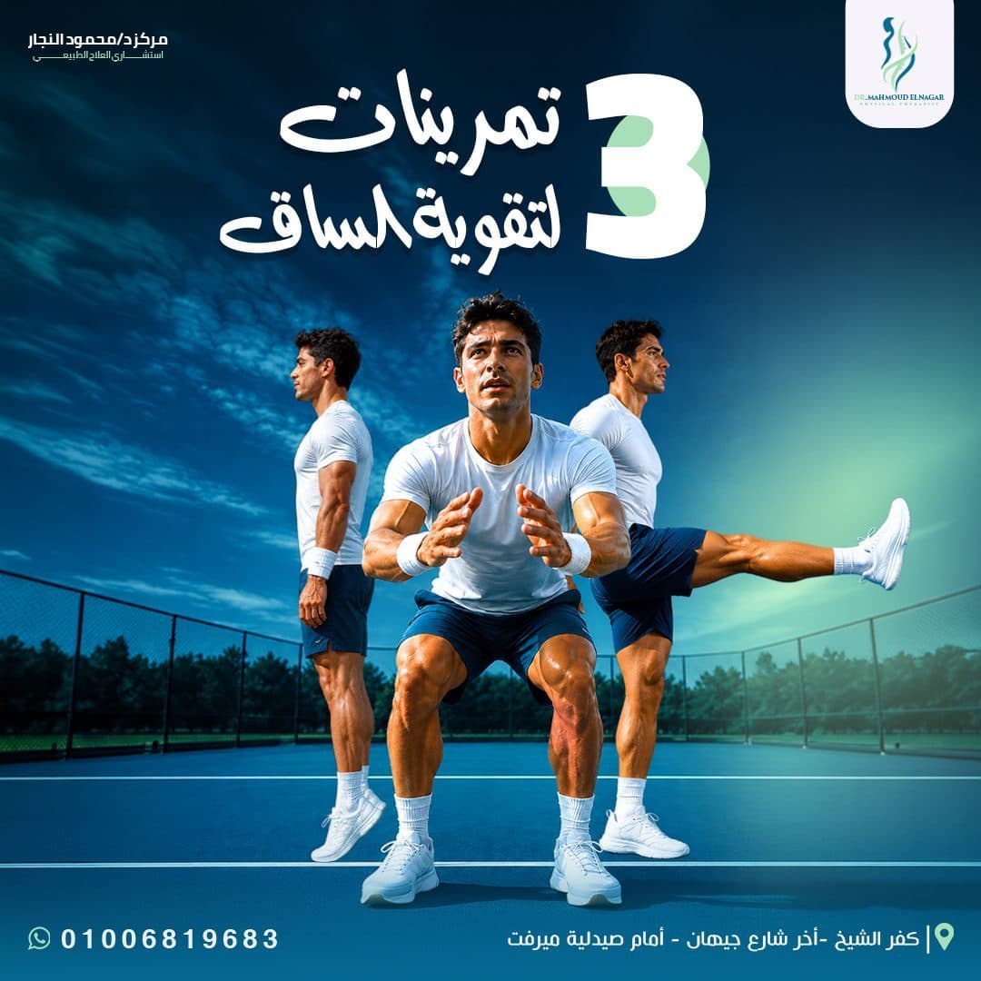
- Heel Raises
- Sit to stand
- Straight Leg Raise
- Back to fitness
- Strong athletic performance
- Strengthening leg muscles
- Medical Awareness
Awareness content that provides solutions to common problems in a direct and easy way.
Such as:
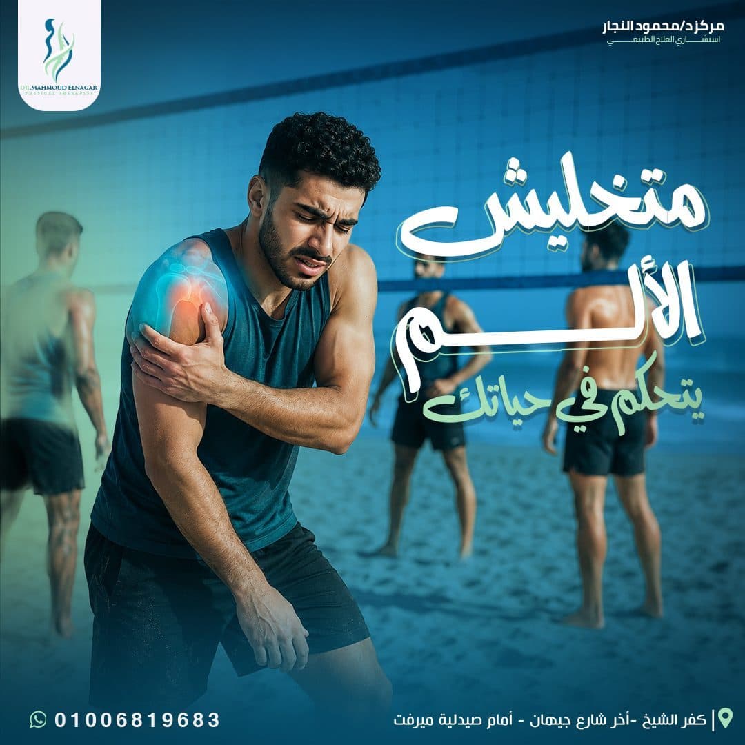
Round shoulder treatment.
Maintain joints.
Rehabilitation after operations.
Neurorehabilitation.
Recovery after injuries.
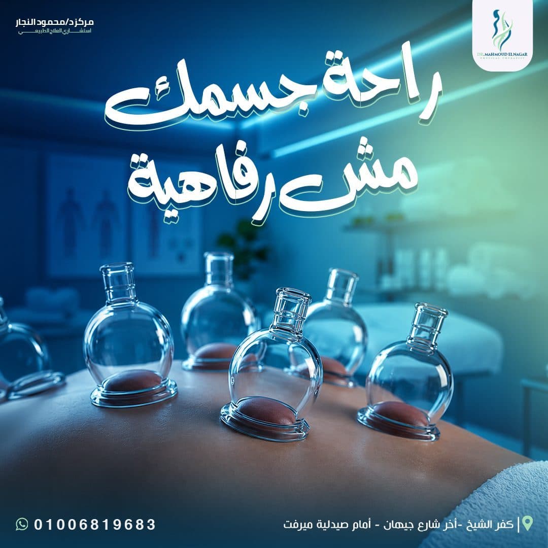
- Recovery & Wellness
Content linking physical therapy to comfort and general health.
Such as:
Muscle recovery.
Body comfort.
Cupping.
Return to movement safely.
- Pediatric Rehabilitation
Content directed to children and parents, reflecting care, confidence and gradual development.
Such as:
Motor rehabilitation for children.
Balance exercises.
Develop confidence and mobility.
Individual rehabilitation programs.
- Brand & Seasonal Content
Content that contributes to strengthening the relationship between the center and the public.
Such as:
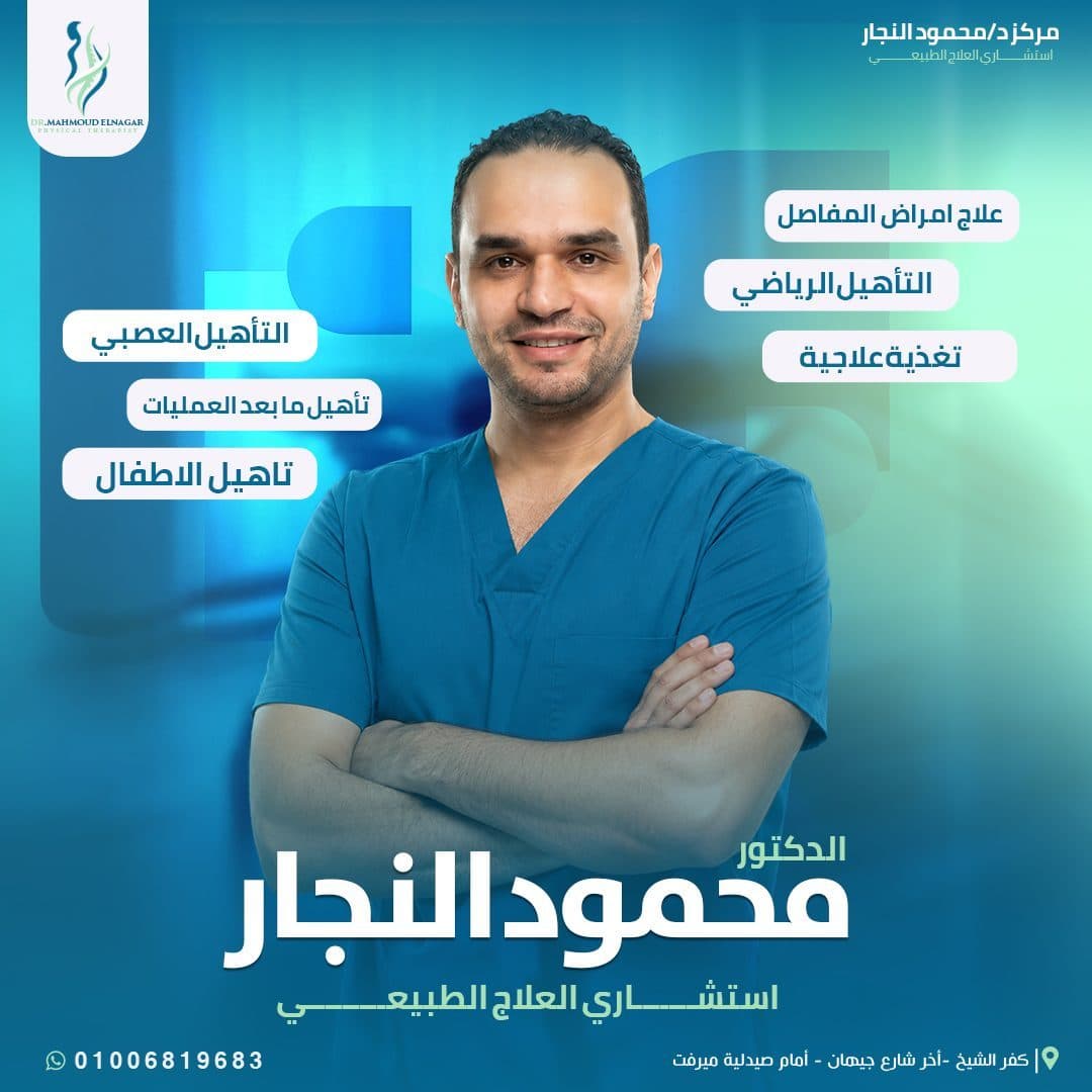
- Doctor Introduction
- Service Overview
- Ramadan Greetings
- Eid Campaigns
- Hijri New Year Posts
Campaign Content Pillars
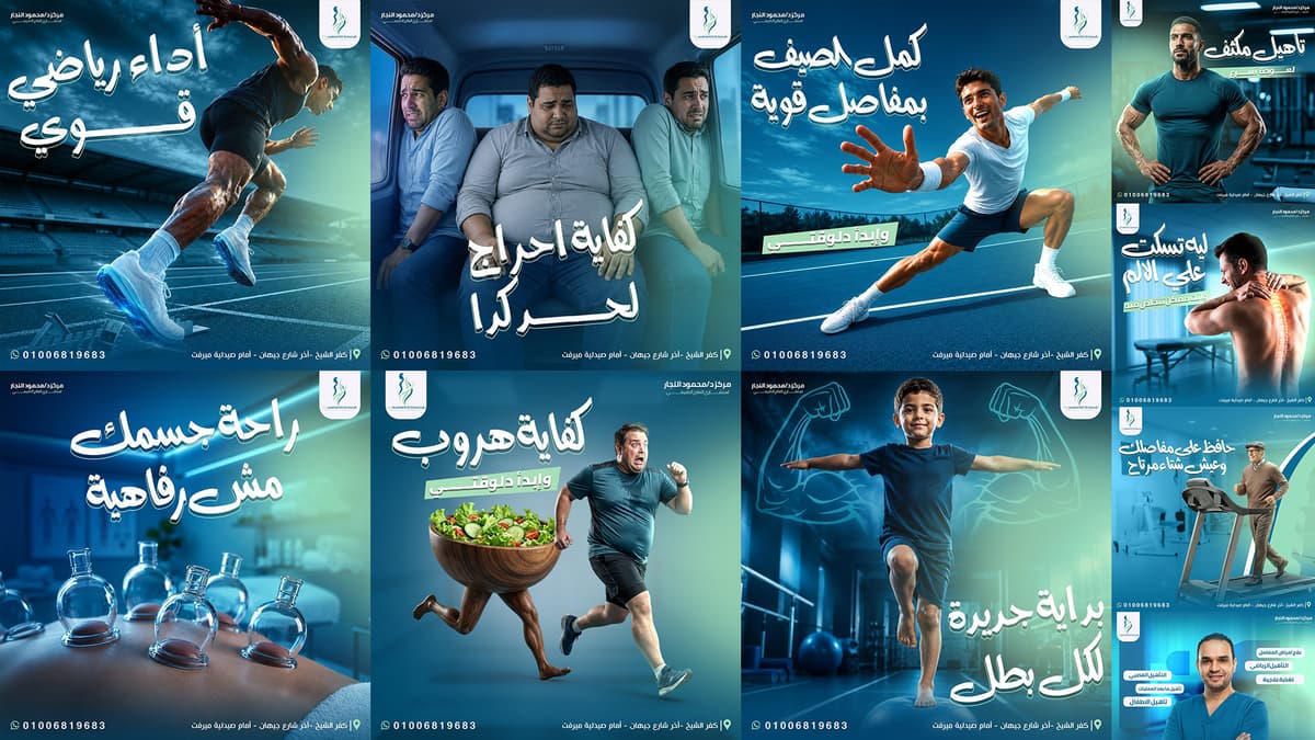
Spine & Posture Infographics
Primary Campaign FocusSports Rehabilitation Campaign
Primary Campaign FocusEid & Seasonal Offers
Primary Campaign FocusExercise Guide Visuals
Primary Campaign FocusCampaign Strategy
A color palette inspired by the center's core identity was adopted, combining medical confidence, energy and vitality.
Primary Color
- Deep medical blue
Color expresses:
Trust.
Professionalism.
Security.
Medical experience.
It was used in backgrounds and background elements to maintain a strong and consistent visual presence.
Secondary Color
- Fresh mint green
It was used to add:
Feeling of recovery.
Vitality and energy.
Visual balance.
Link to health and movement.
Supporting Colors
- White
- Cyan Highlights
- Dark Navy
- Soft Medical Green
Supporting colors were used in:
- Typography
- Icons
- Lighting Effects
- Gradients
- Graphic Shapes
- Call-to-Action Elements
Color Psychology Strategy
Typography Strategy
A clear and bold writing style was chosen that matches the speed of browsing content on social media.
Arabic Typography
Arabic titles were used with strong weights and large spaces to achieve a direct visual impact.
It was relied on:
- Bold Arabic Headlines
- Handwritten Display Style
- Clean Sans-Serif Text
- High-Contrast Typography
The free-form titles gave the campaign a human and lively character, while the geometric fonts maintained professionalism and ease of reading.
English Typography
English fonts are used in exercise names and sports terms.
Such as:
- HEEL RAISES
- SIT TO STAND
- STRAIGHT LEG RAISE
- RECOVERY
Rendered in Outlined Typography to give the design a contemporary, sporty feel without covering up the main image.
Bilingual Typography Sandbox
Visual Direction
The visual system of the campaign is built around a set of fixed elements that help the center to be easily recognised.
The system depends on:
- Blue and Green Gradients
- Bold Oversized Typography
- Cinematic Lighting
- Dynamic Human Positions
- Soft Glow Effects
- Medical and Sports Environments
- Rounded Logo Container
- Consistent Contact Information Bar
The logo, center name, and contact information were placed in fixed or semi-fixed places, which helped achieve visual unity between the different designs.
Green and blue lighting was also used as a recurring element linking all posts to the identity.
Photography & Art Direction
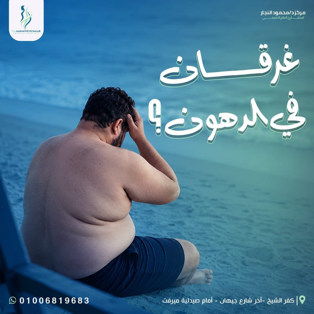
The campaign relied on realistic and cinematic images that directly illustrate movement and treatment conditions.
- Sports Direction
Was used:
- Low Camera Angles
- Strong Athletic Poses
- High-Contrast Lighting
- Outdoor Courts and Gyms
- Visible Muscle Movement
To show energy, strength and improve athletic performance.
- Medical Direction
Quiet therapeutic environments are used, focusing on:
Patient.
Therapeutic movement.
Injury area.
Rehabilitation devices.
Interaction between therapist and case.
- Human Direction
The images were keen to show different emotions depending on the nature of the content:
Confidence for athletes.
Support for children.
Reassurance for patients.
Vitality for the elderly.
Hope in the stages of recovery.
Rehab Exercises Visualizer
Layout Grid System
Posts are designed in a square size suitable for social media platforms, with a flexible Layout system built in that allows changing the configuration without losing identity.
The composition often depends on:
Hero Image is clear.
Great headline.
Negative spaces around text.
Color gradient at the bottom of the design.
The center's logo and name in the upper area.
The phone number and address at Footer are fixed.
The elements are distributed according to the direction of the person's movement within the image, so that the text is placed in the space corresponding to the movement for better visual balance.
Large heading sizes are also used to create a quick catch while browsing the content.
Post Composition Blueprint Grid
Hover over the wireframe components to explore layout structure rules.
Campaign Applications
The visual system was developed to cover different types of content while maintaining a unified identity.
- Educational Posts
Explaining exercises and their benefits.
- Awareness Posts
Awareness of common problems and injuries.
- Service Posts
View the center's services and therapeutic specialties.
- Sports Content
Sports rehabilitation and performance improvement.
- Pediatric Content
Rehabilitating children and developing movement and balance.
- Recover Content
Muscle recovery and treatment after injuries.
- Doctor Introduction
Introducing the doctor, his experience and specializations.
- Seasonal Campaigns
Ramadan, holidays and public events.
The campaign is designed so that it can later be developed into:
- Instagram Stories
- Reels Covers
- Facebook Posts
- Paid Advertisements
- Clinic Screens
- Printed Posters
- Outdoor Advertising
Design Process
Discovery & Research
Understand the nature of the center and the therapeutic services it provides.
- Audience Analysis
Identify the needs of patients, athletes, parents and different age groups.
Content Planning
Dividing the content into therapeutic, sports, awareness, and seasonal themes.
- Visual Research
Study visual trends used in medical and sports campaigns.
- Art Direction
Determine the style of images, lighting, colors and compositions.
- Design Development
Build several design trends and test the clarity of text and images.
- Visual System
Unify locations of logo, contact information, and recurring elements.
- Final Execution
Implement designs in formats suitable for publication while maintaining quality and consistency.
Design & Production Phases
1. Brand Positioning & Market Audit
Comprehensive analysis of competitor messaging and target demographics.
Design Outcome
The end result was a social media campaign:
It has a strong visual presence.
Reflects professionalism and medical confidence.
Services are provided in an easy and fast manner.
It addresses different categories within one system.
Combines sports energy with therapeutic care.
Maintains clarity of identity in all posts.
Expandable to future content and campaigns.
The visual system helped transform medical services into more engaging content, while maintaining the credibility and human aspect of the centre.
Final Statement
The goal was not only to create attractive social media posts, but to build a complete visual communication system that presents physiotherapy as a journey toward movement, confidence, recovery, and a better quality of life.
The campaign combines medical credibility, dynamic visual storytelling, and consistent brand communication to strengthen Dr. Mahmoud Elnagar’s presence across every digital touchpoint.